Scoring genre clarity...

Caravan SandWitch capsule

Caravan SandWitch

Embark on a journey across vast landscapes in Caravan SandWitch, a captivating narrative-driven exploration adventure.

$9.99Very Positive(71)
ExplorationAdventureSingleplayer
Studio Plane ToastSep 12, 2024

Caravan SandWitch scores 75/100 — better than 68% of Steam capsules we've analysed (n=22,658).

Very Positive (71 reviews) · $9.99 · Released Sep 12, 2024 · By Studio Plane Toast

Quick text summary

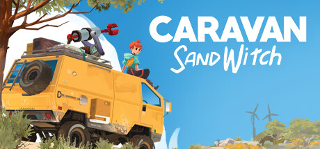
Caravan SandWitch scored 75/100 on Steam Analyzer — Good for a Steam capsule. Top priority fix: [composition] Shift the storm/tornado element to feel more integrated with the truck focal point, or crop tighter on the truck and character to eliminate the split-attention problem at small sizes.

Capsule scores by dimension

  • Genre Clarity: 7/10 — Exploration adventure with mystery hook. The yellow off-road truck with a character perched on top, sandy desert landscape, and a dramatic tornado/storm in the background clearly communicate an open-world exploration or road-trip adventure. At tiny size the truck silhouette and storm still suggest a journey-based game, though the casual/narrative tone is harder to distinguish from a survival or action genre. The stylized art nudges toward indie narrative adventure, which is accurate.
  • Title Readability: 8/10 — Bold white title reads well. The large white sans-serif 'CARAVAN' with the slightly smaller 'SandWitch' below placed against the clean blue sky background gives strong contrast and clear letterforms at full size. At small size 'CARAVAN' remains readable, though 'SandWitch' with its mixed casing becomes slightly ambiguous. At tiny size 'CARAVAN' is still parseable but 'SandWitch' collapses into an unreadable block, which is a minor but real issue.
  • Contrast & Color: 7/10 — Warm palette pops on Steam dark. The bright yellow truck and warm sandy tones create a strong value contrast against Steam's dark #1b2838 background, and the clear blue sky prevents the image from looking muddy. The character figure is relatively small and blends somewhat with the truck at tiny size, reducing silhouette clarity. In grayscale the white title text and bright truck still hold separation, but the storm cloud on the right merges slightly with the sky at reduced sizes.
  • Uniqueness & Polish: 8/10 — Charming stylized art, distinctive concept. The hand-painted cel-shaded aesthetic is clean and consistently executed, with the playful 'SandWitch' wordplay hinting at a unique narrative hook that stands out from generic adventure capsules. The composition of a character lounging atop a heavily-loaded truck with a distant tornado is a specific and memorable visual story beat rather than a generic hero pose. Compared to benchmark titles like Pacific Drive or The Invincible, it holds its own with personality, though the overall polish is slightly below the very top tier.
  • Brand Consistency: 8/10 — Cohesive identity, recognizable palette. The warm desert ochre, sky blue, and the distinctive yellow truck form a recognizable signature palette that would carry across screenshots and marketing. The illustrated style is consistent and internally coherent with no jarring tonal shifts between the foreground characters, the environment, and the background elements. The truck itself functions as a strong brand icon that could anchor the game's identity across store assets.
  • Composition: 7/10 — Clear focal points with good depth. The image uses a solid three-layer composition: the tree and truck in the foreground left, the open sandy landscape in the midground, and the stormy ruins on the right horizon, giving a sense of scale and journey. The title occupies the upper right sky area on a clean background, which is smart placement. However, at small and tiny sizes the weight splits somewhat between the left truck and the right storm, creating two competing focal points rather than one dominant subject, which slightly dilutes the hierarchy under quick scroll conditions.

What works

  • Distinctive yellow truck icon. The bright yellow off-road truck is an immediately recognizable brand anchor that reads as a strong silhouette even at small sizes and gives the game a unique visual identity.
  • Title placement on clean sky. Placing 'CARAVAN SandWitch' against the uncluttered blue sky ensures strong white-on-blue contrast without competing with noisy background texture.
  • Cohesive stylized art direction. The cel-shaded illustrated style is consistently applied across all elements, giving the capsule a premium indie feel that feels intentional and polished.
  • Narrative hook communicated visually. The combination of an adventure-rigged vehicle, a relaxed character, and a distant storm immediately suggests a journey toward something mysterious, communicating narrative exploration without any UI or text support.

What hurts the capsule

  • Dual focal point competition. At small and tiny sizes the eye splits between the truck on the left and the tornado on the right, weakening the single-subject hierarchy needed for quick-scroll recognition.
  • 'SandWitch' collapses at tiny size. The mixed-case stylized subtitle becomes an unreadable blur at 120x45, meaning only 'CARAVAN' survives at the smallest thumbnail size.
  • Character figure is too small. The protagonist sitting on the truck roof is charming at full size but becomes an indistinct speck at tiny size, losing the human connection that helps convey tone.
  • Storm cloud merges with sky at tiny size. The gray-white tornado against the light blue sky loses edge definition at reduced sizes and in grayscale, undermining the dramatic tension it is meant to convey.

Priority fixes

  1. [composition] Shift the storm/tornado element to feel more integrated with the truck focal point, or crop tighter on the truck and character to eliminate the split-attention problem at small sizes.
  2. [title_readability] Increase the size and weight of 'SandWitch' and add a subtle dark drop shadow or soft outline so it survives at tiny thumbnail sizes.
  3. [genre_clarity] Slightly enlarge or repose the character on the truck roof so the human silhouette is readable at 120x45 and reinforces the personal narrative adventure tone.
  4. [contrast_color] Add a subtle dark vignette or edge separation around the storm cloud to ensure it reads as a distinct element from the sky background in grayscale and at reduced sizes.

Store copy priority fixes

  1. [hook_strength] Replace "Embark on a journey across vast landscapes in Caravan SandWitch, a captivating narrative-driven exploration adventure" with a hook that leads with the sister mystery or the unique Provence post-apocalypse setting and the van-based exploration mechanic.
  2. [feature_communication] Add a clear paragraph or bulleted list that explains the core gameplay loop: what does the player do each in-game session? (e.g., upgrade van, complete community tasks, explore ruins, uncover story beats)
  3. [uniqueness] Clarify what the van upgrade system does mechanically—provide 1-2 specific examples of how upgrades unlock new areas or change exploration, to differentiate from generic exploration games.
  4. [genre_clarity] Either remove or explain the "3D Platformer" tag in conjunction with the copy—if platforming is present, show evidence; if not, remove the tag to reduce audience confusion.

Related guides

Steam app ID: 1582650