Scoring genre clarity...

Lil Gator Game capsule

Lil Gator Game

Embark on an adorable adventure, discover new friends and uncover everything the island has to offer. Climb, Swim, Glide and slide your way into the hearts of the many different characters you meet on your travels!

$9.99Overwhelmingly Positive(48)
CasualCozyCute
MegaWobbleDec 14, 2022

Lil Gator Game scores 87/100 — better than 98% of Casual capsules (n=10,372).

Overwhelmingly Positive (48 reviews) · $9.99 · Released Dec 14, 2022 · By MegaWobble

Quick text summary

Lil Gator Game scored 87/100 on Steam Analyzer — Excellent for a Casual capsule. Top priority fix: [genre_clarity] Maintain current design—it performs excellently and clearly communicates casual adventure at all sizes.

Capsule scores by dimension

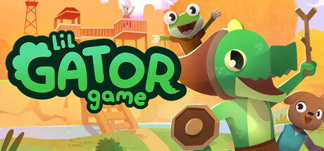
  • Genre Clarity: 9/10 — Charming casual adventure immediately clear. The bright, cheerful art style, friendly gator character with expressive eyes, pastoral island setting with colorful buildings, and casual platforming silhouettes (climbing poses, swimming water) all signal a wholesome indie adventure game instantly. At tiny size, the iconic green gator and warm orange background remain unmistakably readable and genre-appropriate, making the casual-adventure tone unmistakable even at thumbnail size.
  • Title Readability: 9/10 — Bold, legible title stands strong. The large, black-outlined 'lil GATOR' text in a chunky sans-serif is positioned prominently on the left with 'game' as a subtitle below, ensuring strong contrast against the warm orange gradient. The outline weight and size hold clarity at all viewing scales including tiny thumbnails, and the playful lowercase treatment reinforces the casual tone without sacrificing legibility.
  • Contrast & Color: 9/10 — Vibrant warm palette pops strongly. The saturated orange-yellow background creates excellent value separation from the bright green gator character, brown wooden elements, and colorful background buildings. In grayscale, the light warm tones clearly separate from the darker green and brown subjects, and the overall saturation ensures strong silhouette clarity even at tiny sizes during quick scrolls.
  • Uniqueness & Polish: 8/10 — Distinctive art style with clear identity. The chunky, hand-crafted aesthetic with soft rounded shapes, expressive character proportions, and cohesive pastoral island color palette feels intentional and polished rather than generic asset-based. The gator's friendly expression and body language communicate approachability and playfulness, positioning the game as distinctly wholesome without feeling like a template or copycat design.
  • Brand Consistency: 8/10 — Iconic gator character and warm palette. The distinctive green gator with large expressive eyes and the warm orange-yellow color scheme form a memorable visual identity that should carry across store screenshots consistently. The chunky, friendly art style and pastoral setting create a coherent brand voice that signals indie charm and approachability across all touchpoints.
  • Composition: 9/10 — Excellent hierarchy with clear focal point. The large green gator on the right serves as the dominant focal point with the bold title anchoring the left, creating strong left-right balance and preventing center void. Supporting island elements (buildings, trees, secondary characters) occupy the background and edges without competing for attention, and the layering of foreground character, midground structures, and background sky creates clear depth that remains readable at all sizes.

What works

  • Instantly recognizable character. The expressive green gator with large eyes is distinctive, memorable, and immediately communicates the game's friendly, casual tone.
  • Excellent color contrast and pop. The warm orange-yellow background creates outstanding separation from character silhouettes and maintains clarity even at tiny thumbnail size.
  • Strong compositional balance. Title and character are well-positioned with supporting elements filling space without creating clutter or competing focal points.
  • Polished, cohesive art direction. Chunky shapes, consistent rendering style, and intentional palette reinforce a premium indie identity rather than generic template feel.

What hurts the capsule

  • Minor tagline visibility. The 'game' subtitle, while readable at full size, becomes less distinct at tiny thumbnail scale and could emphasize the brand name more.
  • Supporting characters somewhat small. The secondary character (brown creature) in the middle-right area reads as detail clutter rather than a secondary focal point.

Priority fixes

  1. [genre_clarity] Maintain current design—it performs excellently and clearly communicates casual adventure at all sizes.
  2. [uniqueness_polish] Ensure the gator character's expression and body language remain consistent across all store screenshots to reinforce brand identity.
  3. [composition] Consider slightly enlarging or positioning the secondary brown character to either enhance secondary interest or reduce visual clutter depending on design intent.

Store copy priority fixes

  1. [feature_communication] Reorganize the detailed description to lead with 'Lil Gator Game is an open-world, movement-focused adventure where...' before mentioning the DLC, so the base game's core loop is established first.
  2. [hook_strength] Add a sentence after the 'no-pressure adventure' statement that reinforces why movement-based exploration is fun (e.g., 'Every mountaintop and hidden path reveals new friends and secrets to uncover').
  3. [feature_communication] Expand the crafting section with 2-3 more concrete examples of craftable items and their gameplay effects to make the system feel substantial.
  4. [uniqueness] Add one sentence explicitly comparing Lil Gator's no-pressure, friendship-focused approach to traditional adventure games (e.g., 'Unlike action-adventure games built around combat and time pressure, Lil Gator celebrates exploration and social connection').

Related guides

Steam app ID: 1586800 · Tags: Casual, Cozy, Cute, Relaxing, Wholesome