Scoring genre clarity...

City 20 capsule

City 20

Survive in a living post-apocalyptic city. Build trust or spark conflict with NPCs and factions, uncover mysteries, and watch the world change with your every choice.

$15.99Mostly Positive(189)
SurvivalOpen WorldCrafting
Untold GamesSep 23, 2024

City 20 scores 62/100 — better than 3% of Steam capsules we've analysed (n=22,658).

Mostly Positive (189 reviews) · $15.99 · Released Sep 23, 2024 · By Untold Games

Quick text summary

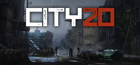
City 20 scored 62/100 on Steam Analyzer — Solid for a Steam capsule. Top priority fix: [contrast_color] Brighten the foreground or add a strong rim light or warm accent color to key figures so the scene pops against the Steam dark background in grayscale scroll.

Capsule scores by dimension

  • Genre Clarity: 7/10 — Post-apocalyptic survival city clear. The rain-soaked ruined cityscape with debris, abandoned vehicles, and silhouetted figures walking through a desolate urban environment strongly communicates post-apocalyptic survival. The genre is readable at small size due to the recognizable destroyed city setting and dark atmospheric tone. At tiny size the urban ruin silhouette still reads as post-apocalyptic, though simulation and social NPC elements are not visually communicated.
  • Title Readability: 7/10 — Bold title readable, numeral stylized. The CITY 20 title uses large, bold white distressed letters with good size that dominates the upper portion of the capsule, making it readable at full and small sizes. The '20' portion uses a reddish-orange scratched style that adds character but reduces legibility slightly at tiny size where it can blur into the background. At tiny size approximately 120x45, the title still parses as two distinct words though fine texture detail on the letters is lost.
  • Contrast & Color: 6/10 — Muted palette blends near Steam dark. The overall image uses a cold, desaturated gray-green palette with heavy rainfall atmosphere, which creates limited value separation against Steam's dark #1b2838 background. The white title text provides the strongest contrast point, but the background scene mid-tones are muddy and the silhouetted figures blend into the street environment. In grayscale the foreground figures and background rubble have minimal separation, reducing overall pop during quick scroll.
  • Uniqueness & Polish: 5/10 — Generic post-apoc scene, competent craft. The composition resembles many post-apocalyptic game capsules with a ruined city street, grey sky, and walking figures, offering limited visual distinctiveness compared to top-tier capsules like Pacific Drive or Lethal Company which have more iconic visual hooks. The craft is competent with believable environmental detail and consistent mood, but there is no singular memorable element or unique visual selling point that communicates the NPC social simulation core mechanic. It reads as a generic survival setting without a distinguishing identity hook.
  • Brand Consistency: 6/10 — Coherent dark tone, limited identity. The capsule maintains a consistent cold desaturated post-apocalyptic palette and atmospheric rain effect that likely matches the in-game aesthetic. The distressed CITY 20 logo with the red-orange numeral scratch style provides a partial brand anchor. However there is no iconic character, symbol, or motif that would make this immediately recognizable as City 20 in a lineup, limiting its standalone brand identity signal.
  • Composition: 6/10 — Centered scene, weak focal hierarchy. The title sits prominently in the upper third and the street scene fills the lower two thirds with silhouetted figures providing a midground element, creating a basic but functional three-layer structure. However the figures are small and spread horizontally without a clear single focal point, and the wide empty sky area above the ruins creates dead space. At small size the composition reads as a wide establishing shot rather than a focused hero moment, weakening visual impact in quick scroll conditions.

What works

  • Strong genre signal at small size. The ruined urban street with debris and silhouetted figures clearly communicates post-apocalyptic survival even at reduced sizes.
  • Title dominates upper composition. The large bold white CITY 20 lettering is well-sized and placed on a relatively controlled dark sky region, making it the strongest contrast element.
  • Atmospheric mood consistency. Rain, overcast lighting, and desaturated palette create a cohesive oppressive atmosphere that fits the survival genre.

What hurts the capsule

  • Muddy mid-tone contrast against Steam background. The desaturated grey-green scene has limited value separation from #1b2838, causing it to visually sink rather than pop during quick scroll.
  • No unique visual hook or mechanic hint. The NPC social simulation and faction mechanics, which are the core selling point, are entirely absent from the visual narrative.
  • Weak focal point at tiny size. Multiple small silhouetted figures spread across the frame without a dominant hero subject, causing the image to read as texture rather than a story at 120x45.
  • Generic post-apocalyptic template feel. The ruined city street composition is a common trope in the genre and does not distinguish City 20 from similar survival titles.

Priority fixes

  1. [contrast_color] Brighten the foreground or add a strong rim light or warm accent color to key figures so the scene pops against the Steam dark background in grayscale scroll.
  2. [uniqueness_polish] Introduce a single iconic visual element that hints at the NPC faction or social mechanic, such as a prominent NPC face, faction symbol, or conflict vignette, to differentiate from generic post-apoc capsules.
  3. [composition] Consolidate the scattered figures into one dominant foreground silhouette or character to create a clear single focal point readable at tiny size.
  4. [title_readability] Increase contrast on the '20' red-orange numeral with a subtle dark outline or drop shadow so it remains legible at tiny size without blending into the scene.

Store copy priority fixes

  1. [hook_strength] Move the 'About the Game' section before the roadmap, and strengthen the short description by leading with the closed-city mystery or the living world mechanic rather than stacking three mechanics in sequence.
  2. [uniqueness] Add a sentence explicitly contrasting City 20's NPC agency model with static-world survival games: e.g., 'Unlike traditional survival games, NPCs pursue their own goals independent of your actions—alliances crumble and enemies rise without your input.'
  3. [feature_communication] Clarify how mysterious creatures fit into core gameplay loops: are they a threat, a puzzle mechanic, or a narrative mystery? Integrate this into survival or crafting sections.
  4. [tone_match] Remove or relocate the roadmap and Discord call-to-action to the bottom of the page to maintain immersive world-building tone throughout the gameplay description.

Related guides

Steam app ID: 1597980