Scoring genre clarity...

Bō: Path of the Teal Lotus capsule

Bō: Path of the Teal Lotus

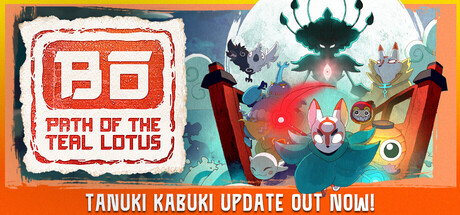
Flow gracefully through a colorful, hand-drawn 2.5D action platformer inspired by Japanese folklore. Engage in acrobatic aerial combat, unlock powerful mystical abilities, and explore an interconnected world of myth as you seek to unravel the mysteries of your origin.

$9.99Very Positive(33)
Precision PlatformerSide ScrollerExploration
Squid Shock Studios, Christopher Stair, Trevor YoungquistJul 17, 2024

Bō: Path of the Teal Lotus scores 68/100 — better than 19% of Steam capsules we've analysed (n=22,658).

Very Positive (33 reviews) · $9.99 · Released Jul 17, 2024 · By Squid Shock Studios

Quick text summary

Bō: Path of the Teal Lotus scored 68/100 on Steam Analyzer — Solid for a Steam capsule. Top priority fix: [composition] Remove or integrate the 'Tanuki Kabuki Update Out Now!' banner into a less intrusive design element so it does not break the capsule's visual hierarchy and premium feel.

Capsule scores by dimension

  • Genre Clarity: 7/10 — Japanese folklore platformer reads well. The hand-drawn aesthetic, torii gate, mystical creatures, and acrobatic fox-like protagonist clearly communicate a Japanese folklore-inspired action platformer. At small size the colorful creature ensemble and torii gate silhouette still hint at the genre. At tiny size it reads as a stylized indie action game with Japanese theming, though the platformer subgenre becomes less certain.
  • Title Readability: 6/10 — Logo reads at full, fades tiny. The red stamp-style logo box containing 'Bō' is distinctive and legible at full size, with 'Path of the Teal Lotus' subtitle readable beneath it. At small size the subtitle becomes strained, and at tiny size 'Path of the Teal Lotus' is essentially unreadable, leaving only the 'Bō' mark visible. The banner text 'Tanuki Kabuki Update Out Now!' at the bottom adds clutter and reads poorly at small sizes.
  • Contrast & Color: 7/10 — Warm teal palette pops from Steam dark. The bright teal and warm orange tones contrast reasonably well against Steam's #1b2838 background, particularly the glowing moon and the orange banner strip at the bottom. The central character group reads clearly against the lighter background. In grayscale, the subject cluster maintains decent separation from the background, though some of the darker creature silhouettes on the right edge blend slightly into the darker sky.
  • Uniqueness & Polish: 7/10 — Charming hand-drawn style stands out. The hand-drawn 2.5D art style with its warm color palette and folklore-inspired character designs gives it a distinctive identity that differentiates it from typical indie platformers. The stamp logo treatment is a clever branding choice that feels intentional and culturally coherent. However, the update banner at the bottom ('Tanuki Kabuki Update Out Now!') feels like an afterthought that reduces the premium feel of the capsule.
  • Brand Consistency: 8/10 — Cohesive Japanese folklore identity. The red ink stamp logo, hand-drawn illustration style, teal and warm orange palette, and Japanese folkloric character designs all reinforce a coherent brand identity. The torii gate, mystical creatures, and protagonist design feel unified in rendering style and cultural reference. The stamp motif for the logo is a memorable and recurring identity element that would be recognizable across marketing materials.
  • Composition: 6/10 — Busy cluster with competing elements. The character group is positioned in the right-center area with the logo occupying the top-left, creating a decent diagonal hierarchy, but the composition feels crowded with multiple characters, creatures, and background elements competing for attention. The bottom update banner disrupts the visual flow and wastes prime real estate. At small size the character cluster becomes a colorful blob without a single clear hero focal point, reducing impact.

What works

  • Distinctive stamp logo. The red ink stamp treatment for the 'Bō' logo is culturally appropriate, memorable, and holds up at small sizes as a recognizable brand mark.
  • Strong cultural genre signaling. The torii gate, folkloric creatures, and hand-drawn style immediately communicate Japanese-inspired indie action game to the viewer.
  • Warm teal palette contrasts Steam background. The glowing warm tones and teal accents pop effectively against Steam's dark navy background during quick scroll browsing.
  • Cohesive art direction. The rendering style, character designs, and background elements are all visually unified and feel like they come from the same hand-crafted world.

What hurts the capsule

  • Update banner kills premium feel. The 'Tanuki Kabuki Update Out Now!' orange strip at the bottom reads as a promotional overlay rather than a designed element, reducing the capsule's overall polish.
  • No single hero focal point. The cluster of multiple characters and creatures at similar sizes creates visual noise with no dominant primary subject to anchor the eye at tiny size.
  • Subtitle unreadable at tiny size. 'Path of the Teal Lotus' collapses to an unreadable string of characters at thumbnail size, leaving only the 'Bō' mark to carry the brand.
  • Busy background competes with foreground. The detailed sky, moon, waves, and multiple creature silhouettes create a busy backdrop that makes it harder to separate the primary character at small sizes.

Priority fixes

  1. [composition] Remove or integrate the 'Tanuki Kabuki Update Out Now!' banner into a less intrusive design element so it does not break the capsule's visual hierarchy and premium feel.
  2. [composition] Establish one dominant hero character at center-right with supporting characters scaled down or pushed further back to create a clear primary focal point at small and tiny sizes.
  3. [title_readability] Increase the size and weight of the 'Path of the Teal Lotus' subtitle text and place it against a more controlled background region so it remains legible at small capsule size.
  4. [contrast_color] Brighten or add a subtle rim light to the main protagonist character to sharpen silhouette separation from the detailed background at tiny size.

Store copy priority fixes

  1. [hook_strength] Move the content update announcement to a separate 'Latest News' section or footer; lead with the core pitch 'Flow with acrobatic grace through a hand-drawn world inspired by Japanese folklore' to immediately engage new players before promoting post-launch content.
  2. [feature_communication] Add a single sentence under the short description clarifying the core progression loop: something like 'Unlock new abilities to access hidden areas and challenge epic boss battles' to reinforce the Metroidvania exploration reward cycle.
  3. [uniqueness] Add a comparative statement that explicitly differentiates: e.g., 'Combines the tight platforming precision of [reference] with the staff-based combat system and Daruma ally mechanics unique to Bō' to help players understand why this stands apart.
  4. [audience_targeting] In the opening paragraph, add a phrase acknowledging difficulty expectations: 'master acrobatic challenges with skill-based precision' signals hardcore platformer fans while 'move-and-reset system' signals accessibility, but a sentence like 'Designed for players seeking graceful challenge and Japanese mythological storytelling' would sharpen audience alignment.

Related guides

Steam app ID: 1614440