Scoring genre clarity...

A Little to the Left capsule

A Little to the Left

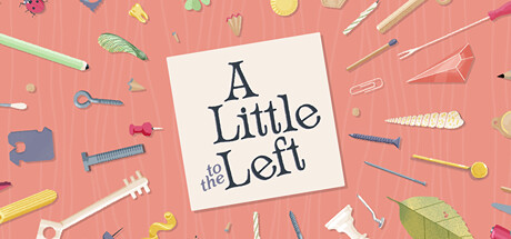
A Little to the Left is a cozy puzzle game that has you sort, stack, and organize household items into pleasing arrangements while you keep an eye out for a mischievous cat with an inclination for chaos. Check out this playful and intuitive puzzler with 100+ satisfying messes to tidy.

$5.99Very Positive(322)
PuzzleRelaxingCleaning
Max InfernoNov 8, 2022

A Little to the Left scores 78/100 — better than 86% of Puzzle capsules (n=4,501).

Very Positive (322 reviews) · $5.99 · Released Nov 8, 2022 · By Max Inferno

Quick text summary

A Little to the Left scored 78/100 on Steam Analyzer — Good for a Puzzle capsule. Top priority fix: [title_readability] Increase the title card size slightly and reduce the 'to the' size differential to improve legibility of the full title at tiny thumbnail dimensions

Capsule scores by dimension

  • Genre Clarity: 8/10 — Cozy organization puzzle implied well. The scattered household items — screws, pins, paper clips, a leaf, a paper plane — immediately communicate sorting and tidying as a core mechanic, which is accurate to the genre. The warm coral wooden surface and craft-paper aesthetic reinforce a cozy, casual tone. At tiny size the dense scattering of small objects still reads as 'organize these things' even if individual items blur together.
  • Title Readability: 7/10 — Legible at full, marginal at tiny. The centered cream card with dark navy serif lettering for 'A Little to the Left' reads cleanly at full and small sizes with good contrast against the card background. At tiny thumbnail size the card shrinks significantly and the stacked multi-line title becomes very small, though the high-contrast dark-on-cream treatment keeps it just barely legible. The secondary phrase 'to the' in smaller size within the title stack adds slight hierarchy complexity that collapses at tiny size.
  • Contrast & Color: 7/10 — Warm coral pops against Steam dark. The salmon-coral background creates strong value contrast against Steam's #1b2838 dark navy background, making the capsule visible in a scroll. The cream title card provides a bright central anchor that separates cleanly in grayscale. However, many of the scattered items share similar warm mid-tones with the background, reducing their individual silhouette definition at small sizes.
  • Uniqueness & Polish: 8/10 — Charming craft aesthetic stands out. The flat-lay craft illustration style with real household object diversity is visually distinctive and communicates the game's unique selling point — organizing everyday clutter — directly through its art direction. The handmade, slightly tactile quality of the objects and the wooden table surface feel intentional and premium. Compared to generic cozy game capsules, this one has a clear visual hook that sets it apart, though it stops short of being iconic.
  • Brand Consistency: 9/10 — Coherent identity, memorable motif. The warm coral palette, craft-paper card motif, flat-lay arrangement of household items, and serif typography create a unified and immediately recognizable identity. The visual language directly mirrors the game's own UI and aesthetic as seen in store screenshots, making it highly cohesive. The scattered-yet-considered arrangement of objects is itself a brand signature that would be recognizable across marketing materials.
  • Composition: 8/10 — Centered card anchors scattered layout. The central cream title card acts as a strong focal point that grounds the composition against the busy surrounding scatter of objects. Items radiate outward from center creating natural eye movement without feeling chaotic. At small size the center card remains the dominant element, though the surrounding object field becomes an indistinct texture; the edges of the composition contain important scattered items that risk being cropped without adding hierarchy value.

What works

  • Distinctive flat-lay concept. The overhead arrangement of household items directly communicates the game's core sorting mechanic, creating a rare case where capsule art doubles as gameplay explanation.
  • Warm coral pops on Steam dark background. The salmon-coral surface creates strong hue and value contrast against #1b2838, ensuring the capsule stands out during a quick scroll.
  • High-contrast title card. The cream card with dark navy serif text provides a self-contained high-contrast title treatment that survives size reduction better than text placed directly on a busy background.
  • Strong brand cohesion. Palette, typography, and object style form a unified identity that is internally consistent and visually memorable across sizes.

What hurts the capsule

  • Title collapses at tiny size. The multi-line stacked title with the smaller 'to the' inset becomes very difficult to parse at 120x45, reducing discoverability in smallest thumbnail views.
  • Peripheral objects lack silhouette clarity. Many small items share similar warm tones with the coral background, causing them to blend together into an undifferentiated texture at small and tiny sizes rather than reading as distinct recognizable objects.
  • No cat or character hook visible. The mischievous cat is a key brand differentiator per the game description but is absent from the capsule, missing an opportunity for a memorable focal character that would aid recognition.
  • Edge items risk crop loss. Several interesting objects sit very close to the image edges and may be cut off in certain Steam display contexts, contributing little to hierarchy while occupying prime real estate.

Priority fixes

  1. [title_readability] Increase the title card size slightly and reduce the 'to the' size differential to improve legibility of the full title at tiny thumbnail dimensions
  2. [genre_clarity] Introduce a subtle cat silhouette or paw print element near the title card to reinforce the brand's unique narrative hook and add a character anchor at small sizes
  3. [contrast_color] Increase value contrast between the scattered peripheral objects and the coral background by adding subtle drop shadows or slightly desaturating the background to make individual item silhouettes read more clearly at small size
  4. [composition] Pull edge-hugging objects inward by a safe margin to ensure no key visual elements are lost to Steam cropping across different capsule display formats

Store copy priority fixes

  1. [uniqueness] Add one sentence explaining what makes the puzzle design philosophically distinct—e.g., 'Unlike traditional logic puzzles, multiple correct arrangements reward creativity and personal preference' or clarify the cat's active role in disrupting puzzle attempts.
  2. [feature_communication] Expand the cat mechanic description by 1-2 sentences to explain its gameplay impact: does it shuffle pieces mid-puzzle, create bonus challenges, or serve as a thematic element?
  3. [hook_strength] In the short description, replace the second mention of 'sort, stack, and organize' with a more specific differentiator or a detail about the unique puzzle design philosophy.
  4. [feature_communication] Move or highlight the seasonal archive feature higher in the detailed description or include it in the FEATURES list, since 'over 100 unique logical puzzles' now understates total content available.

Related guides

Steam app ID: 1629520 · Tags: Puzzle, Relaxing, Cleaning, Organizing, Cute