Scoring genre clarity...

The Last Oricru - Final Cut capsule

The Last Oricru - Final Cut

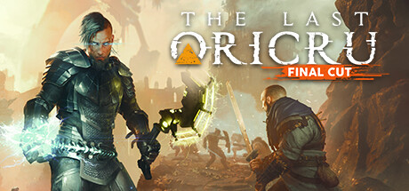
Enter a world beyond imagination with The Last Oricru - Final Cut. An action RPG, The Last Oricru - Final Cut unravels in a fantasy world blending sci-fi and medieval elements to deliver an experience like no other. Seize your destiny and take your place in this adventure for single or co-op play.

$1.99Mixed(548)
Choices MatterAction RPGCo-op
GoldKnightsOct 13, 2022

The Last Oricru - Final Cut scores 62/100 — better than 3% of Steam capsules we've analysed (n=22,658).

Mixed (548 reviews) · $1.99 · Released Oct 13, 2022 · By GoldKnights

Quick text summary

The Last Oricru - Final Cut scored 62/100 on Steam Analyzer — Solid for a Steam capsule. Top priority fix: [uniqueness_polish] Enlarge and spotlight the glowing sci-fi mechanical weapon or shield as a central foreground element to communicate the unique medieval-sci-fi hybrid identity that separates this game from generic dark fantasy titles

Capsule scores by dimension

  • Genre Clarity: 7/10 — Action RPG combat clear enough. Two armored warriors in combat poses with glowing weapons against a ruined landscape clearly signals action RPG or soulslike territory. The sci-fi medieval blend is somewhat visible in the glowing mechanical shield and dark armor. At tiny size the two-figure combat arrangement still reads as an action game, though the sci-fi element becomes very hard to distinguish.
  • Title Readability: 6/10 — Title readable at full, borderline tiny. THE LAST ORICRU uses a large serif-adjacent display font in white with decent contrast against the warm sandy background, reading well at full size. The orange FINAL CUT subtitle badge is a smart differentiator but becomes nearly unreadable at tiny size. At small and tiny sizes ORICRU remains the dominant readable word but THE LAST collapses into indistinct thin letterforms.
  • Contrast & Color: 6/10 — Warm tones blend with dark armor. The warm orange-beige background provides some separation from the dark armored left figure, but the midground and background share very similar warm brownish values creating muddy mid-tone compression. In grayscale the left foreground character silhouette holds reasonably well against the lighter sky, but the right character and background figures blend together significantly. Against Steam's dark #1b2838 background the capsule does pop due to the bright sandy sky region at top.
  • Uniqueness & Polish: 5/10 — Generic dark fantasy combat scene. The two-warrior combat composition is a common genre template and does not communicate the distinctive sci-fi medieval hybrid angle that sets this game apart. The glowing yellow mechanical shield is the most unique visual element but is small and easily missed at small sizes. Compared to benchmark titles like Lies of P or Metaphor: ReFantazio which have strong visual identity hooks, this reads as a competent but forgettable genre entry.
  • Brand Consistency: 6/10 — Coherent style, weak identity anchor. The warm desaturated palette, armored characters, and ruined sci-fi fantasy architecture feel internally consistent with each other. The orange triangle pyramid logo mark above ORICRU is a potential brand identity anchor but is very small and does not register as memorable at small sizes. The FINAL CUT orange badge creates a secondary color accent that ties loosely to the logo triangle color, showing some intentional palette thinking.
  • Composition: 7/10 — Two-figure layout with clear hierarchy. The large foreground left character creates a strong primary anchor point with the right figure providing depth and co-op narrative context. The title sits in the upper center zone on a relatively clean sky background which is a smart placement decision. At small and tiny sizes the left character silhouette remains the dominant focal point, though the crowded background with many small figures adds noise that competes slightly at full size.

What works

  • Title placement on clean sky region. Placing THE LAST ORICRU text against the bright upper sky area provides natural contrast and avoids the noisy background texture.
  • Co-op narrative communicated visually. The two distinct warriors facing the same direction effectively hints at the single and co-op play angle without any text.
  • FINAL CUT badge differentiation. The orange banner badge clearly signals an updated edition and stands out from the main title text at full size.

What hurts the capsule

  • Muddy mid-tone compression in background. The warm sandy tones of the armor, ground, and background ruins all occupy similar values, causing the composition to flatten and lose depth at small sizes.
  • Sci-fi hook nearly invisible at small size. The glowing mechanical shield which is the primary unique selling point of the game's genre blend is too small and central to register at tiny thumbnail size.
  • Generic two-warrior composition. The standing-hero-plus-secondary-figure layout is extremely common in the action RPG genre and does not differentiate this capsule from dozens of competitors.
  • FINAL CUT subtitle unreadable at tiny. The orange FINAL CUT text collapses to an unreadable orange smear at 120x45, losing the edition context entirely at the smallest browsing size.

Priority fixes

  1. [uniqueness_polish] Enlarge and spotlight the glowing sci-fi mechanical weapon or shield as a central foreground element to communicate the unique medieval-sci-fi hybrid identity that separates this game from generic dark fantasy titles
  2. [contrast_color] Introduce stronger value separation between the foreground characters and the background by darkening or desaturating the midground ruins and crowd so the two hero silhouettes read cleanly in grayscale
  3. [title_readability] Increase the font weight or add a subtle drop shadow and thicker outline to THE LAST portion of the title so it survives the collapse to tiny 120x45 thumbnail size
  4. [brand_consistency] Scale up the orange pyramid logo mark so it functions as a recognizable brand anchor at small sizes, tying together the orange color accents across the title treatment

Store copy priority fixes

  1. [hook_strength] Replace 'Enter a world beyond imagination' with a verb-forward hook like 'Shape the fate of an alien planet through your choices—alone or with a friend in real-time co-op combat' to lead with gameplay and decision consequences.
  2. [uniqueness] Add 1–2 sentences explaining what the sci-fi/medieval blend looks and plays like specifically—e.g., 'Fight with swords and shields against techno-magical enemies in a terraformed alien world' to differentiate from generic fantasy.
  3. [tone_match] Inject personality earlier by leading with or hinting at the sarcastic humor mentioned in previews, or include a line about player agency that feels less corporate (e.g., 'Everything you do matters, even your worst decisions').
  4. [feature_communication] Add a single-sentence core gameplay summary early in the detailed description—e.g., 'Master reactive combat, make branching story choices, and spec your character for solo or co-op—then watch the world change'—to ground skimmers.

Related guides

Steam app ID: 1663640