Scoring genre clarity...

MIO: Memories in Orbit capsule

MIO: Memories in Orbit

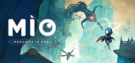
Play as android MIO in this mesmerizing metroidvania where you explore the Vessel, an enormous technological ark overgrown with machines gone rogue. Uncover its secrets, enhance MIO's abilities, and save the spaceship and its residents from oblivion.

$14.99Very Positive(310)
MetroidvaniaExplorationPlatformer
Douze DixièmesJan 20, 2026

MIO: Memories in Orbit scores 68/100 — better than 19% of Metroidvania capsules (n=370).

Very Positive (310 reviews) · $14.99 · Released Jan 20, 2026 · By Douze Dixièmes

Quick text summary

MIO: Memories in Orbit scored 68/100 on Steam Analyzer — Solid for a Metroidvania capsule. Top priority fix: [genre_clarity] Add a visible gameplay silhouette cue, such as a running or combat pose for MIO at larger scale, or a platform structure in the background layer, to communicate metroidvania action at small size.

Capsule scores by dimension

  • Genre Clarity: 5/10 — Sci-fi tone, genre ambiguous. The large glowing portal or lens structure and a small figure suggest a sci-fi or space-themed adventure, which loosely aligns with a metroidvania, but at tiny size the figure nearly disappears and the dominant image reads more like a puzzle or walking sim than an action-metroidvania. The orbital mechanical ring is atmospheric but does not communicate combat, platforming, or exploration loops clearly. At tiny size, genre is essentially unreadable beyond 'sci-fi game.'
  • Title Readability: 7/10 — Bold logo reads at small size. The MIO logotype is large, white, bold, and set against the dark left portion of the image, giving strong contrast and legibility at full and small sizes. The subtitle 'MEMORIES IN ORBIT' uses a smaller serif-adjacent decorative font with diamond flanks that becomes unreadable at tiny size. At tiny size only 'MIO' survives, which is acceptable as a brand mark but loses the full title context.
  • Contrast & Color: 7/10 — Warm glow pops on dark background. The warm orange glowing portal center creates a strong value contrast against the dark steel-blue mechanical ring and the overall dark background, which complements Steam's #1b2838 dark UI well. The white MIO logo on the dark left half has clean separation. However the small central figure blends into the glow at tiny size and the mid-blue ring tones merge slightly with the Steam background in grayscale. Silhouette clarity at tiny size is moderate rather than strong.
  • Uniqueness & Polish: 7/10 — Polished indie craft, atmospheric hook. The illustration has a distinctive hand-painted cel-shaded quality with clean line work visible on the mechanical ring, and the warm-cool color contrast between the glowing portal and the teal-blue machinery is appealing and coherent. The MIO logotype with the eye glyph replacing the O is a clever identity touch. However, compared to top-tier genre capsules like COCOON or ANIMAL WELL which have more immediately iconic or arresting central imagery, this reads as polished but not visually surprising or genre-defining in its hook.
  • Brand Consistency: 8/10 — Strong identity with eye motif logo. The eye integrated into the MIO logotype is a memorable and consistent identity anchor that ties the character concept of an android to the visual brand cleanly. The warm-orange-on-cool-blue palette and the cel-shaded illustration style feel coherent and would translate well across screenshots and UI assets. The subtitle framing with diamond decorators reinforces a consistent sci-fi aesthetic treatment. The overall visual identity feels intentional and recognizable.
  • Composition: 7/10 — Clear split layout, figure too small. The composition uses a clean left-right split with the logo anchored in the dark upper-left and the mechanical portal dominating the right two-thirds, which creates readable hierarchy at full size. The small figure at the center of the portal is an effective storytelling element at full size but essentially vanishes at small and tiny sizes, leaving the composition dependent entirely on the mechanical structure and glow. The ring extends close to the top and right edges which could feel tight at cropped sizes. At small size the composition still reads but the human-scale narrative element is lost.

What works

  • Bold MIO logotype with eye motif. The large white logo with the eye-as-O glyph reads clearly at small size and doubles as a memorable brand symbol.
  • Warm-cool color contrast. The orange glowing portal against the teal-blue mechanical ring creates immediate visual warmth that pulls the eye even in a quick scroll.
  • Polished cel-shaded illustration style. Clean line work and hand-painted quality elevate the capsule above generic indie asset presentations.
  • Dark left zone supports title legibility. Placing the logo over the uncluttered dark region gives maximum contrast without needing outlines or drop shadows.

What hurts the capsule

  • Central figure disappears at tiny size. The small android silhouette inside the portal, which carries the human-scale storytelling, is completely lost below small capsule dimensions.
  • Genre signals are ambiguous. Nothing in the image communicates platforming, combat, or metroidvania exploration loops, making the genre unclear to a new viewer at any size.
  • Subtitle unreadable at small and tiny sizes. 'MEMORIES IN ORBIT' in the smaller decorative font collapses entirely below small capsule size, leaving genre and subtitle meaning lost.
  • Ring structure clips toward top and right edges. The mechanical ring extends close to the frame edges, risking crop loss on the visual anchor element at certain Steam display contexts.

Priority fixes

  1. [genre_clarity] Add a visible gameplay silhouette cue, such as a running or combat pose for MIO at larger scale, or a platform structure in the background layer, to communicate metroidvania action at small size.
  2. [title_readability] Increase the subtitle 'MEMORIES IN ORBIT' to a larger point size or simplify it to two words maximum so it remains legible at small capsule size.
  3. [composition] Scale up the android figure inside the portal or place a secondary figure element in the foreground to ensure human-scale storytelling survives at tiny size.
  4. [contrast_color] Strengthen the silhouette edge of the mechanical ring against the background by adding a subtle dark outer glow or vignette so it separates cleanly from the Steam dark UI in grayscale.

Store copy priority fixes

  1. [feature_communication] Clarify the difficulty curve explicitly: e.g., 'Master increasingly complex boss patterns—each with distinct attack rhythms you must learn' to reinforce that challenge is core, not secondary to exploration.
  2. [uniqueness] Add a specific mechanical differentiator: e.g., 'Repair and team up with damaged robots to unlock new pathways and environmental interactions no other metroidvania offers' to strengthen what makes MIO distinct.
  3. [audience_targeting] Open the detailed description with 'If you crave exploration-driven metroidvanias with challenging boss battles and rich world lore...' to signal who this game is made for before diving into atmosphere.
  4. [hook_strength] Tighten the short description further by replacing 'save the spaceship and its residents' with a more specific emotional goal like 'uncover why the Vessel fell silent and restore its lost consciousness' for stronger narrative pull.

Related guides

Steam app ID: 1672810 · Tags: Metroidvania, Exploration, Platformer, Atmospheric, Singleplayer