Scoring genre clarity...

Lightyear Frontier capsule

Lightyear Frontier

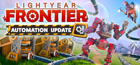
In Lightyear Frontier you use your powerful trusty mech to farm on a large beautiful alien planet. Settle your homestead, farm and deliver produce to remote colonies, gather and manage resources, build, craft, explore, expand, improve your mech, meet neighbors, and make a place to call your own.

$14.99Very Positive(64)
Early AccessBase BuildingCrafting
FRAME BREAKMar 19, 2024

Lightyear Frontier scores 75/100 — better than 68% of Steam capsules we've analysed (n=22,658).

Very Positive (64 reviews) · $14.99 · Released Mar 19, 2024 · By FRAME BREAK

Quick text summary

Lightyear Frontier scored 75/100 on Steam Analyzer — Good for a Steam capsule. Top priority fix: [title_readability] Add a subtle dark shadow or semi-transparent backing behind LIGHTYEAR to improve its contrast and ensure the full logo reads at tiny size.

Capsule scores by dimension

  • Genre Clarity: 8/10 — Mech farming planet clearly implied. The large red mech character standing over a pastoral alien landscape with visible farm plots in the background communicates a farming or settlement game with sci-fi mech elements clearly even at small sizes. The colorful alien world and cultivated fields below reinforce the peaceful exploration-farming tone rather than combat. At tiny size the mech silhouette dominates and still reads as a non-violent sci-fi game, though the farming subgenre nuance fades slightly.
  • Title Readability: 8/10 — Bold title reads well at most sizes. LIGHTYEAR in white and FRONTIER in bold red with a clean drop shadow reads confidently at full and small sizes, with good contrast against the light sky background. The two-line stacked layout and size differential between LIGHTYEAR and FRONTIER create a clear hierarchy that holds up. At tiny size LIGHTYEAR becomes harder to parse due to thinner letterforms, but FRONTIER in large red block type remains legible and carries the identity.
  • Contrast & Color: 7/10 — Warm palette pops against Steam dark. The warm pink-purple sky gradient and the vivid red mech create strong color contrast against Steam's dark #1b2838 background, helping the capsule pop in a browsing context. The mech's red tones and the bright alien sky provide enough saturation and value difference to read cleanly in grayscale. However, the mid-range luminosity of the background landscape slightly softens silhouette separation at tiny size, reducing crispness.
  • Uniqueness & Polish: 7/10 — Charming and distinct mech farmer hook. The combination of a large red construction mech overlooking a quaint alien farm is a genuinely distinctive and memorable visual hook that communicates the game's unique selling point directly. The art is polished with good lighting, detailed mech design, and a cohesive painterly environment style. It avoids genre clichés but sits just short of excellent because the overall composition feels familiar in its hero-pose-over-landscape layout common in indie capsules.
  • Brand Consistency: 8/10 — Cohesive identity with strong mech motif. The red mech serves as a strong recurring identity anchor that likely appears consistently across screenshots and promotional material, making it a memorable brand symbol. The warm alien-world color palette, painterly art direction, and clean logotype all feel intentionally coordinated. The red-white-pink palette is internally consistent and the logo treatment with the flame/spark motif on FRONTIER reinforces the sci-fi farming brand without feeling generic.
  • Composition: 7/10 — Strong hero left, title right balance. The mech is placed on the left third with the title occupying the upper right, creating a natural left-to-right reading flow with good negative sky space for the logo. The farm vista in the lower middle provides depth and context without cluttering the focal areas. At small and tiny sizes the mech's silhouette and the FRONTIER text still hold as the two primary reads, though the lower landscape detail becomes noise and the composition feels slightly crowded at the smallest crop.

What works

  • Distinctive mech-farming visual hook. The red mech overlooking alien farm plots communicates the game's unique premise at a glance, which is rare and memorable in the farming genre.
  • Strong contrast against Steam dark background. The warm pink sky and saturated red mech pop cleanly against Steam's dark navy interface, aiding discoverability during quick scrolling.
  • Bold FRONTIER logotype holds at small size. The large red block lettering of FRONTIER remains legible even at tiny thumbnail sizes, anchoring brand recognition.
  • Clear depth layering creates visual richness. Foreground mech, midground farmland, and background alien horizon create a convincing sense of world scale without cluttering the primary read.

What hurts the capsule

  • LIGHTYEAR text fades at tiny size. The thinner white uppercase LIGHTYEAR loses contrast against the bright sky at very small sizes, reducing the full logo read to just FRONTIER.
  • Landscape mid-tones soften mech silhouette edge. The mech's lower body merges slightly with the similarly valued green-brown landscape at small sizes, reducing crisp silhouette separation.
  • Hero pose layout is compositionally familiar. The single-character hero pose in the lower left with title upper right is a very common indie capsule formula, limiting distinctiveness at the composition level.
  • Farm detail lost at tiny size. The key farming context visible in the background plot fields completely disappears at thumbnail size, relying solely on the mech to carry genre messaging.

Priority fixes

  1. [title_readability] Add a subtle dark shadow or semi-transparent backing behind LIGHTYEAR to improve its contrast and ensure the full logo reads at tiny size.
  2. [contrast_color] Increase the value contrast between the mech's lower body and the landscape below it, using a darker ground plane or vignette to sharpen the silhouette edge at small sizes.
  3. [genre_clarity] Consider adding a small visual cue near the mech — such as a crop tool or tiny farm element in its grasp — to reinforce the farming subgenre at tiny size when background detail is lost.
  4. [uniqueness_polish] Introduce a subtle but distinctive brand motif or texture into the logo treatment to elevate it beyond a standard bold-type title and increase shelf appeal.

Store copy priority fixes

  1. [feature_communication] Expand the resource delivery and colony trade system: specify whether these unlock new crops, machinery, or cosmetics, and clarify their role in progression and end-game loops.
  2. [uniqueness] Explain the mech customization payoff: detail how craft parts and mod chips alter farming speed, exploration ability, or resource gathering, to differentiate from standard farming sims.
  3. [feature_communication] Replace 'Overcome its environmental challenges' with a concrete example (e.g., 'adapt to toxic dust storms and bioluminescent predators') to clarify whether survival is a core loop.
  4. [feature_communication] Remove or populate the 'Roadmap' heading to signal a complete, polished store page and reinforce active development confidence.

Related guides

Steam app ID: 1677110