Scoring genre clarity...

CULTIC capsule

CULTIC

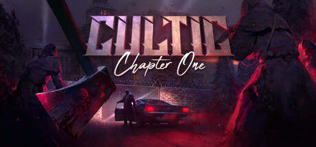
Death is only the beginning. Crawl from your grave and gear up to fight your way through the ranks of a mysterious and twisted cult. You, your guns, and your dynamite will have to shoot, slide, blast, duck, dodge, and maybe throw a gib or two to survive in this old-school-inspired shooter.

$7.49Overwhelmingly Positive(43)
Boomer ShooterFPSShooter
Jasozz GamesOct 13, 2022

CULTIC scores 70/100 — better than 30% of Steam capsules we've analysed (n=22,658).

Overwhelmingly Positive (43 reviews) · $7.49 · Released Oct 13, 2022 · By Jasozz Games

Quick text summary

CULTIC scored 70/100 on Steam Analyzer — Good for a Steam capsule. Top priority fix: [title_readability] Increase the size and weight of 'Chapter One' or replace the script font with a more legible serif or display typeface so it reads at tiny size.

Capsule scores by dimension

  • Genre Clarity: 7/10 — Retro shooter cult horror vibes. The two looming robed cult figures flanking the scene, combined with the lone protagonist by a car and ominous red-lit environment, strongly suggest a horror-action or cult-themed shooter. The old-school aesthetic and atmospheric staging communicate action-horror reasonably well. At tiny size the silhouettes of the flanking figures and the lone protagonist still suggest a dangerous confrontational scenario, though the specific retro-shooter subgenre is harder to pin down without context.
  • Title Readability: 7/10 — Bold title, subtitle struggles small. The CULTIC logo uses large, bold, distressed lettering with good contrast against the dark background and reads clearly at full and small sizes. The 'Chapter One' cursive subtitle beneath adds charm but becomes unreadable at tiny size due to its script font and smaller scale. The title placement in the upper-center on a relatively controlled dark background helps legibility, though the distressed texture on the letters slightly reduces crispness at very small sizes.
  • Contrast & Color: 7/10 — Strong red atmosphere, dark scene. The deep crimson and magenta atmospheric lighting creates a distinctive mood and separates the image from Steam's dark navy background reasonably well. The central protagonist silhouette against the lighter mist and car provides decent focal contrast. In grayscale the flanking cult figures blend somewhat into the dark edges, and the overall mid-to-dark value range means the image doesn't pop aggressively at tiny size, but the red glow provides enough differentiation from #1b2838.
  • Uniqueness & Polish: 7/10 — Atmospheric indie with clear craft. The composition communicates a genuine sense of atmosphere and dread — the towering cult figures, the lone figure, and the moody red lighting give it a distinctive low-budget horror-thriller feel that suits the game's identity. The craft is solid for an indie title and avoids looking like a generic asset flip. However, compared to top-tier capsules in the action genre benchmark, it lacks a truly iconic or singular visual hook that would make it immediately unforgettable at tiny size.
  • Brand Consistency: 7/10 — Cohesive cult horror identity. The color palette of deep reds, muted greens, and shadowy darks feels internally consistent and would translate well to screenshots. The distressed logo style, the robed cult imagery, and the gritty retro atmosphere create a recognizable identity that matches the old-school shooter description. The 'Chapter One' subtitle reinforces episodic branding, though the signature visual motif of the cult figures and the lone hero could be made even more iconic for repeat recognition.
  • Composition: 7/10 — Centered hierarchy with depth layers. The composition uses a clear foreground-midground-background layering: robed figures on the edges frame the central protagonist and car in the midground, with misty architecture in the background. The title sits prominently at top-center on a controlled dark area. At small size the two flanking figures create natural framing that draws the eye inward to the protagonist, though at tiny size the subject hierarchy becomes compressed and the central figure nearly disappears. The safe margins look adequate and the title doesn't hug any edges dangerously.

What works

  • Atmospheric red lighting. The deep crimson glow creates a distinctive mood that differentiates the capsule from Steam's dark background and signals horror-action tone immediately.
  • Framing with cult figures. The two looming robed figures on either side create natural compositional framing that draws the eye to the central protagonist and reinforces the cult antagonist theme.
  • Bold, readable main title. CULTIC in large distressed capitals reads clearly at full and small sizes and sits on a well-controlled dark area of the image.
  • Clear genre storytelling. The lone hero versus imposing robed figures communicates a dangerous confrontational scenario consistent with the action-horror cult shooter description.

What hurts the capsule

  • Subtitle illegible at tiny size. The cursive 'Chapter One' script becomes completely unreadable at approximately 120x45 pixels, wasting a key branding element.
  • Central protagonist too small. The lone protagonist figure is small relative to the overall canvas and nearly disappears at tiny size, weakening the personal hero identification.
  • Dark flanking figures merge into edges. In grayscale the robed figures on the left and right edges blend into the dark border, reducing their silhouette clarity at small viewing sizes.
  • Lacks singular iconic visual hook. Compared to benchmark titles, there is no single instantly memorable visual element or character that creates strong brand recall at a glance.

Priority fixes

  1. [title_readability] Increase the size and weight of 'Chapter One' or replace the script font with a more legible serif or display typeface so it reads at tiny size.
  2. [composition] Scale up or reposition the central protagonist figure so it reads as a clear silhouette at 120x45, perhaps placing it more prominently in the midground with higher contrast lighting.
  3. [contrast_color] Boost the value separation on the flanking cult figure silhouettes by adding a subtle rim light or edge highlight so they remain legible in grayscale at small sizes.
  4. [uniqueness_polish] Introduce one singular iconic visual element — such as a stylized cult symbol, dynamic action pose, or distinctive prop — that makes the capsule instantly recognizable and memorable in a crowded genre shelf.

Store copy priority fixes

  1. [uniqueness] Expand the cult theme description in the opening paragraph—add 1-2 sentences explaining how the cult aesthetic, lore, or enemy design differentiate this from other boomer shooters.
  2. [feature_communication] Replace 'physics, lighting, and fully 3D game world' with a gameplay-specific modern feature (e.g., 'dynamic destructible environments,' 'real-time physics for trap placement,' or 'advanced AI enemy reactions') that meaningfully impacts player tactics.
  3. [hook_strength] Reinforce the cult narrative in the short description by adding a secondary hook after the combat verb list (e.g., 'Uncover the mysteries of the entity pulling the cult's strings' or similar lore teaser).

Related guides

Steam app ID: 1684930