Scoring genre clarity...

Who's Lila? capsule

Who's Lila?

A reverse-detective adventure, where you control your character's face

$4.79Overwhelmingly Positive(59)
HorrorPsychological HorrorChoose Your Own Adventure
Garage HeathenFeb 23, 2022

Who's Lila? scores 60/100 — better than 0% of Horror capsules (n=3,252).

Overwhelmingly Positive (59 reviews) · $4.79 · Released Feb 23, 2022 · By Garage Heathen

Quick text summary

Who's Lila? scored 60/100 on Steam Analyzer — Solid for a Horror capsule. Top priority fix: [genre_clarity] Add subtle visual cue to the portrait or border that hints at the face-control mechanic—e.g., overlaid facial feature sliders, split/reassembled face, or UI-like elements suggesting character customization.

Capsule scores by dimension

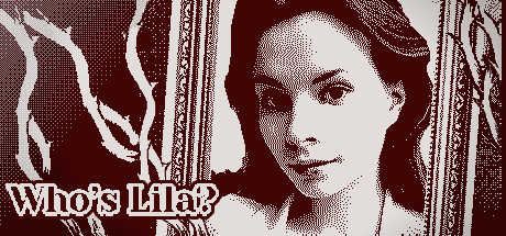
  • Genre Clarity: 5/10 — Unclear genre, strong mystery vibe. The halftone portrait and 'Who's Lila?' text communicate mystery and narrative intrigue, but do not clearly signal adventure, RPG, or casual gameplay at any size. The face-focused imagery hints at character-driven storytelling but gives no visual cues about the reverse-detective or face-control mechanics that define the game. At tiny size, it reads as a portrait mystery rather than an interactive adventure with clear mechanical identity.
  • Title Readability: 7/10 — Strong readability, intriguing hook. The title 'Who's Lila?' is rendered in clean, bold serif lettering with strong white-to-dark contrast that holds at small and tiny sizes. Placement in the lower-left quadrant avoids the busy portrait area and ensures consistent visibility across scales. The tagline is minimal and the layout supports quick recognition, though the question mark creates intentional mystery rather than clarity about what the player will do.
  • Contrast & Color: 7/10 — High contrast halftone, clean separation. The portrait uses halftone dot patterns in cream and dark burgundy-maroon tones that separate clearly from the Steam background #1b2838. The lighter face and decorative border elements pop against the dark field with strong value separation visible at all sizes. The monochromatic treatment avoids color noise and ensures the silhouette remains clear even at tiny size, though the intricate halftone detail softens slightly when squinting.
  • Uniqueness & Polish: 6/10 — Distinctive halftone style, generic composition. The halftone portrait technique is visually striking and stands apart from typical indie adventure capsules, giving it a vintage print or noir aesthetic. However, the composition is a straightforward portrait centered with decorative frame borders—a common template approach without visible storytelling about the unique face-control mechanic. The craft is clean but the concept does not communicate what makes this game mechanically distinct or offer a hook beyond 'who is this character.'
  • Brand Consistency: 5/10 — Coherent style, no recognizable icon. The halftone aesthetic and serif typography are internally consistent and create a unified visual identity, suggesting art-house indie game production. However, there is no memorable character motif, color palette, or symbolic element that would allow recognition of 'Who's Lila?' in a crowded storefront or series of thumbnails. The portrait-and-mystery framing is thematic but not distinctive enough to serve as a brand anchor across marketing materials.
  • Composition: 6/10 — Centered portrait, safe margins preserved. The halftone portrait is centered with a decorative frame border and title anchored bottom-left, creating balance and protecting key elements from Steam's edge cropping. The focal point is clear and singular at all sizes, with the face drawing primary attention. However, the layout is symmetrical and reserved, offering no depth layering or dynamic visual storytelling—it functions competently but feels static and relies entirely on the portrait's inherent interest rather than compositional craft to engage at quick-scroll speeds.

What works

  • Strong title contrast and placement. White serif lettering in lower-left corner maintains legibility at small and tiny sizes while keeping the portrait uncluttered.
  • Halftone technique stands out visually. The vintage portrait style and dot-pattern rendering create a distinctive look that differentiates the capsule from typical indie adventure designs.
  • Clean value separation from background. Cream and dark burgundy tones provide high contrast against Steam's dark interface, ensuring the portrait reads clearly even at thumbnail size.

What hurts the capsule

  • No clear genre or mechanic signals. The portrait-based design communicates mystery and character focus but gives no visual hints about adventure, RPG, casual play, or the unique face-control mechanic.
  • Generic centered portrait composition. The symmetrical layout with decorative frame is a template approach that lacks dynamic hierarchy or visual storytelling about what makes this game unique.
  • No recognizable brand identity or icon. While the halftone style is coherent, there is no memorable character, symbol, or palette element that would make the game instantly recognizable across thumbnails and marketing.
  • Halftone detail loss at tiny sizes. The intricate dot patterns soften when viewing at 120×45 or squinting, reducing the visual impact that makes the design distinctive at full size.

Priority fixes

  1. [genre_clarity] Add subtle visual cue to the portrait or border that hints at the face-control mechanic—e.g., overlaid facial feature sliders, split/reassembled face, or UI-like elements suggesting character customization.
  2. [uniqueness_polish] Introduce a compositional layer or secondary element that conveys the reverse-detective narrative hook—e.g., magnifying glass, clues, or fragmented portrait suggesting investigation.
  3. [brand_consistency] Develop a signature color accent or symbolic motif (beyond the portrait itself) that could anchor the brand across capsule, header, and promotional imagery for consistent recognition.

Store copy priority fixes

  1. [feature_communication] Replace 'And more..' with one or two specific features (e.g., 'Multiple narrative branching paths' or 'Interactive puzzle solving elements') to reinforce completeness and polish.
  2. [audience_targeting] Add a sentence specifying the target audience and replay value: 'Perfect for choice-driven narrative enthusiasts and players seeking branching mystery stories with high replayability.' or clarify accessibility around facial recognition.
  3. [tone_match] Rewrite the neural network explanation to match the surreal, artistic tone: 'Your facial expressions guide the narrative in real-time—smile, frown, or betray nothing as the AI interprets your emotions' instead of the technical framing.

Related guides

Steam app ID: 1697700 · Tags: Horror, Psychological Horror, Choose Your Own Adventure, Detective, Point & Click