Scoring genre clarity...

Teslagrad 2 capsule

Teslagrad 2

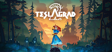
Lumina, a young Teslamancer, finds herself stranded after her airship crash lands in Wyrmheim, a remote and treacherous land to the North. Embark on a dangerous adventure, exploring a gigantic, abandoned tower looming over a fjordside valley, on a quest to get Lumina home and back to her family.

$1.99Mostly Positive(408)
AdventurePuzzleAction
Rain GamesApr 19, 2023

Teslagrad 2 scores 75/100 — better than 68% of Steam capsules we've analysed (n=22,658).

Mostly Positive (408 reviews) · $1.99 · Released Apr 19, 2023 · By Rain Games

Quick text summary

Teslagrad 2 scored 75/100 on Steam Analyzer — Good for a Steam capsule. Top priority fix: [title_readability] Increase the size and weight of the decorative crown symbol above the logo so it remains a recognizable brand mark at tiny thumbnail size.

Capsule scores by dimension

  • Genre Clarity: 7/10 — Action adventure platformer implied. The central character Lumina standing on a ruin with a glowing magical staff, surrounded by shadowy enemies and a looming castle in the background, clearly signals action-adventure with platformer and exploration elements. The fantastical Norse-inspired environment and magical blue energy effects reinforce the indie adventure genre. At tiny size the silhouette of a small hero against a large moody world still reads as exploration or platformer, though the specific electromagnetic magic mechanic is not immediately obvious.
  • Title Readability: 7/10 — Clean logo reads at small size. The TESLAGRAD title uses a clean, stylized white font with a distinctive decorative symbol above it, placed against the warm orange sky gradient which provides good contrast. At full size the lettering is crisp and well-spaced with readable letterforms. At tiny size the word TESLAGRAD compresses but remains legible as the white against the warm background still holds contrast, though the decorative crown-like symbol above becomes indistinct.
  • Contrast & Color: 8/10 — Warm orange sky anchors strong contrast. The warm amber-orange sunset gradient in the center creates excellent value separation against the dark silhouetted trees and shadowy enemy figures flanking the edges. Lumina's bright blue dress and the cyan bioluminescent foreground glow provide a vivid complementary contrast to the warm tones, making her pop clearly as the focal subject. In grayscale the central character retains strong separation from both the lighter sky behind and the darker foreground ruins below.
  • Uniqueness & Polish: 7/10 — Polished indie painterly style. The hand-painted style with layered depth, distinctive silhouetted enemy figures, and the glowing electromagnetic energy effects give the capsule a premium indie feel above typical template work. The composition has a cinematic storybook quality with strong color storytelling. However compared to top-performing benchmarks like Hades II or Sea of Stars it lacks a truly singular hook or unexpected visual idea that would make it stand out in a crowded scroll, feeling competent rather than iconic.
  • Brand Consistency: 8/10 — Cohesive Norse magic identity. The blue-dressed young heroine, cyan electromagnetic glow effects, and Norse-inspired dark fantasy environment create a recognizable and internally cohesive visual identity that aligns well with a Teslagrad sequel. The stylized logo symbol above the title acts as a recognizable brand mark. The color palette of warm orange sky against cool blue magic is a distinctive signature combination that could be recognized across marketing materials.
  • Composition: 8/10 — Strong hero-centered depth layering. The composition uses excellent three-layer depth with glowing foreground ruins, the central elevated character as midground focal point, and the castle-mountain backdrop providing scale. Lumina is placed just above center with slight breathing room creating a strong primary focal point, and the flanking dark enemy silhouettes frame her without competing. At small size the single bright character against the warm sky reads cleanly, though at tiny size the foreground cyan glow can slightly compete with the character for attention.

What works

  • Strong complementary color contrast. The warm orange sky against Lumina's cool blue dress creates an immediately eye-catching chromatic contrast that draws attention to the focal character at any size.
  • Clear hero silhouette with implied scale. Lumina's small figure elevated on a ruin against the vast backdrop effectively communicates the exploration scope of the game in a single glance.
  • Readable title placement on clean background region. The TESLAGRAD logo sits on the clear orange sky area, avoiding noisy texture and maintaining strong contrast for legibility at small sizes.
  • Layered depth creates cinematic quality. The foreground, midground, and background layers give the image a painterly depth that elevates it above generic single-plane capsule compositions.

What hurts the capsule

  • Tiny size loses the decorative logo mark. The distinctive crown-like symbol above the title becomes an unreadable blur at tiny thumbnail size, reducing brand distinctiveness at the smallest viewing condition.
  • Foreground glow competes at tiny size. The bright cyan bioluminescent energy in the lower foreground draws the eye away from Lumina at very small sizes, creating a split focal point.
  • Genre specificity could be stronger. While action-adventure reads clearly, the electromagnetic or teslamancer mechanic that differentiates this game from generic fantasy adventures is not visually communicated.
  • Shadowy enemy figures lack presence. The flanking enemy silhouettes are too dark and indistinct at small size to convey meaningful threat or add genre-specific storytelling value.

Priority fixes

  1. [title_readability] Increase the size and weight of the decorative crown symbol above the logo so it remains a recognizable brand mark at tiny thumbnail size.
  2. [genre_clarity] Introduce a subtle but visible electromagnetic or magnetic visual effect on Lumina or the staff to communicate the unique teslamancer mechanic that differentiates the game.
  3. [contrast_color] Slightly darken or reduce the saturation of the foreground cyan glow elements so they do not compete with Lumina as the primary focal point at tiny size.
  4. [uniqueness_polish] Consider increasing the silhouette contrast and distinctiveness of at least one enemy figure to add narrative tension and genre specificity that competes with top-performing indie benchmarks.

Store copy priority fixes

  1. [hook_strength] Rewrite the short description opening to lead with the electromagnetic power mechanic and puzzle-solving gameplay before the narrative setup—e.g., 'Harness electromagnetic powers to survive a treacherous Norse tower after your airship crashes in Wyrmheim.'
  2. [audience_targeting] Add a sentence explicitly identifying the core audience—e.g., 'Perfect for players who love Metroidvania exploration and physics-based puzzle-solving' or 'Whether you're a platformer veteran or discovering the genre, master Lumina's electromagnetic abilities to progress.'
  3. [uniqueness] Expand the 'Scandivania' explanation with a concrete example of how the Norse setting or theme changes the gameplay loop compared to standard Metroidvanias—e.g., how Nordic mythology enemies or magnetic Nordic architecture uniquely challenge the player.

Related guides

Steam app ID: 1698220