Scoring genre clarity...

KLETKA capsule

KLETKA

KLETKA is a co-op (up to 6 players) horror game about going down in an elevator that is trying to eat you. Feed the elevator, explore deadly floors and descend deeper.

$5.49Very Positive(198)
HorrorCo-opOnline Co-Op
Callback, ln404Feb 19, 2026

KLETKA scores 68/100 — better than 19% of Steam capsules we've analysed (n=22,658).

Very Positive (198 reviews) · $5.49 · Released Feb 19, 2026 · By Callback

Quick text summary

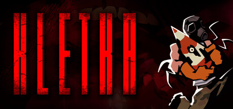
KLETKA scored 68/100 on Steam Analyzer — Solid for a Steam capsule. Top priority fix: [contrast_color] Add a thin light or white outline or drop shadow to the KLETKA letterforms to separate them from the red background texture at tiny size.

Capsule scores by dimension

  • Genre Clarity: 7/10 — Horror indie game, genre readable. The dark red palette, gas-masked creature with clawed hands, and gritty texture strongly imply horror. The stylized illustrated creature on the right gives an indie feel, and the combination reads as survival horror or creature-feature horror at small size. At tiny size the masked creature silhouette still implies danger and horror genre, though the co-op or elevator mechanic is not communicated visually.
  • Title Readability: 7/10 — Bold logo reads at most sizes. The title KLETKA is rendered in large, bold red block letters with a cracked or distressed texture, centrally placed against a dark background. At full size the letterforms are clear and distinctive. At tiny size the word collapses somewhat due to the internal texture detail within the letters, but the overall shape and word length remain identifiable thanks to strong size and value contrast against the dark backdrop.
  • Contrast & Color: 7/10 — Strong red on dark, good separation. The deep crimson background and bright red logo create a cohesive but slightly low-contrast pairing since they share similar hue. The illustrated creature on the right has warm orange-brown tones that separate from the dark background reasonably well, with claw highlights providing edge definition. In grayscale the creature and title both hold their own against the dark background, though the red-on-red logo texture reduces internal letter contrast at tiny size.
  • Uniqueness & Polish: 7/10 — Distinctive illustrated creature, indie charm. The flat illustrated style of the gas-masked creature is a memorable and distinctive choice that differentiates it from photorealistic horror capsules. The distressed red environment texture and cracked title lettering create a cohesive gritty aesthetic. However, the composition feels slightly templated with the character pushed to the right corner and the large text centered, which is a common indie capsule layout, keeping polish from reaching the top tier.
  • Brand Consistency: 7/10 — Cohesive dark horror identity. The red and dark palette, illustrated creature art style, and distressed typography all point to a consistent internal visual identity. The gas mask and claws serve as a recognizable character motif that could anchor brand recognition across assets. There are no jarring inconsistencies in rendering style, and the creature illustration feels like it belongs to the same world as the title treatment.
  • Composition: 6/10 — Workable but slightly imbalanced layout. The large centered title dominates the left two-thirds of the image while the creature occupies the right third, creating a functional but somewhat static two-part split. The creature is partially cropped at the right edge, which risks losing detail under Steam cropping. At small size the title and character still coexist legibly, but the composition lacks a strong foreground-midground-background depth hierarchy that would add visual punch and help it compete against more dynamically composed capsules.

What works

  • Distinctive illustrated creature. The gas-masked, clawed character in a flat illustration style is immediately recognizable and genre-appropriate, standing out from photorealistic horror peers.
  • Strong title size and placement. The KLETKA logo is large enough to remain readable at small capsule size and benefits from a relatively dark, controlled background behind it.
  • Cohesive color palette. The monochromatic red-and-dark scheme creates a unified horror atmosphere with no jarring off-palette elements.
  • Horror genre mood is clear. Even at tiny size the combination of dark tones, creature silhouette, and distressed aesthetic signals horror to a browsing viewer.

What hurts the capsule

  • Red logo on red background reduces contrast. The distressed texture inside the letterforms merges with the similarly toned background at tiny size, softening the title's punch.
  • Creature partially cropped at edge. The right side of the character is clipped near the image boundary, risking important detail loss under Steam capsule cropping.
  • Elevator mechanic not communicated. The game's unique hook of an eating elevator is entirely absent from the visual, making it read as generic creature horror rather than something more distinct.
  • Flat depth, no layering. The composition lacks a clear background, midground, and foreground separation, making the image feel like a flat two-element layout rather than a world with depth.

Priority fixes

  1. [contrast_color] Add a thin light or white outline or drop shadow to the KLETKA letterforms to separate them from the red background texture at tiny size.
  2. [composition] Pull the creature slightly inward from the right edge and introduce a subtle depth layer such as a floor, doorway, or elevator shaft silhouette to add visual hierarchy.
  3. [genre_clarity] Incorporate a subtle visual reference to the elevator concept such as descending lines, shaft walls, or floor indicator numbers to communicate the game's unique mechanic.
  4. [uniqueness_polish] Add a stronger focal lighting effect behind or around the creature to create a sense of dramatic emergence that competes with top-tier horror capsules.

Store copy priority fixes

  1. [feature_communication] Add a sentence explaining the core feeding mechanic: what resources feed the elevator, how often, and what the consequence of starvation is mechanically.
  2. [feature_communication] Include explicit mention of procedural generation, run-based progression, or floor variety to clarify the roguelike loop and replayability structure.
  3. [feature_communication] Add one sentence detailing what players do during exploration: scavenging fuel, finding resources, uncovering anomalies, or solving floor-specific challenges.

Related guides

Steam app ID: 1699480