Scoring genre clarity...

Starfield capsule

Starfield

Starfield is the first new universe in 25 years from Bethesda Game Studios, the award-winning creators of The Elder Scrolls V: Skyrim and Fallout 4.

$39.99Mixed(474)
SpaceOpen WorldSingleplayer
Bethesda Game StudiosSep 5, 2023

Starfield scores 80/100 — better than 89% of Space capsules (n=1,305).

Mixed (474 reviews) · $39.99 · Released Sep 5, 2023 · By Bethesda Game Studios

Quick text summary

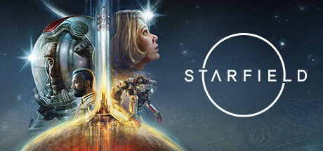
Starfield scored 80/100 on Steam Analyzer — Good for a Space capsule. Top priority fix: [contrast_color] Darken or add a subtle vignette behind the central female character to improve her silhouette separation from the background at small sizes.

Capsule scores by dimension

  • Genre Clarity: 7/10 — Sci-fi space RPG implied. The astronaut helmet, rocket launch, space setting, and armored characters clearly communicate a science fiction universe. At small size, the space theme reads immediately, though the RPG subgenre is harder to distinguish from a pure action shooter. At tiny size, the glowing rocket and helmet silhouettes still hint at sci-fi exploration rather than combat, which leans toward the RPG feel.
  • Title Readability: 8/10 — Clean minimal logo reads well. The STARFIELD wordmark in clean, spaced white capitals sits on the right half against a relatively dark star field background, giving strong contrast. The circle motif behind the text is a nice brand mark but adds minimal noise. At small size the title remains legible; at tiny size the letterforms compress but the word is still parseable due to the high contrast and simple sans-serif font. The dot in the 'I' replaced by a star is a subtle detail lost at tiny size but does not hurt overall readability.
  • Contrast & Color: 8/10 — Strong warm-cool contrast separation. The warm golden-orange rocket glow at center creates a strong contrast against the cool dark blue-black space background, producing excellent value separation against Steam's #1b2838 dark UI. Character faces and helmets are lit dramatically and separate well from the background. In a grayscale mental test, the central light source remains the dominant focal element and silhouettes hold, though the female character's lighter face blends slightly into the mid-value background at tiny size.
  • Uniqueness & Polish: 8/10 — Premium Bethesda production quality. The multi-character composite artwork feels polished and cinematic, consistent with AAA Bethesda presentation. The rocket launch as a central motif between the characters is a clever visual storytelling element that implies scale and exploration. It avoids being a generic 'hero stares into distance' capsule, though the overall composition style of layered character faces is a common triple-A RPG convention seen in Diablo IV and similar titles, which limits its uniqueness ceiling.
  • Brand Consistency: 9/10 — Cohesive identity with strong motif. The circle symbol, clean spaced typography, dark space palette, and warm golden accent are a coherent visual identity that carries through Bethesda's Starfield marketing. The combination of the circle logo mark and the STARFIELD wordmark creates a recognizable brand unit. The art style, lighting, and color treatment feel internally unified with no clashing elements, establishing a distinctive identity that would be recognizable across multiple touchpoints.
  • Composition: 8/10 — Balanced split composition with clear focal point. The design is split horizontally with characters occupying the left two-thirds and the logo on the right third, creating clear visual zones. The rocket launch at the center-bottom acts as the unifying focal anchor with the warm glow drawing the eye inward. At small size the character cluster and logo remain distinct; at tiny size the logo side feels slightly under-utilized as the circle mark loses definition, but the character mass still communicates scale. Safe margins are respected and no critical elements sit dangerously close to the crop edge.

What works

  • Strong central light source. The golden rocket glow creates an immediate warm focal point that separates the capsule from the dark Steam background at all sizes.
  • Clean, legible wordmark. The spaced white sans-serif STARFIELD title placed on a controlled dark region maintains readability down to small capsule sizes.
  • Coherent brand identity. The circle motif paired with the wordmark creates a recognizable brand unit that is consistent with broader Starfield marketing materials.
  • Multi-character storytelling. The layered composite of characters and space environment implies a rich cast and exploration-focused universe without a single cluttered scene.

What hurts the capsule

  • Genre ambiguity at tiny size. At 120x45, the astronaut and armored figures could read as a shooter rather than an RPG, making genre signaling dependent on prior brand awareness.
  • Right-side logo underutilizes space at tiny size. The circle brand mark loses detail at tiny size and the right third of the capsule becomes mostly dark negative space that weakens the overall impact.
  • Female character blends into background. The lighter mid-tones of the central female character's face and hair do not separate cleanly from the grayish background in a grayscale test at small sizes.
  • Common triple-A composite convention. The layered character faces composition is a well-worn formula in the RPG genre, reducing uniqueness when compared to top-performing peers like Metaphor: ReFantazio.

Priority fixes

  1. [contrast_color] Darken or add a subtle vignette behind the central female character to improve her silhouette separation from the background at small sizes.
  2. [genre_clarity] Introduce a subtle UI or exploration cue such as a planet surface or navigation reticle to signal RPG exploration more distinctly from shooter at tiny size.
  3. [composition] Increase the size or weight of the circle logo mark slightly so it retains visual presence at tiny capsule dimensions rather than disappearing into the dark background.
  4. [uniqueness_polish] Consider a more distinctive compositional hook beyond the layered character composite to differentiate from other AAA RPG capsules in the genre benchmark set.

Store copy priority fixes

  1. [hook_strength] Rewrite the short description to lead with a concrete gameplay hook (e.g., "Explore over 1,000 planets, captain your own ship, and shape your character's fate in Bethesda's first new universe in 25 years") rather than relying solely on pedigree.
  2. [uniqueness] Add a sentence early in the detailed description that articulates what makes Starfield's space exploration or ship mechanics distinct from other space RPGs, not just that it is "ambitious."
  3. [audience_targeting] Clarify in the opening whether this is for players who want exploration-driven freedom, narrative-focused questing, or systems mastery, to reduce expectation mismatch reflected in mixed reviews.

Related guides

Steam app ID: 1716740 · Tags: Space, Open World, Singleplayer, RPG, Sci-fi