Scoring genre clarity...

Mahokenshi - The Samurai Deckbuilder capsule

Mahokenshi - The Samurai Deckbuilder

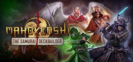
Begin your journey to become a mighty samurai mage! In a blend of adventure, strategy and deckbuilding gameplay, choose how you will follow the way of the Mahoken. Explore the Celestial Islands, build your deck, battle challenging demons, and protect the land from the forces of corruption.

$6.24Mostly Positive(460)
Board GameTurn-Based TacticsTurn-Based Strategy
Game Source StudioJan 24, 2023

Mahokenshi - The Samurai Deckbuilder scores 80/100 — better than 90% of Steam capsules we've analysed (n=22,658).

Mostly Positive (460 reviews) · $6.24 · Released Jan 24, 2023 · By Game Source Studio

Quick text summary

Mahokenshi - The Samurai Deckbuilder scored 80/100 on Steam Analyzer — Good for a Steam capsule. Top priority fix: [genre_clarity] Strengthen deckbuilding visual cue by enlarging or repositioning golden card motif to a more prominent location such as bottom-left or top-right corner to reinforce the dual RPG-deckbuilder pitch.

Capsule scores by dimension

  • Genre Clarity: 8/10 — Fantasy RPG with card strategy elements clear. The winged angel figure in red robes with magical auras, flanked by a green necromancer and armored samurai, immediately signals fantasy RPG combat. The deckbuilding aspect is reinforced by the golden card-like iconography at bottom center and the strategic composition of three distinct character archetypes. At TINY size, the silhouettes and color separation (green, red, purple) remain distinct enough to read as a magical combat game, though the deckbuilding element becomes less obvious.
  • Title Readability: 8/10 — Bold title legible, tagline readable at full. MAHOKENSHI appears in large, bold golden letters with clear serif definition and dark shadow backing that ensures contrast against the busy background. THE SAMURAI DECKBUILDER sits in a clean white banner below, maintaining excellent readability at all sizes. At SMALL size the title remains fully legible and the tagline is still readable; at TINY size MAHOKENSHI dominates clearly while the tagline compresses but does not collapse into illegibility.
  • Contrast & Color: 9/10 — Excellent value separation and chromatic clarity. The capsule leverages three primary color zones—vibrant acid green (left), rich red/gold (center), and cool purple/magenta (right)—all with high saturation and clear separation from the dark Steam background. The winged figure in the center has strong luminous rim lighting that creates silhouette definition, and the golden title text pops sharply against both dark and mid-tone regions. In grayscale, the value contrast between characters and background remains strong, with the green and purple elements reading as distinct mid-tones and the red as warm mid-high value, ensuring edge clarity at all viewing sizes including TINY.
  • Uniqueness & Polish: 8/10 — Polished character art with coherent magical theme. The illustration style is clean and professional with high rendering quality—each character has distinct visual identity, detailed costume work, and coherent lighting model that conveys premium production value. The fusion of samurai archetype with winged angel and necromancer archetypes communicates a unique Eastern-fantasy-meets-magic-system hook rather than generic RPG fare. The composition avoids template feel through intentional character hierarchy and color zoning that suggests strategic gameplay depth, though it does not quite reach top-tier innovation in concept.
  • Brand Consistency: 7/10 — Coherent magical eastern fantasy identity. The visual language establishes a consistent brand through the golden geometric motifs (card frames at borders, title styling), the prominent winged celestial figure as potential signature archetype, and the cohesive blend of Japanese samurai silhouettes with arcane magic effects. The palette of deep jewel tones (green, red, purple) with gold accents creates a recognizable aesthetic that could anchor future marketing. However, without seeing the 11 additional screenshots, it is difficult to assess whether this establishes a truly memorable recurring character or motif that would be iconic across the brand ecosystem.
  • Composition: 8/10 — Strong three-point hierarchy with clear focal point. The winged angel in red occupies the visual center with highest luminance and detail, naturally drawing the eye first; the green and purple characters flank left and right to create balanced secondary interest without competing. The title and tagline sit cleanly in the bottom-center safe zone with white backing that isolates text from background noise, and the ornamental border framing adds intentional depth layering. At SMALL size, the three-character arrangement and golden title remain the primary read; at TINY size, the central winged figure and title text are the dominant elements, with flanking characters compressing into supportive silhouettes that do not create clutter.

What works

  • Strong chromatic contrast pops on Steam dark background. The saturated green, red, and purple zones create immediate visual separation from #1b2838 and ensure discoverability in quick-scroll browsing.
  • Premium character illustration with coherent lighting. Each figure is rendered with high polish, clear costume detail, and rim lighting that creates silhouette definition and conveys production quality.
  • Clear focal hierarchy and balanced composition. The central winged angel serves as primary anchor while flanking characters guide the eye without competing, creating a natural three-point reading pattern.
  • Title legible and protected across all viewing sizes. MAHOKENSHI maintains clear serif letterforms and dark shadow backing that preserves contrast even at TINY thumbnail size.

What hurts the capsule

  • Deckbuilding mechanic is visual afterthought. The card-like golden elements at borders feel decorative rather than integral to the main composition, and the deckbuilding hook does not register strongly at SMALL or TINY sizes compared to character imagery.
  • Background detail density may obscure title at glance. The ornamental border frames and mystical aura effects, while thematically coherent, create visual noise that competes with text readability during quick scrolling.
  • Samurai identity is less visually dominant than magic. While the tagline emphasizes samurai, the winged angel and spell effects dominate the visual read, potentially underselling the samurai positioning to players specifically seeking that archetype.

Priority fixes

  1. [genre_clarity] Strengthen deckbuilding visual cue by enlarging or repositioning golden card motif to a more prominent location such as bottom-left or top-right corner to reinforce the dual RPG-deckbuilder pitch.
  2. [composition] Reduce ornamental border complexity or reduce opacity of background mystical effects to increase white space around title and reduce visual competition during small-size viewing.
  3. [contrast_color] Increase saturation or add subtle rim light to the samurai figure on the right to ensure it reads as equally prominent as the central angel at TINY size, strengthening the samurai brand signal.

Store copy priority fixes

  1. [uniqueness] Add a sentence that explicitly differentiates this game: 'Unlike traditional deckbuilders, terrain and elemental synergies force you to adapt your strategy mid-run' or similar concrete comparison.
  2. [hook_strength] Replace 'mighty samurai mage' with a more specific hook tied to a unique mechanic or consequence: 'Master both blade and spell in a roguelike where every card choice shapes your playstyle and the story of the Celestial Islands.'
  3. [audience_targeting] Add a direct audience signal near the end of the short description: 'Perfect for fans of tactical deckbuilders and roguelikes who crave strategic depth and replayability.'

Related guides

Steam app ID: 1717640