Scoring genre clarity...

The Crown of Wu capsule

The Crown of Wu

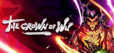
Unravel the mystery behind the stolen crown of Wu. Run, jump, fight, explore, master the elements of fire, air, earth and lightning, cross through chasms and solve puzzles, in this action and adventure-packed game, with a high level of difficulty as well as a narrative full of mythology.

$2.19Positive(31)
Third PersonActionFantasy
Red MountainMar 24, 2023

The Crown of Wu scores 78/100 — better than 84% of Third Person capsules (n=2,510).

Positive (31 reviews) · $2.19 · Released Mar 24, 2023 · By Red Mountain

Quick text summary

The Crown of Wu scored 78/100 on Steam Analyzer — Good for a Third Person capsule. Top priority fix: [title_readability] Add a thin high-contrast outline or shadow to the title to maintain legibility and crispness at thumbnail sizes without changing the brush-stroke character.

Capsule scores by dimension

  • Genre Clarity: 8/10 — Strong action-adventure visual language. The flaming demon character with aggressive pose, dynamic energy effects, and weapon-like appendages clearly signal action gameplay. The Asian mythological aesthetic and elemental fire/lightning visuals directly reinforce the adventure and elemental mastery hook mentioned in the description. At tiny size, the fiery silhouette and aggressive stance still communicate 'action game' effectively, though specific genre nuance (platformer with combat) is less obvious.
  • Title Readability: 7/10 — Readable title with hand-drawn charm. The title 'THE CROWN OF WU' uses a distinctive hand-drawn/brush stroke font in white that contrasts well against the dark background gradient. At full and small sizes it reads clearly; at tiny size the stroke-based letterforms remain somewhat legible due to good spacing and weight. The casual, expressive style fits the indie action vibe but risks losing sharpness at extreme reduction.
  • Contrast & Color: 9/10 — Excellent vibrant separation and silhouette. Hot reds, magentas, oranges, and golds in the character and energy effects create strong value and saturation contrast against the dark purple-black background (#1b2838). The glowing neon lines and intense character lighting create clear depth separation; the demon's golden face and red fire aura read distinctly even at tiny thumbnail size. Grayscale test shows excellent light-dark separation with the character as a strong focal highlight.
  • Uniqueness & Polish: 8/10 — Distinctive Asian-inspired design with polish. The demonic character design, hand-drawn title treatment, and mythological fire aesthetic set this apart from generic action game templates. The neon energy effects and color grading feel intentional and cohesive, conveying a premium indie sensibility rather than asset-store generic. The visual storytelling—a mythologically charged demon/antagonist—hints at narrative depth and a unique selling point beyond standard action fare.
  • Brand Consistency: 7/10 — Consistent mythological aesthetic internally. The palette (red, gold, magenta, dark purples), character art style, and elemental energy effects form a coherent visual identity rooted in Asian mythology and fire/elemental magic. Without seeing all 6 store screenshots, internal cohesion is strong; the fiery demon and brush-stroke typography reinforce each other. The brand feels recognizable as 'mythologically charged action' but lacks a single iconic symbol or motif that would make it instantly re-identifiable.
  • Composition: 8/10 — Strong focal hierarchy with balanced layout. The demon character anchors the right two-thirds of the composition with clear primary focus; the title sits in the upper-left quadrant in white, leaving the lower-left open and framing the character against the dynamic energy effects. The layering—dark background, mid-tone gradient, bright character and neon lines—creates clear depth. At small and tiny sizes, the character silhouette and title remain the primary reads with no competing distractions; safe margins are respected and the composition stays readable across scale.

What works

  • Vibrant color contrast and glow effects. Hot reds, golds, and magentas combined with neon line work create strong visual pop against the dark Steam background, ensuring high visibility in quick scrolls.
  • Clear action-adventure genre communication. The aggressive demon pose, elemental fire effects, and weapon details immediately signal combat-focused gameplay with a mythological twist.
  • Distinctive hand-drawn aesthetic. The brush-stroke title treatment and character art style convey premium indie craft and stand apart from mass-market action game templates.
  • Readable composition at all sizes. Strong focal hierarchy and balanced spacing keep the title and character recognizable even at thumbnail scale without crowding or clutter.

What hurts the capsule

  • Hand-drawn title loses sharpness at tiny scale. The expressive brush-stroke letterforms risk becoming soft or blurry at extreme reduction, potentially hurting legibility in carousel browsing.
  • Limited iconic brand symbol or motif. While the aesthetic is cohesive, there is no single instantly re-identifiable icon or logo mark that would make this game stand out in memory.
  • Elemental mastery mechanic not visually obvious. The fire and lightning effects dominate, but the air, earth, and puzzle-solving elements are not visually hinted at in the capsule, potentially misleading players.

Priority fixes

  1. [title_readability] Add a thin high-contrast outline or shadow to the title to maintain legibility and crispness at thumbnail sizes without changing the brush-stroke character.
  2. [uniqueness_polish] Introduce a distinctive icon or branded symbol (e.g., a stylized crown motif, rune, or seal) that reinforces the 'Crown of Wu' identity and improves long-term recognition.
  3. [genre_clarity] Incorporate a subtle visual hint of the puzzle or platforming elements (e.g., a ledge, stepping stone, or earth element accent) to hint at the full mechanic set beyond combat.
  4. [brand_consistency] Reference the 6 store screenshots to ensure the capsule color palette and character styling align with wider game visual identity for campaign coherence.

Store copy priority fixes

  1. [hook_strength] Rewrite the opening line to lead with Sun Wukong's journey and the elemental combat as the core draw—e.g., 'Play as Sun Wukong, master fire, air, earth, and lightning to reclaim the stolen Crown of Wu in this challenging 3D action-platformer inspired by Chinese legend' instead of the checklist format.
  2. [feature_communication] Expand the combat system paragraph with one concrete example of how elemental powers interact with environment or enemies—e.g., 'Use lightning to stun armored enemies, air to bypass chasms, earth to shield from projectiles' to replace the vague 'fresh and easy combat system' language.
  3. [audience_targeting] Add a sentence explicitly naming the intended player type—e.g., 'For players seeking a challenging parkour-action experience with story depth' or 'If you love difficult 3D platformers and mythology-driven narratives' to replace ambiguity.
  4. [tone_match] Choose and maintain a single tonal voice throughout—either poetic-mythological or punchy-mechanical—rather than switching between formality and marketing cliché.

Related guides

Steam app ID: 1732220 · Tags: Third Person, Action, Fantasy, Difficult, Indie