Scoring genre clarity...

Have a Nice Death capsule

Have a Nice Death

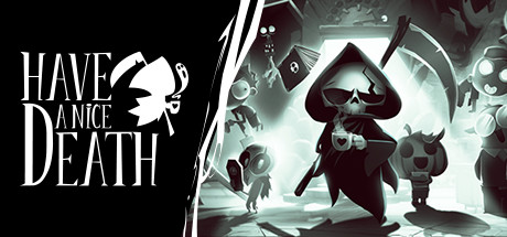
Have a Nice Death is a 2D action roguelike where you play as an overworked Death, whose employees have run rampant, completely throwing off the balance of souls - and his vacation plans. In order to restore order, you'll have to grab your trusty scythe and show your employees who's boss.

$8.74Very Positive(46)
Action RoguelikeHack and Slash2D
Magic Design StudiosMar 22, 2023

Have a Nice Death scores 85/100 — better than 97% of Steam capsules we've analysed (n=22,658).

Very Positive (46 reviews) · $8.74 · Released Mar 22, 2023 · By Magic Design Studios

Quick text summary

Have a Nice Death scored 85/100 on Steam Analyzer — Excellent for a Steam capsule. Top priority fix: [contrast_color] Intensify the teal backlight glow behind the protagonist slightly to ensure the focal separation holds at 120x45 thumbnail size during quick scroll

Capsule scores by dimension

  • Genre Clarity: 9/10 — Action roguelike reads instantly. The central Grim Reaper figure wielding a scythe surrounded by chaotic monster minions communicates action combat and dark fantasy tone immediately. The cartoonish yet menacing enemy variety suggests roguelike enemy diversity, and the overwhelmed-boss-fights-minions concept is visually legible. At tiny size the scythe-wielding silhouette and surrounding chaos still read as action combat without ambiguity.
  • Title Readability: 8/10 — Bold title reads well at most sizes. The title 'Have a Nice Death' uses a clean, bold sans-serif with strong white lettering that contrasts well against the darker upper background region. At small size the text remains readable with good letter spacing. At tiny size the words 'Have a Nice' compress slightly but 'Death' remains legible due to its larger weight and positioning near the center top.
  • Contrast & Color: 8/10 — Strong monochrome contrast with teal glow. The deliberate black-and-white art style with a focused teal-green glowing light source behind the central character creates excellent value separation against Steam's dark #1b2838 background. The bright white scythe blade and glowing chest area of the protagonist create a strong focal highlight. In grayscale the central figure separates cleanly from both the dark background and the lighter surrounding enemies.
  • Uniqueness & Polish: 9/10 — Distinctive monochrome cartoon style. The hand-drawn black-and-white aesthetic with expressive cartoon characters is immediately distinctive and stands apart from nearly all genre peers which rely on photorealistic or vibrant color palettes. The concept of Death as an overworked bureaucrat surrounded by unruly employees is visually communicated through the scene composition. The polish level is high with consistent ink-style rendering, intentional lighting, and no cheap asset feel.
  • Brand Consistency: 9/10 — Cohesive ink-art identity throughout. The monochromatic ink-and-teal palette, expressive cartoon character designs, and Grim Reaper protagonist create a strong recognizable identity that would carry through to screenshots and UI. The small butterfly motif in the logo adds a charming signature detail. The rendering style is internally consistent with no tonal or stylistic breaks across visible characters and environmental elements.
  • Composition: 8/10 — Clear hierarchy with strong focal character. The central Death character is larger than all surrounding figures and lit from behind with a focused glow, establishing immediate visual hierarchy. The title sits cleanly in the upper center above the character's head in a relatively uncluttered zone. At small size the composition holds well with the protagonist remaining the dominant element, though the many surrounding enemies create mild visual noise that competes slightly at tiny size.

What works

  • Distinctive monochrome art style. The black-and-white ink aesthetic is immediately recognizable and stands out strongly against the colorful Steam store environment.
  • Clear protagonist silhouette. The Grim Reaper with scythe reads as the primary focal point even at tiny thumbnail size due to its central placement and backlit glow.
  • Genre and tone communicated instantly. Combat action against monster employees with a darkly comedic tone is legible in under one second at any viewing size.
  • Title placement in clean zone. The title text sits above the character silhouette on a relatively uncluttered dark area, preserving legibility without needing additional outline treatment.

What hurts the capsule

  • Enemy crowd creates tiny-size noise. At 120x45 the surrounding monster characters merge into a busy textured mass that slightly dilutes focus on the central protagonist.
  • Teal glow is subtle at tiny size. The key lighting effect that separates the protagonist from the background compresses and dims significantly at thumbnail scale, reducing pop against Steam's dark UI.
  • Upper logo area slightly busy. The ghost and monster elements framing the title in the upper corners compete mildly with the title text at small capsule sizes.
  • Limited color signal for quick scroll. The near-monochrome palette, while distinctive, relies on the viewer slowing down to appreciate it, and may not grab attention as aggressively as high-saturation peers in a fast scroll.

Priority fixes

  1. [contrast_color] Intensify the teal backlight glow behind the protagonist slightly to ensure the focal separation holds at 120x45 thumbnail size during quick scroll
  2. [composition] Slightly reduce the opacity or detail density of the outermost framing monsters to declutter the composition at small sizes without changing the overall scene
  3. [title_readability] Add a very subtle dark vignette or shadow beneath the title text to ensure it remains crisp if the capsule is viewed against lighter Steam page regions
  4. [genre_clarity] Consider adding a very small stylized scythe or roguelike icon motif near the logo to reinforce the action-roguelike subgenre for viewers unfamiliar with the title

Store copy priority fixes

  1. [hook_strength] Rewrite the opening sentence to lead with the character premise: 'Play as Death Inc.'s overworked CEO in this darkly funny roguelike' to hook on premise before mechanics.
  2. [feature_communication] Replace the Early Access opening paragraph with a concise one-liner summarizing the launch and immediately pivot to core gameplay features.
  3. [audience_targeting] Add one sentence explicitly signaling difficulty or player type: 'Designed for roguelike veterans seeking challenging combat and narrative charm' or similar.
  4. [feature_communication] Expand the Curse system example with one more consequence or reward to demonstrate mechanical depth rather than leaving it as a single example.

Related guides

Steam app ID: 1740720