Scoring genre clarity...

HumanitZ capsule

HumanitZ

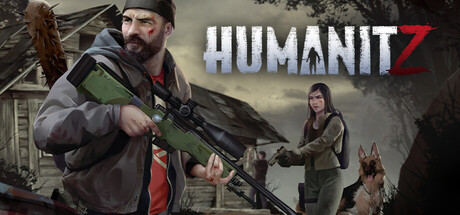
HumanitZ is an isometric, open-world sandbox survival game set in a world ended by a zombie outbreak. Survive alone or with friends by scavenging, crafting, building, and fighting to last as long as ‘humanly’ possible. You can’t change the past, but you can fight for the future of humanity.

$12.99Mostly Positive(288)
SurvivalZombiesOpen World
Yodubzz StudiosFeb 6, 2026

HumanitZ scores 63/100 — better than 6% of Steam capsules we've analysed (n=22,658).

Mostly Positive (288 reviews) · $12.99 · Released Feb 6, 2026 · By Yodubzz Studios

Quick text summary

HumanitZ scored 63/100 on Steam Analyzer — Solid for a Steam capsule. Top priority fix: [contrast_color] Darken or desaturate the background building and foliage so the primary foreground character silhouette separates cleanly in both color and grayscale views.

Capsule scores by dimension

  • Genre Clarity: 8/10 — Zombie survival sandbox clear. The center character holding a sniper rifle, a second armed female character, and a German Shepherd dog against a dilapidated rural building background clearly communicate post-apocalyptic survival. The barbed-wire bat and tactical gear reinforce zombie survival genre conventions well. At tiny size the armed human silhouettes and ruined environment still suggest survival action, though the isometric sandbox nuance is lost.
  • Title Readability: 7/10 — Title reads well at full size. The 'HUMANITZ' logo in bold white lettering with a stylized Z is clearly readable at full and small sizes, with the yellow '1.0 AVAILABLE NOW' subtitle adding visibility through high contrast. At tiny size the main title still resolves but the subtitle text becomes difficult to read and may appear as decorative noise rather than legible information. The font choice is sturdy enough to survive small rendering but the tagline collapses.
  • Contrast & Color: 6/10 — Adequate contrast, muddy midtones. The yellow subtitle and white logo contrast reasonably against the muted grey-green background, but the primary character's green jacket blends into the similarly toned background foliage and building, reducing silhouette separation. In a grayscale mental test, the characters do not pop cleanly from the environment due to similar mid-tone values. At small size the overall image reads as a brownish-green blob with a bright text band in the middle.
  • Uniqueness & Polish: 5/10 — Generic zombie survival template feel. The composition of armed survivors in front of a ruined building is a familiar trope in the zombie survival genre with no distinctive visual hook or unique art style to differentiate it. The '1.0 AVAILABLE NOW' badge placement and yellow color feel like a temporary promotional overlay rather than an integrated design element. Compared to benchmark titles like Resident Evil 4 or Pacific Drive which use distinctive lighting, silhouettes, or stylization, this feels like a competent but unremarkable execution.
  • Brand Consistency: 6/10 — Coherent but forgettable identity. The muted earthy palette, survivor character designs, and ruined rural setting are internally consistent and align with the isometric zombie survival genre. The stylized Z in HUMANITZ is a recognizable brand motif, but it does not stand out strongly at small sizes as an iconic identity mark. There is no signature color scheme or distinctive visual motif that would make this capsule immediately recognizable in a scroll lineup.
  • Composition: 6/10 — Functional layout, crowded elements. The large foreground character on the left, secondary characters on the right, and centered title text create a basic triangular hierarchy, but the composition feels crowded with three human figures plus a dog competing for attention alongside the title. At small size the title band dominates but the character grouping underneath becomes a noisy cluster rather than a clear focal point. The safe margin usage is adequate, with no critical elements clipped at edges.

What works

  • Clear genre signaling. Armed survivors, tactical gear, and a ruined rural background immediately communicate zombie survival to a scrolling viewer even at small sizes.
  • Strong title contrast at full size. The bold white HUMANITZ logo with yellow promotional subtitle creates a readable text band that draws the eye first in the composition.
  • Cohesive character grouping. The three-character plus dog ensemble implies co-op multiplayer survival gameplay without requiring any text explanation.

What hurts the capsule

  • Character blends into background. The primary character's green jacket merges with the green-grey background tones, weakening silhouette separation in grayscale and at tiny size.
  • Promotional badge feels temporary. The '1.0 AVAILABLE NOW' yellow text reads as a temporary overlay that hurts perceived production value and will become outdated.
  • No distinctive visual identity hook. The composition follows a generic zombie survival template with no stylistic or conceptual differentiation from dozens of similar genre capsules.
  • Crowded at small sizes. Three characters plus a dog create visual noise that collapses into an unreadable cluster at tiny thumbnail size.

Priority fixes

  1. [contrast_color] Darken or desaturate the background building and foliage so the primary foreground character silhouette separates cleanly in both color and grayscale views.
  2. [uniqueness_polish] Remove the '1.0 AVAILABLE NOW' promotional text from the base capsule or integrate it as a stylized badge rather than a plain yellow overlay, to improve timeless polish.
  3. [composition] Reduce the composition to a single dominant hero character at small size by making the primary figure significantly larger and pushing secondary characters further into the background.
  4. [title_readability] Increase the size and weight of the HUMANITZ logo relative to the promotional subtitle so the brand mark remains the dominant readable element at tiny size.

Store copy priority fixes

  1. [uniqueness] Rewrite the opening of the detailed description to lead with a HumanitZ-specific hook (e.g., 'In HumanitZ, survival isn't just about killing zombies—it's about reclaiming civilization through farming, vehicles, and alliance-building') that differentiates from generic zombie games.
  2. [hook_strength] Add a one-sentence callout in the short description that highlights the game's core differentiator (e.g., 'build vehicles and bases, farm and hunt, or dominate through PvP') to immediately signal why this game stands out.
  3. [audience_targeting] Create a dedicated line near the top addressing difficulty options and playstyle intensity (e.g., 'From casual survival to Permadeath hardcore—choose your challenge') to signal tone and expected audience clearly.
  4. [feature_communication] Replace vague adjectives ('extensive,' 'robust,' 'plethora') with one concrete example per system (e.g., 'Craft dozens of weapons with attachment slots and mods' instead of 'Craft with a plethora of weaponry').

Related guides

Steam app ID: 1766060