Scoring genre clarity...

Kingdom Come: Deliverance II capsule

Kingdom Come: Deliverance II

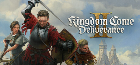
A thrilling story-driven action RPG, with a rich open world, set in 15th century Medieval Europe. Experience the ultimate medieval adventure - through the eyes of young Henry - as you embark on a journey of epic proportions.

$23.99Very Positive(2,509)
RPGMedievalOpen World
Warhorse StudiosFeb 4, 2025

Kingdom Come: Deliverance II scores 82/100 — better than 96% of RPG capsules (n=3,643).

Very Positive (2,509 reviews) · $23.99 · Released Feb 4, 2025 · By Warhorse Studios

Quick text summary

Kingdom Come: Deliverance II scored 82/100 on Steam Analyzer — Good for a RPG capsule. Top priority fix: [title_readability] Create a simplified logo lock-up variant with tighter spacing and a stronger dark drop-shadow or halo so the title survives at 120x45 thumbnail size.

Capsule scores by dimension

  • Genre Clarity: 9/10 — Medieval RPG instantly recognizable. Four armored medieval characters in dynamic combat poses with swords, shields, and a bow immediately signal historical action-RPG. The rolling countryside, castle in the background, and period-accurate armor leave no genre ambiguity. Even at tiny size, the medieval warrior silhouettes and period setting communicate the subgenre clearly.
  • Title Readability: 8/10 — Strong logo with gold serif treatment. The 'Kingdom Come Deliverance II' title uses a bold gold and white serif font with good weight, sitting on a relatively controlled lower-center region against the character grouping. At full size it reads crisply and the gold treatment gives it premium distinction. At tiny size the title reduces significantly and the word 'Deliverance' becomes difficult to parse, though the large Roman numeral II and the distinctive lettering style still register as a known brand.
  • Contrast & Color: 7/10 — Warm tones separate well from Steam dark. The warm golden sky, pale green landscape, and brightly lit foreground characters create reasonable separation against Steam's dark #1b2838 background. The central armored hero with red cape and raised sword has strong value contrast and reads as a clear silhouette. In grayscale the landscape background midtones are somewhat similar in value to the flanking secondary characters, causing slight muddiness at tiny size on the outer figures.
  • Uniqueness & Polish: 8/10 — Premium painterly style, grounded realism. The oil-painting-style illustration with historically grounded armor and a realistic Bohemian landscape sets it apart from fantasy-heavy genre competitors, communicating a distinct authentic medieval identity. The craft level is high — lighting is coherent, the group composition feels intentional, and the color palette avoids the oversaturated fantasy clichés common in the genre. It sits comfortably among top-tier capsules though lacks a single iconic visual hook that would make it immediately distinctive versus peers like God of War or Black Myth.
  • Brand Consistency: 9/10 — Cohesive identity, strong sequel signaling. The painterly illustration style, gold serif logotype, and the central character Henry in period-accurate armor are consistent identity markers carried over from the first game, making this instantly recognizable to the existing fanbase. The warm palette, realistic medieval setting, and ensemble character arrangement feel internally coherent with no clashing styles or tonal inconsistencies. The Roman numeral II integrated into the logo cleanly signals sequel status without disrupting the visual identity.
  • Composition: 8/10 — Strong center hero, layered depth. The composition uses a clear foreground-midground-background layering: flanking characters in shadow, the central hero elevated and backlit against the bright sky, and a receding landscape with castle. The focal hierarchy is well managed with the raised sword drawing the eye upward. The title sits low-center and does not compete with the primary subject. At small and tiny sizes the cropping may cut flanking figures and some landscape depth, but the central armored hero with red cape remains a clean and dominant read.

What works

  • Instant genre identification. Period armor, sword pose, and medieval landscape communicate historical action-RPG at a glance even at tiny thumbnail size.
  • Painterly art style elevates perceived quality. The oil-painting illustration treatment gives the capsule a premium, cinematic feel that stands out among photobashed or CG-heavy genre competitors.
  • Strong center silhouette. The central hero with raised sword and red cape creates a dominant, high-contrast focal point that survives aggressive downscaling.
  • Gold serif logotype is distinctive. The warm gold title treatment is legible at full size and carries strong brand recognition for returning players familiar with the franchise.

What hurts the capsule

  • Title collapses at tiny size. At 120x45 the full title text becomes unreadable, and only the rough shape of the logotype registers rather than specific words.
  • Secondary characters lose definition at small size. The flanking figures on the left and right blend into midtones at small and tiny sizes due to their darker value range matching the landscape shadows.
  • No single iconic visual hook. Unlike top-tier peers with a single unforgettable image or symbol, the ensemble group shot is competent but not immediately iconic among competitive genre capsules.
  • Background landscape creates mid-tone muddiness. The pale greenish landscape behind the characters reduces silhouette sharpness in grayscale, particularly around the outer characters at small sizes.

Priority fixes

  1. [title_readability] Create a simplified logo lock-up variant with tighter spacing and a stronger dark drop-shadow or halo so the title survives at 120x45 thumbnail size.
  2. [contrast_color] Increase value separation on the flanking secondary characters by deepening the background behind them or brightening their silhouette edges to prevent blending at small sizes.
  3. [uniqueness_polish] Consider introducing a single iconic foreground element or symbol — such as Henry's sigil or a motif from the game — to give the capsule a more instantly ownable visual hook.
  4. [composition] Tighten the title placement slightly upward to ensure it remains fully in-frame and clear if Steam crops the bottom edge of the capsule.

Store copy priority fixes

  1. [feature_communication] Add a detailed description section (minimum 150 words) that covers core gameplay mechanics: combat system, dialogue/roleplay mechanics, quest structure, character progression, and how the open world encourages exploration.
  2. [uniqueness] Include a sentence or paragraph explaining what makes Kingdom Come: Deliverance II distinctive—e.g., historical authenticity, immersive simulation focus, realism mechanics, or what the sequel improves over the original.
  3. [hook_strength] Rewrite the opening line to lead with a specific, evocative hook instead of generic 'thrilling' language—e.g. 'Live as a blacksmith's son in 15th century Bohemia, where every decision shapes your survival and the fate of a kingdom.'
  4. [audience_targeting] Add signals about the player experience level and gameplay style—e.g., whether this is for hardcore immersion seekers, story-first players, or action-combat fans—to help the right audience self-identify.

Related guides

Steam app ID: 1771300 · Tags: RPG, Medieval, Open World, Singleplayer, Story Rich