Scoring genre clarity...
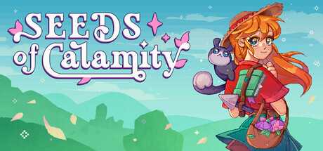
Take part in healing after the Great Calamity. Tend your farm, complete quests for the villagers, and explore dungeons filled with challenge and treasure in this cozy, solo-developed farming sim. Build a new life in a recovering world with your fluffy Spellbook Companion.
$7.49Mostly Positive(11)
Farming SimLife SimCozy
Laborious Lark StudiosApr 13, 2026