Scoring genre clarity...

DRAGON BALL: Sparking! ZERO capsule

DRAGON BALL: Sparking! ZERO

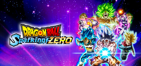
DRAGON BALL: Sparking! ZERO takes the legendary gameplay of the Budokai Tenkaichi series and raises it to whole new levels. Make yours the destructive power of the strongest fighters ever to appear in Dragon Ball!

$34.99Very Positive(283)
AnimeMultiplayerAction
Spike Chunsoft Co., Ltd.Oct 10, 2024

DRAGON BALL: Sparking! ZERO scores 85/100 — better than 97% of Steam capsules we've analysed (n=22,658).

Very Positive (283 reviews) · $34.99 · Released Oct 10, 2024 · By Spike Chunsoft Co., Ltd.

Quick text summary

DRAGON BALL: Sparking! ZERO scored 85/100 on Steam Analyzer — Excellent for a Steam capsule. Top priority fix: [title_readability] Increase contrast and weight on the 'Sparking!' subtitle text with a thicker white outline so it remains legible at 120x45 thumbnail size

Capsule scores by dimension

  • Genre Clarity: 9/10 — Anime fighter genre crystal clear. Multiple dynamic fighting characters with energy auras, glowing power effects, and combat poses instantly communicate anime arena fighter at even tiny sizes. The Dragon Ball IP characters — recognizable Super Saiyan hair and energy blasts — are unmistakable genre signals. At tiny size the cluster of colorful charging fighters still reads as a fighting game even without reading the title.
  • Title Readability: 8/10 — Logo bold at full, tight at tiny. The DRAGON BALL Sparking! ZERO logo uses a thick outlined bold font with orange and white coloring that reads well at full and small sizes. The stylized 'S' wrapping into 'Sparking!' is clever but becomes harder to parse at tiny size. At tiny thumbnail the 'ZERO' wordmark remains the most legible element while 'Sparking!' subtitle detail collapses slightly.
  • Contrast & Color: 9/10 — Vibrant palette pops on dark Steam. The deep purple-blue space background contrasts sharply against the bright greens, blues, yellows, and whites of the character energy auras and hair colors. Against Steam's #1b2838 dark background this image pops with excellent value separation. In grayscale the characters maintain strong silhouette separation from the background due to the glowing light effects radiating outward.
  • Uniqueness & Polish: 8/10 — Polished anime fighter, IP-reliant hook. The composition is highly polished with professional render quality, layered energy effects, and a premium feel consistent with a AAA anime title. The main hook is IP recognition rather than a truly unique visual concept — it relies on Dragon Ball character appeal which is extremely strong but not visually inventive. Compared to top-tier benchmarks like Black Myth or God of War Ragnarök, the composition feels more catalog than singular vision, though it executes its formula very well.
  • Brand Consistency: 9/10 — Strong DB franchise identity signals. The Dragon Ball franchise visual language is executed with complete internal consistency — iconic energy auras, signature Super Saiyan transformations with glowing colored hair, and the recognizable logo treatment all reinforce the brand immediately. The cosmic purple-blue background with radial light beams is a signature aesthetic consistent with the Budokai Tenkaichi series. Any returning fan or Dragon Ball viewer would recognize this as part of the franchise instantly.
  • Composition: 8/10 — Dynamic diagonal split with clear focal point. The composition uses a strong diagonal energy beam as a dividing line with the title logo occupying the left third and the character cluster dominating the right two-thirds. The central white energy burst between the two lead characters creates a clear focal point that anchors the design at every scale. At small sizes the logo and character cluster remain readable, though the upper background characters (green-haired Broly figure) start to merge with the cosmic background and lose some definition.

What works

  • Instant genre recognition. The charged energy poses and Super Saiyan aesthetics communicate anime arena fighter in under a second even at tiny thumbnail size.
  • Strong value contrast against Steam dark UI. The glowing aura effects and bright character colors create excellent separation against #1b2838 making it pop in a quick scroll.
  • Clear focal hierarchy. The central energy burst between lead fighters creates an undeniable focal anchor that holds across all viewing sizes.
  • Franchise brand signals are unmistakable. Dragon Ball's iconic visual vocabulary is deployed consistently and confidently with zero ambiguity about what series this belongs to.

What hurts the capsule

  • Title subtitle collapses at tiny size. The stylized 'Sparking!' lettering with the overlapping S becomes difficult to parse at 120x45 thumbnail scale.
  • Upper character cluster loses separation. The background fighters including the green-haired character merge partially into the purple cosmic background at small sizes due to similar dark tones.
  • IP-dependent uniqueness. The design's distinctiveness relies almost entirely on Dragon Ball IP recognition rather than a visually inventive or unexpected compositional idea.
  • Left region feels slightly underweighted. The left half hosting only the logo leaves a somewhat empty negative space gap that could be better utilized to add depth or supporting visual storytelling.

Priority fixes

  1. [title_readability] Increase contrast and weight on the 'Sparking!' subtitle text with a thicker white outline so it remains legible at 120x45 thumbnail size
  2. [composition] Add subtle additional foreground lighting or character element to the left logo region to reduce the empty gap and improve depth layering
  3. [contrast_color] Brighten the edge lighting on the upper background characters like the green-haired fighter to improve their silhouette separation from the dark cosmic background at small sizes
  4. [uniqueness_polish] Introduce a more distinctive compositional hook beyond standard fighter cluster arrangement to elevate above genre-standard capsule formulas when competing against top-tier action titles

Store copy priority fixes

  1. [hook_strength] Replace 'raises it to whole new levels' with a specific, visceral gameplay difference—e.g., 'Master split-second guard cancels and environmental destruction in real-time 3D arenas' or reference a concrete new system versus Budokai Tenkaichi.
  2. [uniqueness] Add 1-2 sentences explaining what core mechanic or design choice makes Sparking! ZERO's combat stand out from other 3D fighting games (e.g., guard mechanics, stage destruction impact, team mechanics if applicable).
  3. [feature_communication] Simplify the edition tier descriptions into a quick comparison table or bullet points showing Standard vs Deluxe vs Ultimate—what characters/cosmetics does each add?—rather than listing the same features three times.
  4. [audience_targeting] Add explicit language about skill floor: is this welcoming to fighting game newcomers (easy combos + training mode) or aimed at hardcore players? Clarity here will help the right players self-select.

Related guides

Steam app ID: 1790600