Scoring genre clarity...

Fear Of The Darkness capsule

Fear Of The Darkness

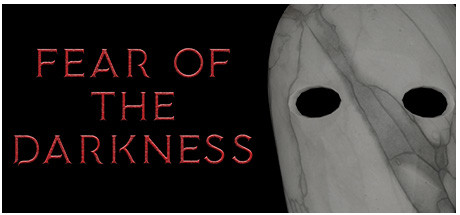
Fear Of The Darkness is a narrative psychological horror game that will push you to face the serious phobias of some patients. Play as the enigmatic doctor, avoid being overwhelmed by the heavy emotional burden of your patients, come out of the Darkness and explore the various corners of the Truth.

$11.995 user reviews
HorrorPsychological HorrorExploration
GFCreativeLabOct 31, 2023

Fear Of The Darkness scores 77/100 — better than 77% of Steam capsules we've analysed (n=22,658).

5 user reviews · $11.99 · Released Oct 31, 2023 · By GFCreativeLab

Quick text summary

Fear Of The Darkness scored 77/100 on Steam Analyzer — Good for a Steam capsule. Top priority fix: [uniqueness_polish] Add a subtle visual element that hints at the doctor-patient dynamic or the emotional burden mechanic (e.g., layered human silhouettes, fragmented patient faces, or a doctor's instrument motif) to differentiate from generic horror and communicate the unique narrative angle.

Capsule scores by dimension

  • Genre Clarity: 8/10 — Strong psychological horror identity. The stark white masked face with hollow black eyes against pure black background immediately signals horror and dread. The minimalist, unsettling imagery and title 'FEAR OF THE DARKNESS' clearly establish psychological horror tone at full and small sizes. At tiny size, the face silhouette and eye voids remain recognizable enough to convey unease and horror genre.
  • Title Readability: 8/10 — Clear, readable orange serif text. The orange-red serif font stands out sharply against the black background with excellent contrast and consistent letterform clarity at all sizes. Text is left-aligned on a clean, uncluttered dark area with no competing visual noise. At tiny size the title remains readable due to strong value separation, though individual words may blur slightly into one mass at extreme reduction.
  • Contrast & Color: 9/10 — Excellent dark-light value separation. The composition uses extreme contrast: pure black background, bright orange-red text, and pale gray-white mask face with black void eyes. Silhouette of the mask remains crisp and distinct even in grayscale, and the color palette pops cleanly against Steam's dark #1b2838 background. At tiny size, the high value and saturation separation ensures elements do not blur into background noise.
  • Uniqueness & Polish: 7/10 — Distinctive horror aesthetic, moderate craft. The masked face and 'fear of darkness' concept feel authentic to psychological horror rather than generic jump-scare aesthetics, and the execution is clean and intentional. The stark minimalism avoids cheap effects or asset template feel. However, the design relies heavily on the unsettling image alone without additional visual storytelling or unique mechanical hints that would elevate it to premium tier.
  • Brand Consistency: 6/10 — Cohesive horror mood, limited identity anchors. The pale masked figure and orange serif title create internal visual cohesion and reinforce the psychological horror tone consistently. The palette and styling feel deliberate, but without additional brand-specific motifs, character silhouettes, or signature visual hooks shown in store screenshots, the capsule lacks a memorable long-term identity marker. It communicates the genre well but may not be distinctly recognizable as 'Fear of the Darkness' versus other horror titles.
  • Composition: 8/10 — Clean layout, strong focal hierarchy. The title occupies the left third in a controlled, dark area while the masked face anchors the right side, creating clear depth and balance without clutter. The composition uses the left-to-right reading flow naturally and respects safe margins, avoiding edge-crop hazards. At small and tiny sizes, the focal point (the face) remains dominant and the eye is guided to text first, then expression, maintaining hierarchy.

What works

  • Powerful color contrast against Steam background. Orange-red title and pale face pop cleanly against #1b2838, ensuring high visibility and quick recognition during fast scrolling.
  • Clear horror genre signaling. The unsettling masked face and title immediately communicate psychological horror without ambiguity or mixed genre messaging.
  • Readable typography at all sizes. Serif font with strong contrast and deliberate spacing remains legible from full header down to tiny thumbnail.
  • Uncluttered, intentional minimalism. Spare composition avoids template feel and communicates premium restraint over cheap effect overload.

What hurts the capsule

  • Limited brand identity anchors. The masked face is striking but generic to horror; no character, symbol, or signature visual motif that would distinguish this specific title from other psychological horror games.
  • Minimal storytelling or mechanic hints. The capsule conveys mood and genre but provides no visual clues about the doctor perspective, patient interaction, or unique narrative hook mentioned in the description.
  • Lacks premium production signaling. While clean and cohesive, the aesthetic does not suggest AAA-tier polish or distinctive art direction that would place it above mid-tier indie horror competition.

Priority fixes

  1. [uniqueness_polish] Add a subtle visual element that hints at the doctor-patient dynamic or the emotional burden mechanic (e.g., layered human silhouettes, fragmented patient faces, or a doctor's instrument motif) to differentiate from generic horror and communicate the unique narrative angle.
  2. [brand_consistency] Introduce a recognizable secondary visual motif or palette accent that could become iconic to 'Fear of the Darkness' specifically and increase recall across store pages and community discussion.
  3. [composition] Consider subtle environmental context or additional human silhouettes in the negative space to hint at patient stories and psychological depth without adding clutter.

Store copy priority fixes

  1. [hook_strength] Replace the abstract ending of the short description ('come out of the Darkness and explore the various corners of the Truth') with a concrete, visceral hook that explains what the player actually confronts—e.g., 'delve into patients' deepest fears as a doctor whose own grip on reality begins to slip.'
  2. [feature_communication] Clarify the core gameplay loop in the opening paragraph: explain how patient sessions are structured, what 'emotional burden' means mechanically (health/sanity meter?), and how the four gameplay phases connect to treating each patient.
  3. [uniqueness] Add a single sentence in the General Description section that differentiates this game: e.g., 'Unlike traditional horror games, your terror comes not from external threats but from the fractured psyches of those you're sworn to heal.'
  4. [audience_targeting] Insert a brief note about intended difficulty/pacing—e.g., 'Designed for players who value narrative and atmosphere over fast-paced action, with multiple endings based on your choices' to set expectation and attract the right audience.

Related guides

Steam app ID: 1793200