Scoring genre clarity...

Deer & Boy capsule

Deer & Boy

In this poetic cinematic platformer, a runaway boy meets a fawn. As their bond grows, so do their abilities and the emotional weight of their journey, where silence speaks louder than words.

$17.99Very Positive(132)
AdventurePlatformerCute
Lifeline GamesJun 23, 2026

Deer & Boy scores 67/100 — better than 15% of Steam capsules we've analysed (n=22,658).

Very Positive (132 reviews) · $17.99 · Released Jun 23, 2026 · By Lifeline Games

Quick text summary

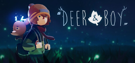
Deer & Boy scored 67/100 on Steam Analyzer — Solid for a Steam capsule. Top priority fix: [contrast_color] Darken or desaturate the lower grass and sky region slightly and add a subtle rim light or vignette edge to separate the characters more clearly from the Steam dark background during quick scroll.

Capsule scores by dimension

  • Genre Clarity: 6/10 — Indie adventure mood clear. The soft painterly style, child character with a small deer companion, and glowing firefly atmosphere strongly suggest a narrative indie adventure or platformer. At tiny size the warm emotional tone and duo pairing read as a companion-based journey game, though the platformer genre specifically is not implied visually. Genre cues lean more toward narrative or walking sim than action platformer.
  • Title Readability: 7/10 — Title reads well at full size. The title DEER & BOY sits on a controlled dark sky background in clean serif-influenced lettering with good spacing and a leaf icon replacing the ampersand, which is a charming typographic detail. At small size the title remains legible with reasonable contrast against the dark background. At tiny size the text shrinks considerably and the decorative leaf ampersand becomes unreadable, but the core words DEER BOY still parse.
  • Contrast & Color: 6/10 — Soft palette blends into dark Steam. The muted teal-green background and desaturated character tones provide limited value contrast against Steam's dark #1b2838 background, causing the lower portion of the image to nearly merge with the page. The glowing fireflies and the fawn's soft blue-white light create focal highlights that help, but the overall low saturation and mid-tone range means the capsule does not pop in a quick scroll. In grayscale the silhouettes are readable but lack strong separation.
  • Uniqueness & Polish: 7/10 — Polished painterly indie charm. The soft 3D rendering style with hand-painted lighting and the boy-plus-deer duo creates a visually distinctive and emotionally resonant image that stands apart from most action-heavy capsules in the genre. The leaf ampersand is a thoughtful branding touch. However compared to top indie benchmarks like COCOON or ANIMAL WELL, the composition feels somewhat conventional and does not surface a unique mechanical hook or strong visual storytelling beyond the emotional pairing.
  • Brand Consistency: 7/10 — Cohesive soft storybook identity. The warm earthy tones, soft 3D art style, glowing nature motifs, and the boy-deer duo form a recognizable and internally consistent visual identity. The leaf motif integrated into the logo reinforces the nature theme. The palette and rendering style suggest the same look would carry through screenshots, making the capsule a reliable brand signal. The identity is memorable within the soft narrative indie space though not uniquely iconographic at tiny size.
  • Composition: 7/10 — Centered duo with decent hierarchy. The child character is centered and occupies the primary focal zone with the deer companion on the left shoulder creating a clear subject pairing. The title floats in the upper right against clean dark sky giving it breathing room. Fireflies and grass provide foreground-background depth layering. At small size the character reads cleanly as the hero. At tiny size the composition holds but the dual subject slightly dilutes the single focal point rule, and the title competes with the character for the upper half.

What works

  • Emotionally resonant character pairing. The boy and deer duo immediately communicates a companion bond narrative that differentiates the game from generic adventure titles.
  • Title placement on clean sky region. Positioning the title against the dark sky background ensures legibility without fighting noisy texture.
  • Leaf ampersand typographic detail. The leaf replacing the ampersand is a clever branding touch that ties the logo to the nature theme cohesively.
  • Depth layering with fireflies and grass. Foreground grass blades and floating fireflies create a sense of atmospheric depth that adds polish to the scene.

What hurts the capsule

  • Low contrast against Steam dark background. The muted teal-green lower half blends into #1b2838, reducing pop during quick scroll browsing.
  • Genre ambiguity at tiny size. At 120x45 the image reads as a narrative or walking sim rather than signaling the platformer genre the game belongs to.
  • Title shrinks significantly at tiny size. The decorative leaf ampersand and fine letterforms lose detail at tiny thumbnail size, weakening brand recall.
  • No mechanical or gameplay hook visible. The capsule communicates mood well but shows no visual cue of gameplay, which may underperform against genre peers that show action or mechanic hints.

Priority fixes

  1. [contrast_color] Darken or desaturate the lower grass and sky region slightly and add a subtle rim light or vignette edge to separate the characters more clearly from the Steam dark background during quick scroll.
  2. [genre_clarity] Introduce a subtle environmental cue such as a stylized platform ledge, floating terrain, or light trail that hints at platformer gameplay without breaking the poetic mood.
  3. [title_readability] Increase the font weight slightly and add a soft drop shadow or glow behind the title text to ensure DEER & BOY remains legible at tiny thumbnail size.
  4. [uniqueness_polish] Strengthen the visual storytelling by surfacing one unique emotional or mechanical moment in the scene, such as a shared ability glow between the boy and deer, to differentiate from generic companion-adventure capsules.

Store copy priority fixes

  1. [feature_communication] Replace 'Clever challenges integrated into your journey' with one concrete puzzle example: e.g., 'Use environmental obstacles to protect your fawn while advancing together,' showing how puzzles connect to the core companion mechanic.
  2. [feature_communication] Clarify moment-to-moment gameplay in one sentence: specify whether players primarily platformform, explore, solve environmental puzzles, or combine mechanics, and how the fawn's growth changes the approach.
  3. [hook_strength] Strengthen the short description closing with a specific emotional or mechanical consequence: replace 'where silence speaks louder than words' with a higher-stakes statement like 'where every choice shapes both their survival and your bond.'

Related guides

Steam app ID: 1803140