Scoring genre clarity...

Lords of Ravage capsule

Lords of Ravage

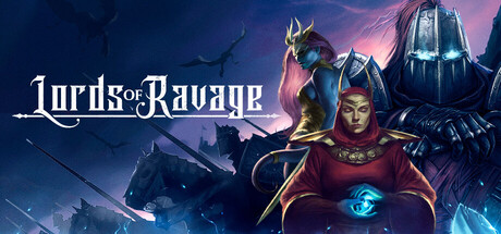
Become the Final Boss! Play any way you want, combine followers from different factions, and win spectacular turn-based battles. Expand your Empire of Darkness and seek a powerful artifact that can change the fate of the world.

$4.99Mixed(132)
AdventureVillain ProtagonistTactical RPG
Synthetic DomainOct 15, 2025

Lords of Ravage scores 62/100 — better than 3% of Steam capsules we've analysed (n=22,658).

Mixed (132 reviews) · $4.99 · Released Oct 15, 2025 · By Synthetic Domain

Quick text summary

Lords of Ravage scored 62/100 on Steam Analyzer — Solid for a Steam capsule. Top priority fix: [uniqueness_polish] Introduce a visual storytelling element that communicates the 'become the Final Boss' mechanic, such as a throne perspective, an enemy army bowing, or a clear villain-POV framing to differentiate from standard hero-led RPG capsules.

Capsule scores by dimension

  • Genre Clarity: 7/10 — Dark fantasy strategy RPG implied. The central robed spellcaster figure with a glowing orb, armored knight, mounted soldiers, and stormy battlefield background clearly communicate dark fantasy RPG or strategy. The 'become the villain' power fantasy angle is readable at full size via character composition. At tiny size the genre reads as fantasy RPG but the turn-based strategy nuance is lost, leaving it feeling closer to a generic dark fantasy RPG.
  • Title Readability: 7/10 — Readable at full, strained at tiny. The 'Lords of Ravage' logo uses a stylized serif font with a decorative sword motif through the lettering, placed on a relatively clean mid-dark sky region in the upper left. At full size it reads clearly with decent contrast. At tiny size around 120x45 the letterforms compress significantly and the decorative elements in the font cause the title to blur together, though the word shapes remain roughly parseable to an attentive viewer.
  • Contrast & Color: 6/10 — Mid-range contrast, muddy midtones. The warm red robes of the central character provide the strongest value and hue contrast against the cool blue-grey background, giving one clear anchor. However the armored figures on the left and right blend into the dark background in grayscale, and the overall mid-tone density of the composition means silhouettes are not crisply separated at small sizes. Against Steam's #1b2838 dark background the capsule holds reasonably but the top sky region and background blend somewhat into the page.
  • Uniqueness & Polish: 5/10 — Competent but genre-generic execution. The composition of a central villain-type caster flanked by companions against a dark fantasy battle scene is extremely common in the RPG and strategy space, and does not communicate a distinctive selling point such as the 'become the final boss' mechanic described. The illustration quality is solid but not exceptional, and the overall feel sits closer to a mid-tier indie template than the standout visual identity seen in benchmarks like Metaphor ReFantazio or Hades II. No memorable motif or visual hook distinguishes it from dozens of similar capsules.
  • Brand Consistency: 6/10 — Coherent palette, limited identity. The cool blue-purple atmosphere combined with warm red accent on the central character creates an internally consistent color language. The rendering style across the three main characters is cohesive and the dark empire aesthetic is maintained. However there is no iconic symbol, motif, or signature visual element that would create strong brand recall across Steam browse, and the title treatment lacks the visual weight needed to become a recognizable identity marker.
  • Composition: 6/10 — Clear focal point, crowded sides. The central seated spellcaster serves as a reasonable focal point with the eye drawn to the glowing blue orb and red robes. The flanking characters and horse-mounted soldiers in the background create depth layering, but the left and right edges feel crowded and the composition does not simplify gracefully at small sizes. The title placement in the upper left is safe from cropping but competes slightly with the blue creature figure directly behind it. At tiny size the composition collapses into an indistinct cluster of dark figures with only the red robe remaining as a readable element.

What works

  • Strong central color anchor. The red-robed central character creates an immediate warm focal point against the cool blue-grey background that survives down to small capsule sizes.
  • Clear dark fantasy tone. The combination of armored knights, a caster with a glowing orb, and stormy skies communicates the genre and tone quickly during a casual scroll.
  • Safe title placement. The logo is positioned in the upper left over a relatively clean sky region, avoiding the busiest parts of the illustration.
  • Coherent atmosphere. The cool purple-blue palette with warm red accent is internally consistent and creates a moody dark fantasy atmosphere across the full image.

What hurts the capsule

  • Generic villain lineup composition. The three-character lineup with a central caster flanked by warriors is one of the most overused capsule compositions in dark fantasy RPG and strategy, failing to communicate the unique 'play as the final boss' angle.
  • Side characters blend into background. The armored figure on the right and horse-mounted soldiers are nearly indistinguishable from the dark background in grayscale or at tiny sizes, reducing silhouette clarity.
  • Title collapses at tiny size. The decorative script elements in the 'Lords of Ravage' wordmark cause it to become illegible at 120x45, leaving only a rough word-shape impression.
  • No distinctive USP visualization. Nothing in the capsule hints at the turn-based mechanics or empire-building angle, missing an opportunity to stand out from generic dark fantasy RPG competitors.

Priority fixes

  1. [uniqueness_polish] Introduce a visual storytelling element that communicates the 'become the Final Boss' mechanic, such as a throne perspective, an enemy army bowing, or a clear villain-POV framing to differentiate from standard hero-led RPG capsules.
  2. [title_readability] Simplify the 'Lords of Ravage' logo letterforms, add a subtle dark outline or drop shadow, and increase letter weight so it remains legible at 120x45 thumbnail size.
  3. [contrast_color] Increase the value contrast of the flanking armored characters by lightening their edge lighting or darkening the background behind them to create cleaner silhouettes in grayscale.
  4. [composition] Reduce visual clutter on the left and right edges by pulling the side characters closer to center or simplifying background elements so the composition reads as one clear focal group at small sizes.

Store copy priority fixes

  1. [feature_communication] Explicitly define how Orders work in the deckbuilder system—are they selected each run? Drafted from a pool? This closes the gap between the 'Roguelike Deckbuilder' tag and the actual mechanics described.
  2. [audience_targeting] Add a sentence clarifying difficulty, recommended experience level, or whether the game has assist options; this will help solo/casual players self-select appropriately.
  3. [uniqueness] Add a line contrasting the faction-mixing and political manipulation system against typical tactical RPGs or roguelikes to reinforce why this specific execution matters.
  4. [hook_strength] In the short description, move 'turn-based battles' earlier and lead with the core verb 'Command' or 'Lead' instead of the secondary value prop 'Play any way you want' to tighten the hook's focus.

Related guides

Steam app ID: 1830320