Scoring genre clarity...

Rubinite capsule

Rubinite

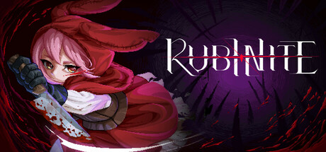
"Rubinite" is a dark fantasy boss rush action game that utilizes the unique mechanic "Focus" to pinpoint enemies' weaknesses and execute thrust attacks. Follow Ruby, a princess who has escaped from the Scarlet Kingdom, embarking on a journey of revenge to reclaim her kingdom.

Souls-likeBoss RushDifficult
Cup Dog Games, GameWorks VenturesJul 23, 2026

Rubinite scores 67/100 — better than 15% of Steam capsules we've analysed (n=22,658).

Released Jul 23, 2026 · By Cup Dog Games

Quick text summary

Rubinite scored 67/100 on Steam Analyzer — Solid for a Steam capsule. Top priority fix: [title_readability] Increase stroke weight and letter spacing on RUBINITE and add a stronger dark drop shadow or glow outline so the title remains legible at 120x45 thumbnail size.

Capsule scores by dimension

  • Genre Clarity: 7/10 — Dark fantasy action RPG clear. The hooded anime-style character wielding a blade with blood splatter strongly implies action combat in a dark fantasy setting. The swirling dark vortex background and aggressive pose communicate boss rush or combat-focused gameplay well. At tiny size the character silhouette and blade read clearly enough to suggest action genre, though boss rush specificity is lost.
  • Title Readability: 6/10 — Readable full size, collapses tiny. At full size RUBINITE is legible in a stylized serif font with a glowing red gem replacing the I, placed on a relatively controlled dark purple background region in the upper right. At tiny 120x45 size the letterforms compress significantly and the decorative gem-dot detail in the title becomes invisible, reducing the title to a barely readable white text cluster. The font choice is atmospheric but thin strokes hurt small-size legibility.
  • Contrast & Color: 7/10 — Strong red-dark contrast, mid blend risk. The vivid red cloak and blood splatter pop strongly against the deep purple-black swirling background, creating a high-contrast focal point that holds up in grayscale. The character's face and pink hair provide a lighter mid-tone anchor that separates from the dark background well. At tiny size the red mass of the cloak remains the dominant read and holds silhouette clarity against Steam's dark navy background.
  • Uniqueness & Polish: 6/10 — Competent anime dark fantasy style. The Little Red Riding Hood-inspired character design with bunny ears and a sword is a charming distinguishing detail, but at small sizes this specific hook is lost and it reads as a fairly generic anime action game capsule. The blood splatter and swirling dark vortex are well-executed craft-wise but are common visual tropes in the indie dark fantasy space. Compared to top-tier benchmarks like Lies of P or Hades II, the composition feels functional but not visually distinctive or premium.
  • Brand Consistency: 7/10 — Cohesive dark red palette identity. The deep crimson, dark purple, and blood-red palette is internally consistent and creates a recognizable dark fantasy identity. The gem motif embedded in the title logo ties the brand name visually to the character's aesthetic. The rendering style is consistent pixel-adjacent anime art that would likely carry across screenshots and store assets recognizably.
  • Composition: 7/10 — Clear focal hierarchy, good balance. The character occupies the left-center foreground with the title logo cleanly positioned in the upper right quadrant, creating a balanced diagonal composition that avoids crowding either element. The swirling vortex background provides depth without cluttering the midground, and blood-splash particles add motion energy without competing with the focal character. At small size the character and title maintain separation, though the title drifts toward the edge and could risk crop at extreme ratios.

What works

  • Strong red-dark silhouette contrast. The vivid red cloak against the dark purple vortex creates immediate visual contrast that holds up at small and tiny sizes on Steam's dark background.
  • Distinctive character design hook. The bunny-eared Little Red Riding Hood warrior is a memorable concept that differentiates the game from generic hooded protagonists at full viewing size.
  • Balanced logo and character placement. The diagonal split between character left and title upper-right uses the full canvas efficiently without crowding or dead zones.
  • Internally cohesive dark palette. Crimson, deep purple, and black form a tight brand palette that communicates tone consistently across the entire image.

What hurts the capsule

  • Title collapses at tiny size. The thin serif letterforms and decorative gem-I detail in RUBINITE become illegible at 120x45 thumbnail size, reducing discoverability in scroll contexts.
  • Genre hook too generic at small size. At small and tiny sizes the bunny ears and Little Red Riding Hood concept are unreadable, leaving only a standard anime girl with sword visual that blends into the crowded indie action genre.
  • Mid-tone face risks blending. The character's face sits in a mid-tone range between the bright cloak and dark background, and in grayscale at tiny size the face detail is nearly lost against the swirling background.
  • Vortex background adds noise at small size. The swirling dark brushstroke texture adds atmospheric depth at full size but becomes visual noise that competes with the character silhouette when heavily downscaled.

Priority fixes

  1. [title_readability] Increase stroke weight and letter spacing on RUBINITE and add a stronger dark drop shadow or glow outline so the title remains legible at 120x45 thumbnail size.
  2. [uniqueness_polish] Introduce a cleaner foreground element or visual shorthand that communicates the bunny-ear or Red Riding Hood concept at small size, such as a more prominent stylized hood shape or iconic weapon silhouette.
  3. [contrast_color] Lighten or add a subtle rim light to the character's face and hair to improve separation from the dark swirling background in grayscale and at tiny size.
  4. [genre_clarity] Consider adding a subtle UI or environmental cue such as a glowing enemy eye or arena-style framing in the background that reinforces the boss rush mechanic for players unfamiliar with the title.

Store copy priority fixes

  1. [hook_strength] Replace the generic opening 'Rubinite is a dark fantasy boss rush action game' with a verb-forward hook like 'Master the Focus mechanic to pierce your enemies' armor and carve a path of vengeance through the Scarlet Kingdom.'
  2. [feature_communication] Add a dedicated paragraph explaining the Focus mechanic in concrete terms—how it is triggered, what resources it costs, and how it shapes moment-to-moment combat decisions.
  3. [uniqueness] Expand the talisman crafting section to explain which stat trees or playstyles they enable, positioning this as a core differentiator from other boss-rush games.
  4. [genre_clarity] Remove the verbatim repetition of the short description in the detailed section and replace it with gameplay depth: enemy types, boss variety, or combat pacing expectations.

Related guides

Steam app ID: 1845250