Scoring genre clarity...

Norland capsule

Norland

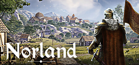
Lead your noble family in this medieval colony sim, facing off against class conflict, religious struggle, and political treachery. Tend to your people’s needs, uncover the lost knowledge of a fallen empire, and engage in nefarious plots against your enemies.

$14.99Very Positive(135)
StrategySimulationCity Builder
Long JauntJul 18, 2024

Norland scores 65/100 — better than 11% of Steam capsules we've analysed (n=22,658).

Very Positive (135 reviews) · $14.99 · Released Jul 18, 2024 · By Long Jaunt

Quick text summary

Norland scored 65/100 on Steam Analyzer — Solid for a Steam capsule. Top priority fix: [uniqueness_polish] Introduce a visual element that signals Norland's unique noble family or intrigue mechanics, such as a heraldic symbol, a second character in conflict, or a dramatic narrative scene, to differentiate from Manor Lords and generic colony sims.

Capsule scores by dimension

  • Genre Clarity: 7/10 — Medieval colony sim implied well. The armored figure from behind overlooking a medieval settlement with windmills, farms, and stone buildings clearly communicates a medieval strategy or colony-builder genre. The lord-surveying-his-domain pose is a well-established genre visual shorthand for city builders and strategy games. At tiny size the settlement detail is lost, but the armored figure and warm pastoral landscape still read as medieval strategy.
  • Title Readability: 7/10 — Title readable at full, marginal tiny. The word 'Norland' uses a serif medieval-style font positioned in the lower left against a somewhat bright but controlled portion of the image, offering reasonable contrast. At full size it reads cleanly, but at tiny size the decorative letterforms and the competing light values in the background reduce crispness. No outline or drop shadow appears to be reinforcing the title against the varied background, which weakens legibility at small and tiny sizes.
  • Contrast & Color: 6/10 — Warm palette, moderate separation. The golden armor of the central figure separates reasonably well from the blue-green background sky and green fields, but the overall palette is naturalistic and mid-range in value, lacking strong dark-to-light punchy contrast. Against Steam's #1b2838 dark background the capsule's bright daylit sky provides edge contrast, but in a quick scroll the subject doesn't pop sharply. The grayscale test reveals the armored figure and background settlement blend into similar mid-tones at tiny size, reducing silhouette clarity.
  • Uniqueness & Polish: 6/10 — Competent but generic execution. The render quality is solid and the composition reads professionally, but the 'armored figure overlooking settlement' concept is a well-worn trope in the genre, used notably by Manor Lords and similar titles. The scene does not communicate the unique political intrigue, religious conflict, or noble family dynasty mechanics that differentiate Norland from competitors. It is polished and competent but does not surface any memorable visual hook or unique selling point.
  • Brand Consistency: 6/10 — Coherent medieval palette, no standout identity. The warm golden tones, soft natural lighting, and medieval architectural style are internally cohesive and likely consistent with in-game visuals. However, there is no distinctive motif, icon, or signature element that would make this capsule immediately recognizable as 'Norland' specifically in a library or wishlist. The presentation is generic enough to be confused with Manor Lords or similar colony sims, limiting brand recall.
  • Composition: 7/10 — Clear focal point, good depth layering. The composition layers foreground armored figure, mid-ground farmland and fencing, and background settlement and mountains effectively, creating genuine depth. The central figure anchors the eye and the title sits in the lower left without competing with the main subject. At small size the figure remains the clear primary focus, though the settlement detail in the upper half competes slightly for attention and the title risks getting lost in the lower-left corner near the edge.

What works

  • Strong depth layering. The foreground lord, mid-ground fields, and background town create convincing three-layer depth that communicates scale and world.
  • Clear medieval genre signaling. The armored figure and visible settlement with windmills and timber buildings immediately read as medieval strategy or colony sim.
  • Polished render quality. The 3D render or illustration is clean and professional, avoiding the cheap asset-flip look common in early access strategy titles.
  • Subject-background color contrast. The warm golden armor against the cooler blue sky provides enough value separation for the figure to read at small capsule size.

What hurts the capsule

  • Generic 'lord overlooking settlement' concept. This exact visual trope is used by Manor Lords and several other colony sims, making Norland visually indistinct from direct competitors.
  • Title lacks reinforcement at tiny size. The 'Norland' wordmark has no visible outline or shadow to separate it from the busy background, causing it to soften and lose crispness at tiny size.
  • No unique gameplay hook visualized. The political intrigue, noble family dynasty, and religious conflict mechanics that differentiate Norland are entirely absent from the visual storytelling.
  • Flat mid-tone palette reduces pop on Steam. The naturalistic daylight palette lacks punchy saturation or strong dark areas that would help it stand out quickly against Steam's dark #1b2838 interface.

Priority fixes

  1. [uniqueness_polish] Introduce a visual element that signals Norland's unique noble family or intrigue mechanics, such as a heraldic symbol, a second character in conflict, or a dramatic narrative scene, to differentiate from Manor Lords and generic colony sims.
  2. [title_readability] Add a subtle dark drop shadow or thin outline to the 'Norland' wordmark so it remains legible against the varied background at small and tiny capsule sizes.
  3. [contrast_color] Darken the lower portion of the image behind the title and figure to create a stronger value anchor, improving both title contrast and silhouette separation against the Steam dark UI.
  4. [brand_consistency] Introduce a recurring brand motif such as a crown, family crest, or heraldic banner that can become a recognizable identity marker across capsule, header, and store page.

Store copy priority fixes

  1. [feature_communication] Add a bullet-point or structured summary of core mechanics (Family Management, Peasant Economy, Knowledge & Research, Diplomacy & War) near the top of the detailed description to help skimmers grasp the system architecture before diving into narrative context.
  2. [hook_strength] Strengthen the short description with a contrasting gameplay hook after the conflict statement—e.g., 'Lead your noble family through medieval intrigue, balancing internal betrayal with external threats' or similar to signal the unique family-vs-world tension earlier.
  3. [genre_clarity] Insert 1–2 sentences early in the detailed description that explicitly state the core gameplay loop (e.g., 'Command your family nobles to manage a city, grow resources, and navigate diplomacy while your peasants rebel, your relatives scheme, and enemies close in') to prevent readers from mistaking this for a pure narrative game.
  4. [audience_targeting] Add a line acknowledging Early Access status and expected development scope (e.g., 'Early Access: Full production includes X, Y, Z' or 'Currently includes core campaign systems with emergent story generation') to set expectations and reassure players about completeness.

Related guides

Steam app ID: 1857090