Scoring genre clarity...

The Perfect Pencil capsule

The Perfect Pencil

The Perfect Pencil is a surreal action platformer where exploration and choice shape everything. Discover hidden paths, meet bizarre characters, and unravel a psychological story filled with bizzare humor.

$17.49Mostly Positive(64)
MetroidvaniaDarkHand-drawn
Studio CimaJan 29, 2026

The Perfect Pencil scores 75/100 — better than 71% of Metroidvania capsules (n=370).

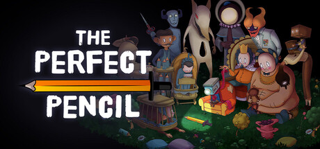
Mostly Positive (64 reviews) · $17.49 · Released Jan 29, 2026 · By Studio Cima

Quick text summary

The Perfect Pencil scored 75/100 on Steam Analyzer — Good for a Metroidvania capsule. Top priority fix: [genre_clarity] Add a subtle UI or environmental detail (e.g., fragmented mind visuals, layered worlds, or puzzle elements) to strengthen the 'surreal psychological platformer' positioning and differentiate from pure whimsy.

Capsule scores by dimension

  • Genre Clarity: 7/10 — Story-driven platformer with surreal tone. The whimsical character assembly on the right and yellow pencil icon on the left effectively signal creative, indie-driven gameplay with an unconventional art style. At tiny size, the pencil silhouette and colorful character cluster read as indie adventure rather than pure action, though the surreal aesthetic hints at narrative depth. Genre messaging is clear but slightly softened by the playful visual tone rather than emphasizing tension or combat.
  • Title Readability: 8/10 — Clean, bold sans-serif hierarchy. THE PERFECT PENCIL uses a strong white sans-serif typeface with excellent contrast against the dark background, split across two lines with strategic placement on the left side. At small size, both words remain legible with good letterform distinction and no decorative loss. At tiny size, the text holds up well due to weight and spacing, though fine details soften slightly—the design prioritizes legibility without relying on serifs or thin strokes.
  • Contrast & Color: 8/10 — Strong value separation and warm accent. White title text pops sharply against the near-black background, and the yellow pencil icon provides warm saturation contrast that draws the eye. The character cluster on the right uses orange, red, and warm brown tones that separate clearly from the dark base, creating depth layering. In grayscale mental test, silhouettes remain distinct; at tiny size, the overall light-dark balance holds and the warm yellow accent remains the primary focus driver.
  • Uniqueness & Polish: 7/10 — Distinctive surreal art with clear identity. The hand-drawn or digitally-painted character aesthetic and the storybook quality of the assembled figures communicate a unique creative vision distinct from typical action platformers. The pencil motif ties directly to the title and thematic premise, showing intentional visual storytelling. However, the execution, while polished, doesn't feel breakthrough—it reads as solid indie craft rather than memorable visual innovation that would stand out at tiny size against COCOON, Chants of Sennaar, or Harold Halibut.
  • Brand Consistency: 7/10 — Coherent surreal palette and character style. Internal consistency is strong: the warm color palette (yellows, oranges, browns, reds), painterly rendering style, and whimsical character design all reinforce a unified art direction. The pencil becomes an iconic motif that ties title, mechanic, and visual metaphor together. Without access to the 15 store screenshots, the visible identity markers (character style, palette warmth, surreal tone) suggest recognizable branding, though confirmation would require extended comparison.
  • Composition: 8/10 — Clear hierarchy with balanced focal balance. The title anchors the left third with strong weight, while the character cluster on the right provides a secondary focal point and fills the frame with visual interest without clutter. The yellow pencil bridges both zones and guides eye movement. At small size, the composition reads clearly with no dead zones; at tiny size, the left-right balance holds and the pencil icon remains a recognizable anchor despite compression.

What works

  • Title legibility across all sizes. White sans-serif with strong weight and spacing maintains readability from full header down to tiny thumbnail without font collapse or illegibility.
  • Cohesive surreal visual identity. Unified art direction, warm palette, and hand-drawn character aesthetic create a distinct and memorable brand presence aligned with story-driven indie positioning.
  • Thematic pencil integration. The yellow pencil icon functions as both title element and thematic anchor, directly supporting the game's core metaphor and creating a recognizable visual symbol.
  • Strong contrast and value separation. Dark background, white text, and warm accent colors create clear visual hierarchy and pop against the Steam dark interface at all viewing scales.

What hurts the capsule

  • Character cluster reads generic at distance. While charming, the assembled characters lack distinct silhouette clarity at tiny size and don't immediately communicate 'surreal psychological platformer' without the pencil context.
  • Limited action or tension signaling. The whimsical, storybook tone may undersell the action platformer and boss battle elements mentioned in the description, risking misaligned audience expectations.
  • No narrative or mechanical hint beyond title. The capsule communicates 'creative indie game' but doesn't visually suggest the psychological depth, narrative drive, or surreal world traversal unique to this title compared to similar genre peers.

Priority fixes

  1. [genre_clarity] Add a subtle UI or environmental detail (e.g., fragmented mind visuals, layered worlds, or puzzle elements) to strengthen the 'surreal psychological platformer' positioning and differentiate from pure whimsy.
  2. [uniqueness_polish] Increase visual distinctiveness by emphasizing a signature visual hook or mechanic (e.g., pencil-drawn world transitions, reality distortion, or iconic character silhouette) that reads at small/tiny size and stands out against comparable indie titles like COCOON or Chants of Sennaar.
  3. [composition] Ensure the character cluster background doesn't crop awkwardly at Steam's standard capsule margins; test against typical horizontal letterbox compression to confirm safe zone integrity.

Store copy priority fixes

  1. [feature_communication] Clarify how the analysis ability works mechanically—e.g., 'Scan enemies and objects to reveal hidden patterns and weaknesses' or 'Use analysis to uncover alternate paths and secret areas,' turning narrative description into actionable gameplay verb.
  2. [hook_strength] Open the short description with a clearer value proposition before the metaphorical hook—e.g., 'Explore a surreal hand-drawn world of psychological terror. The Perfect Pencil is a story-driven action platformer where your choices shape multiple endings and reveal the nature of fear itself.'
  3. [uniqueness] Add a concrete differentiator in the detailed description—e.g., 'Every boss encounter is a manifestation of a core human fear (isolation, failure, identity)' or 'Your choices in dialogue directly alter which psychological manifestations you face,' to separate it from generic indie Metroidvanias.
  4. [feature_communication] Fix the typo 'bizzare' to 'bizarre' in the short description to maintain professional polish.

Related guides

Steam app ID: 1858810 · Tags: Metroidvania, Dark, Hand-drawn, Story Rich, Psychological