Scoring genre clarity...

Mutant Karate Canary capsule

Mutant Karate Canary

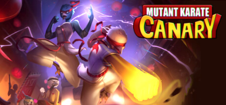
MKC blends 80s and 90s Saturday morning TV show characters with deck-building and turn-based 2d tactics in a classic 1vs1 fight game setting. Play your cards, use your action points efficiently and position your fighter to overcome the odds and defeat your opponent.

Turn-Based StrategyDeckbuildingRoguelike Deckbuilder
Troldkarlens HatTo be announced

Mutant Karate Canary scores 72/100 — better than 44% of Steam capsules we've analysed (n=22,658).

Released To be announced · By Troldkarlens Hat

Quick text summary

Mutant Karate Canary scored 72/100 on Steam Analyzer — Good for a Steam capsule. Top priority fix: [genre_clarity] Introduce a subtle card or strategic UI element such as floating cards or a tactical grid overlay in the background to signal the deck-building and turn-based mechanics without disrupting the action energy.

Capsule scores by dimension

  • Genre Clarity: 7/10 — Action fighter genre reads clearly. The two anthropomorphic characters in fighting stances, karate uniforms with red accents, and a glowing energy kick communicate action-brawler clearly. At small size the martial arts pose of the foreground bird character with the yellow energy burst is readable and implies combat. However the deck-building and turn-based tactics layer is completely invisible from the art, which may mislead players expecting a pure action game.
  • Title Readability: 8/10 — Bold logo reads well at most sizes. The title 'MUTANT KARATE CANARY' uses a bold, chunky font with a red filled block style and a dark outline, positioned in the top-right on a relatively controlled dark background area. At full size it reads immediately and clearly. At tiny size 'CANARY' in the larger bottom line remains readable due to its size and contrast, while 'MUTANT KARATE' above it becomes harder to parse but is still roughly legible as two words.
  • Contrast & Color: 7/10 — Strong foreground character separation. The foreground canary character in cream and white tones with a glowing yellow energy burst creates strong separation against the darker mid-toned purple-green background. The blue character in the upper left has decent contrast against the murky background. In grayscale the foreground figure still reads well due to the luminous yellow energy element. The background crowd and environment are dark and mid-toned enough not to compete, though the overall scene is slightly muddy in the mid-register at tiny size.
  • Uniqueness & Polish: 7/10 — Charming style but genre hook missing. The Saturday morning cartoon aesthetic with anthropomorphic mutant fighters is genuinely distinctive and the art style has personality and polish that sets it apart from generic indie capsules. The foreground character's dynamic kick pose with the energy blast is well-executed and eye-catching. However the deck-building and tactics angle, which is the true unique selling point of the game, is entirely absent from the visual, making it feel like a generic brawler capsule rather than communicating the game's actual hook.
  • Brand Consistency: 7/10 — Cohesive cartoon fighter identity. The capsule has a coherent internal identity: consistent cel-shaded rendering style, a unified palette of warm creams, reds, and cool blues with energetic accent lighting, and a clear Saturday morning cartoon aesthetic throughout. The red bandana and uniform accents are repeated across both characters, reinforcing a team or brand motif. The bold chunky logo treatment matches the energetic action tone of the characters and feels like a deliberate design choice rather than an afterthought.
  • Composition: 7/10 — Dynamic pose with clear focal hierarchy. The large foreground canary character in a kicking pose anchors the lower center-left as the clear primary focal point, with the glowing yellow energy on the foot acting as a natural eye draw. The blue character in the upper left provides depth and secondary interest without competing. The title logo in the upper right balances the composition diagonally. At small and tiny sizes the main character silhouette still dominates and the logo holds its position, though the background crowd elements become noise that slightly muddies the lower portion.

What works

  • Dynamic kick pose anchors composition. The foreground canary's energy-charged kick creates an immediate action read with the glowing yellow burst acting as a natural focal magnet even at tiny size.
  • Distinctive cartoon art style. The cel-shaded Saturday morning aesthetic with anthropomorphic characters is genuinely differentiated from the typical indie action capsule and communicates personality instantly.
  • Bold logo with strong contrast. The chunky red and white title with dark outline sits on a controlled dark background region and remains legible at small sizes.
  • Coherent color palette and character theming. Red bandana and uniform accents are shared across both characters, creating a unified visual language and repeatable brand identity.

What hurts the capsule

  • Genre mismatch with actual gameplay. The capsule reads as a pure action brawler but the game is actually a deck-building turn-based tactics game, which risks attracting the wrong audience and disappointing buyers.
  • Muddy mid-tones in background. The background crowd and environment blend into a dark murky mass at small and tiny sizes, reducing overall depth and making the scene feel slightly cluttered.
  • No tactics or card-game visual cue. There is zero visual reference to the deck-building or strategic gameplay layer, which is the game's primary differentiator from other action titles.
  • Blue character lacks silhouette clarity at tiny size. The upper-left blue character blends partially into the dark purple background at tiny size, weakening the sense of a multi-character ensemble.

Priority fixes

  1. [genre_clarity] Introduce a subtle card or strategic UI element such as floating cards or a tactical grid overlay in the background to signal the deck-building and turn-based mechanics without disrupting the action energy.
  2. [contrast_color] Increase background-to-character edge contrast for the blue character in the upper left by adding a subtle rim light or darker vignette behind them to preserve their silhouette at tiny size.
  3. [uniqueness_polish] Add a brief visual tagline or iconographic callout that hints at the card or tactics layer, differentiating MKC from a generic brawler in the crowded action-indie space.
  4. [composition] Darken and simplify the lower background crowd area to reduce noise and let the primary foreground character read more cleanly at small and tiny sizes.

Store copy priority fixes

  1. [feature_communication] Restructure the features section into a bullet-point list: 'Fuse cards into devastating combos,' 'Position strategically to gain advantage,' 'Explore South Town and unlock new cards,' 'Master turn-based tactics in 1v1 fights.' This will dramatically improve scannability and clarity.
  2. [hook_strength] Strengthen the opening hook by leading with an action verb: 'Master deck-building and turn-based tactics as a martial artist canary in a retro 80s/90s action-packed South Town.' This leads with the player's agency, not the game's premise.
  3. [audience_targeting] Add explicit audience signals: 'Perfect for fans of tactical deckbuilders and roguelike card games' or 'Single-player, roguelike run structure with replayable deck combinations.' This helps the right player self-identify.
  4. [tone_match] Reframe the crime-fighting narrative summary to match the campy tone: Replace the earnest 'organized crime ring' language with playful language that echoes the absurdist Saturday morning TV vibe established in the opening.

Related guides

Steam app ID: 1870800