Scoring genre clarity...

Clair Obscur: Expedition 33 capsule

Clair Obscur: Expedition 33

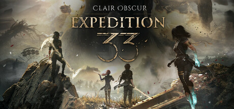
Lead the members of Expedition 33 on their quest to destroy the Paintress so that she can never paint death again. Explore a world of wonders inspired by Belle Époque France and battle unique enemies in this turn-based RPG with real-time mechanics.

$39.99Overwhelmingly Positive(2,055)
Turn-Based CombatStory RichFantasy
Sandfall InteractiveApr 24, 2025

Clair Obscur: Expedition 33 scores 75/100 — better than 71% of Turn-Based Combat capsules (n=1,071).

Overwhelmingly Positive (2,055 reviews) · $39.99 · Released Apr 24, 2025 · By Sandfall Interactive

Quick text summary

Clair Obscur: Expedition 33 scored 75/100 on Steam Analyzer — Good for a Turn-Based Combat capsule. Top priority fix: [title_readability] Increase the size and contrast of the 'CLAIR OBSCUR' subtitle text, or integrate it more boldly into the logo lockup so it survives at small capsule size.

Capsule scores by dimension

  • Genre Clarity: 7/10 — RPG party adventure implied clearly. Three heroic silhouettes standing on a clifftop against a dramatic sky with fantastical floating structures communicates an adventure or RPG tone effectively at full size. At small size the trio of characters still reads as a party-based game, suggesting RPG or action-adventure. At tiny size the silhouettes merge and the genre cue becomes vague, losing the specific turn-based or Belle Époque flavor entirely.
  • Title Readability: 7/10 — Logo reads well at mid size. The title 'CLAIR OBSCUR: EXPEDITION 33' uses a clean serif-adjacent typeface with good letter spacing, placed in the upper center against a relatively controlled sky region. At small size 'EXPEDITION 33' remains legible due to its large display size and the bold stylized numeral treatment, while 'CLAIR OBSCUR' in smaller caps above it becomes harder to parse. At tiny size only the large '33' numeral survives as a recognizable mark, which actually functions as a decent brand anchor even if full title is unreadable.
  • Contrast & Color: 7/10 — Warm tones separate from Steam dark BG. The golden-amber atmospheric lighting and pale sky gradient contrast reasonably well against Steam's dark #1b2838 background, giving the capsule a warm glow that pops on the platform. The three character silhouettes are dark against a lighter sky midground, providing clean silhouette separation in grayscale. However, the overall palette is mid-tone and desaturated in large areas, and the rocky foreground blends into the Steam dark background at the bottom edge, slightly weakening the lower boundary definition at tiny size.
  • Uniqueness & Polish: 8/10 — Distinctive art direction, high craft. The composition has a cinematic quality with strong environmental storytelling — the floating ruined structures, the warm atmospheric haze, and the three distinct character silhouettes suggest a world with a unique visual identity. The stylized '33' numeral integrated into the title treatment is a memorable and distinctive design choice that sets it apart from generic RPG capsules. Compared to benchmark titles like Sea of Stars or Eiyuden Chronicle, this capsule feels more premium and artistically confident, though it stops short of the icon-level impact of Black Myth: Wukong or Helldivers 2.
  • Brand Consistency: 8/10 — Coherent identity with strong motif. The warm amber and teal atmospheric palette, the fantastical Belle Époque-inspired environment with floating ruins, and the stylized '33' motif combine to form a recognizable internal identity that coheres well as a single brand impression. The character silhouettes are distinct enough to serve as recurring visual anchors. The art direction feels consistent with a high-production RPG and the '33' numeral functions as a memorable emblem that could carry brand recognition across marketing assets.
  • Composition: 8/10 — Strong cinematic hierarchy and depth. The composition uses a clear three-layer depth structure — dark rocky foreground, lit character group in the midground, and dramatic sky with floating structures in the background — creating a strong sense of scale and narrative weight. The title sits centered in the upper portion against the cleaner sky region, keeping it readable, while the characters anchor the lower two-thirds. At small size the focal triangle of three characters and the title block both remain legible, though at tiny size the composition compresses and the characters lose individual distinction, leaving mostly the title and atmospheric glow as primary read elements.

What works

  • Memorable '33' numeral device. The stylized large numeral integrated into the title treatment acts as a distinctive brand mark that remains recognizable even when full title text collapses at tiny size.
  • Strong cinematic depth layering. The foreground rock, midground character trio, and background floating ruins create a convincing sense of scale and world-building that reads well at full and small size.
  • Warm palette pops against Steam dark UI. The golden-amber atmospheric glow creates immediate value contrast against Steam's #1b2838 dark background, making the capsule stand out in a scroll.
  • Distinct character silhouettes suggest party RPG. Three visible hero figures in varied poses communicate a party-based RPG concept clearly at full and small viewing sizes.

What hurts the capsule

  • 'CLAIR OBSCUR' subtitle is too small. The smaller caps text above 'EXPEDITION 33' becomes unreadable at small size and completely invisible at tiny size, losing half the game title in practical browsing conditions.
  • Bottom edge bleeds into Steam background. The dark rocky foreground has no clear boundary separation from the Steam dark UI, making the capsule feel like it dissolves into the page rather than sitting as a defined card.
  • Genre ambiguity at tiny size. At tiny size the turn-based RPG and Belle Époque identity cues disappear entirely, leaving only a generic fantasy adventure impression that does not differentiate the game.
  • Mid-tone desaturation reduces punch in quick scroll. Large areas of the image are muted amber-grey which, while atmospheric, reduces the immediate visual impact compared to high-saturation benchmark capsules like Diablo IV or Metaphor: ReFantazio.

Priority fixes

  1. [title_readability] Increase the size and contrast of the 'CLAIR OBSCUR' subtitle text, or integrate it more boldly into the logo lockup so it survives at small capsule size.
  2. [contrast_color] Add a subtle dark vignette or ground shadow along the bottom edge to create clear separation between the capsule art and Steam's dark UI background.
  3. [genre_clarity] Introduce a small but legible genre-specific visual cue — such as a glowing weapon, stylized UI element, or Belle Époque motif — that survives at small size to reinforce the RPG identity.
  4. [uniqueness_polish] Increase overall saturation or add a more distinctive color accent to compete with high-saturation benchmark capsules during quick-scroll browsing on Steam.

Store copy priority fixes

  1. [feature_communication] Move the Digital Deluxe Edition details below the main game pitch, or create a separate expansion section. Lead with "About the Game" to front-load gameplay and narrative hooks.
  2. [audience_targeting] Add one sentence explicitly mentioning adjustable difficulty and accessibility features (Adjustable Text Size, Subtitle Options, Custom Volume Controls) to signal this is welcoming to diverse player skill levels and needs.
  3. [uniqueness] Expand the companion recruitment mechanic with a specific example: 'Recruit creatures of legend as companions to unlock new travel methods—explore previously inaccessible areas and uncover hidden quests.' This clarifies the gameplay loop impact.
  4. [feature_communication] Add a brief sentence explaining progression depth: 'Develop character builds through multiple gear loadouts, skill trees, and party synergies to adapt to enemy weaknesses and playstyle.' This answers 'how deep is the character building?'

Related guides

Steam app ID: 1903340 · Tags: Turn-Based Combat, Story Rich, Fantasy, Great Soundtrack, RPG