Scoring genre clarity...

Killer Frequency capsule

Killer Frequency

Killer Frequency is a first-person horror puzzle game set in 1987, that puts you in the role of a late-night radio talk show host in small town America whose callers are being stalked by a mysterious killer.

$4.99Very Positive(64)
HorrorAdventurePuzzle
Team17Jun 1, 2023

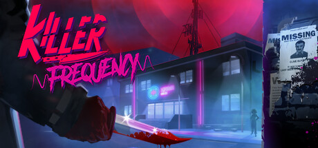
Killer Frequency scores 77/100 — better than 87% of Horror capsules (n=3,136).

Very Positive (64 reviews) · $4.99 · Released Jun 1, 2023 · By Team17

Quick text summary

Killer Frequency scored 77/100 on Steam Analyzer — Good for a Horror capsule. Top priority fix: [genre_clarity] Consider adding a subtle radio microphone or booth element in the hand or foreground to communicate the talk show host mechanic and distinguish it as a simulation-horror hybrid rather than pure action-horror.

Capsule scores by dimension

  • Genre Clarity: 7/10 — Horror thriller with retro setting. The neon-soaked 1987 aesthetic, blood-red knife, radio tower silhouette, and dark moody atmosphere immediately signal horror. The first-person perspective and radio booth environment are less obvious at tiny size, but the knife and neon pink/red color palette strongly communicate a dark thriller. At tiny size the horror genre reads clearly, though the radio talk show host mechanic is not visually apparent without prior knowledge.
  • Title Readability: 8/10 — Bold neon logo, excellent contrast. KILLER FREQUENCY uses a striking bright magenta/neon pink serif font with clean letterforms that maintain legibility at small size. The title sits strategically in the upper left on a dark background region, ensuring it does not compete with the busy scene behind it. Even at tiny size the word KILLER reads clearly due to high saturation and weight, though FREQUENCY becomes slightly softer but remains identifiable.
  • Contrast & Color: 8/10 — Strong neon-dark value separation. The bright magenta/pink title and red knife create excellent pop against the dark blue-purple background and Steam dark theme #1b2838. Neon highlights on the building and red blood trail provide secondary luminous elements that guide the eye. In grayscale the value range is strong—bright neon remains distinct from dark shadows—and the silhouette of the knife and building edges read cleanly at all sizes.
  • Uniqueness & Polish: 8/10 — Distinctive synthwave aesthetic, high craft. The 1987 synthwave visual language with neon signage, blood-red color accents, and retrofuturistic architecture feels intentional and genre-specific rather than generic. The hand reaching for a knife and the detailed building environment show strong art direction and visual storytelling that communicates danger and mystery. This exceeds baseline competence and feels premium; the neon aesthetic and horror-thriller mood are cohesive and memorable.
  • Brand Consistency: 7/10 — Consistent synthwave palette, recognizable. The dominant neon pink, deep blues, reds, and dark purples form a cohesive and instantly recognizable palette that signals the game's identity. The radio tower and neon signage are thematic brand elements tied to the 1987 radio host setting. While not featuring a repeating iconic character or symbol across store screenshots, the synthwave aesthetic and color vocabulary are strong enough to be recognizable as Killer Frequency's visual identity.
  • Composition: 8/10 — Clear focal hierarchy, balanced layout. The hand and knife in the foreground left-center create a strong primary focal point, while the neon-lit building and tower provide supporting depth in the midground and background. The title occupies the upper left in a safe margin without crowding edges, and the composition layers foreground, midground, and background effectively. At tiny size the knife silhouette and neon glow remain the primary read; no elements compete equally for attention.

What works

  • Neon title with excellent legibility. Bright magenta KILLER FREQUENCY logo maintains clean readability even at tiny thumbnail size due to high saturation, weight, and strategic placement on dark background.
  • Strong contrast and visual pop. Neon highlights, blood-red knife, and dark background create excellent value separation that reads clearly against Steam dark theme and in quick scroll contexts.
  • Cohesive synthwave aesthetic. Consistent neon palette, 1987 architecture, and horror-thriller mood create a distinctive and memorable visual identity that feels premium and intentional.
  • Clear focal point hierarchy. Hand and knife in foreground lead the eye naturally, with supporting environmental depth preventing scattered attention or dead zones.

What hurts the capsule

  • Radio talk show host role not visually apparent. The first-person perspective and radio booth setting are key mechanics but are not clearly communicated at small or tiny size; the imagery reads primarily as horror-thriller.
  • Dense background detail at small sizes. The busy neon-lit building, multiple windows, and signage in the background can become slightly muddy at small sizes, though the primary knife and title remain clear.

Priority fixes

  1. [genre_clarity] Consider adding a subtle radio microphone or booth element in the hand or foreground to communicate the talk show host mechanic and distinguish it as a simulation-horror hybrid rather than pure action-horror.
  2. [composition] Verify that no critical detail (knife, building edge, title tail) sits within Steam's typical edge crop zone; test at mobile/small capsule aspect ratios to confirm resilience.

Store copy priority fixes

  1. [hook_strength] Lead the short description with the radio-host decision-making hook rather than just naming the premise: 'Every phone call during your overnight shift could be someone's last—solve puzzles and make split-second decisions to save your callers from a mysterious killer stalking Gallows Creek.'
  2. [feature_communication] Add one sentence briefly describing what 'satisfying riddles' entail (e.g., 'decode caller clues, piece together suspect information, or unlock radio station tools') to give players clearer expectations of puzzle types.
  3. [uniqueness] Strengthen the uniqueness section by explicitly stating what makes this different from typical point-and-click adventures: 'Unlike traditional adventure games, you never see the killer or victims—all action unfolds through dialogue and your investigative decisions in real time.'

Related guides

Steam app ID: 1903620 · Tags: Horror, Adventure, Puzzle, Interactive Fiction, 1980s