Scoring genre clarity...

BattleSage capsule

BattleSage

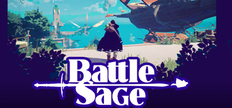
BattleSage is a 3rd person single player Flight Action Adventure game. An adventure set in a vertical world filled with floating villages, towns and temples Along the way, you will meet friends and enemies and puzzles will challenge you to gain more mastery of your flying skills.

ActionFlightAction-Adventure
TovenaarTo be announced

BattleSage scores 60/100 — better than 0% of Steam capsules we've analysed (n=22,658).

Released To be announced · By Tovenaar

Quick text summary

BattleSage scored 60/100 on Steam Analyzer — Solid for a Steam capsule. Top priority fix: [genre_clarity] Add a visible dynamic element such as the character mid-flight, magical effects, or an enemy encounter to communicate action-adventure gameplay and justify the 'Battle' in the title

Capsule scores by dimension

  • Genre Clarity: 6/10 — Fantasy adventure, genre somewhat ambiguous. The cloaked character viewed from behind, a floating airship in the upper right, and a bright fantasy landscape with a tower suggest an adventure or RPG setting. The airship hints at flight mechanics but this is not immediately obvious at tiny size. At tiny size the scene reads as a generic fantasy third-person adventure with no clear combat or action cues despite the 'Battle' in the title.
  • Title Readability: 7/10 — Bold logo reads well at small size. The title 'BattleSage' uses a large bold white serif-style font with a bright purple-blue glow and dark outline, placed over a dark lower band that creates strong contrast. The sword-and-arrow motif flanking the text adds visual interest. At small size the title remains readable, but at tiny size the decorative sword/arrow elements dissolve and only the core wordmark survives, which is acceptable.
  • Contrast & Color: 6/10 — Title pops but midtones compete. The lower purple gradient band creates a strong base for the white title text, which pops well against the Steam dark background. However, the main character is dark against a mid-brightness teal-blue background, creating limited silhouette separation in the midground. In a grayscale mental test, the character blends somewhat into the scene, reducing focal clarity at small and tiny sizes.
  • Uniqueness & Polish: 5/10 — Competent but generic indie feel. The art style is clean and appealing with a stylized low-poly aesthetic, and the floating airship adds a distinctive world-building element. However the composition of a cloaked figure viewed from behind in a fantasy landscape is extremely common in indie capsule art, and the overall execution feels template-adjacent rather than distinctive. Compared to top-performing capsules in the genre, there is no standout visual hook or memorable identity element that differentiates this from dozens of similar offerings.
  • Brand Consistency: 6/10 — Coherent palette, limited identity hooks. The teal-blue sky, warm orange airship accent, dark foliage silhouettes, and purple title treatment form a reasonably cohesive palette. The title logo with its glow and sword motif is a recognizable identity element. However there is no iconic character face, symbol, or motif that would make this instantly recognizable in a sequel or franchise context, keeping brand memorability at a baseline level.
  • Composition: 6/10 — Clear zones but focal point weak. The image is divided into a scenic upper two-thirds and a title-dominant lower third, which is a functional layout. The cloaked character sits roughly center-frame but is small relative to the overall image area, making them a weak focal point especially at small and tiny sizes where they nearly disappear. The dark leaf silhouettes in the foreground add depth layering but also obscure the lower scene and compete with the title area at small sizes.

What works

  • Title contrast is strong. The purple-blue glow and white letterforms on a dark gradient band ensure the 'BattleSage' wordmark remains legible at small size against the Steam dark background.
  • Floating airship adds world flavor. The airship in the upper right immediately signals a fantasy flight-adventure world and differentiates the setting from purely ground-based RPGs.
  • Layered depth creates visual interest. Dark foreground foliage, bright midground landscape, and sky background create a three-layer depth stack that gives the image a polished, scene-like quality at full size.

What hurts the capsule

  • Character silhouette is too small and dark. The cloaked protagonist is small relative to the canvas and blends into the mid-tone background, nearly disappearing at tiny size and failing to establish a memorable character identity.
  • Generic back-of-character composition. A lone figure viewed from behind in a fantasy landscape is one of the most overused compositions in indie capsule art, reducing uniqueness and recall value.
  • Foreground foliage competes with the title. Dark leaf silhouettes at the bottom corners overlap with the title zone and create visual noise that fragments attention at small and tiny sizes.
  • No clear action or combat visual cue. Despite being an action-adventure with flight mechanics, nothing in the image communicates dynamic action, making the 'Battle' part of the title feel disconnected from the peaceful scene depicted.

Priority fixes

  1. [genre_clarity] Add a visible dynamic element such as the character mid-flight, magical effects, or an enemy encounter to communicate action-adventure gameplay and justify the 'Battle' in the title
  2. [composition] Scale up the protagonist or shift to a more dramatic angle — such as a three-quarter view showing the face or a flight pose — so there is a clear hero focal point visible at tiny size
  3. [contrast_color] Increase value contrast between the character and the background by brightening the character's outfit edges or darkening the sky directly behind them to improve silhouette separation in grayscale
  4. [uniqueness_polish] Introduce a signature visual motif — such as magical runes, floating island silhouettes, or a unique weapon glow — that anchors the capsule to the game's specific world and makes it memorable in a crowded genre

Store copy priority fixes

  1. [feature_communication] Replace 'Puzzles and battles are the two pillars...' with one concrete example of a puzzle (e.g., 'Navigate through a collapsing tower by timing your flight through rotating beams') and one combat example (e.g., 'Duel airborne enemies using spellcasting combos') to ground abstract mechanics.
  2. [hook_strength] Lead the detailed description with 'Experience the fantasy of flight—from the oldest myths to modern superhero dreams, now in your hands' to move the emotional hook earlier and more prominently.
  3. [feature_communication] Delete the trailing 'Find out more about the upcoming puzzles and combat...' and replace it with 2-3 specific sentences describing one puzzle mechanic and one combat scenario so the copy feels complete.
  4. [audience_targeting] Add one sentence early in the detailed description that signals intended audience, e.g., 'Designed for action-adventure fans who love exploration' or 'A colorful, skill-based adventure suitable for teens and adults.'

Related guides

Steam app ID: 1905550