Scoring genre clarity...

Grit and Valor - 1949 capsule

Grit and Valor - 1949

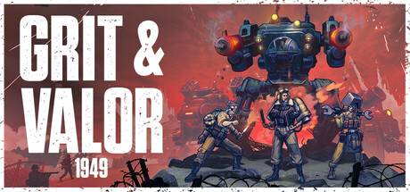
A dieselpunk real-time tactics roguelite set in an alt-history World War 2. Grit and Valor – 1949 puts you in command of an elite Mech Squadron. Think fast and battle the Evil Axis forces to liberate Europe. Upgrade your Mechs and Pilots and develop new strategies to neutralise the enemy HQ!

$10.99Mostly Positive(272)
ControllerMechsReal Time Tactics
Milky Tea StudiosMar 26, 2025

Grit and Valor - 1949 scores 72/100 — better than 44% of Steam capsules we've analysed (n=22,658).

Mostly Positive (272 reviews) · $10.99 · Released Mar 26, 2025 · By Milky Tea Studios

Quick text summary

Grit and Valor - 1949 scored 72/100 on Steam Analyzer — Good for a Steam capsule. Top priority fix: [title_readability] Enlarge or remove the '1949' subtitle, or integrate it more boldly into the main logo so it contributes legibility rather than noise at tiny size.

Capsule scores by dimension

  • Genre Clarity: 8/10 — Dieselpunk mech warfare clear. The large walking mech dominating the center of the image immediately communicates a mechanized military setting, with WWII-era street dressing, soldiers, and enemy banners reinforcing the alt-history war theme. The burning city backdrop and mech walker strongly imply action-strategy or tactics gameplay. At tiny size, the mech silhouette and wartime street still read as a military mech game, though the roguelite and casual elements are not visually communicated.
  • Title Readability: 7/10 — Bold title readable at small size. The title 'GRIT & VALOR' is set in large, bold white serif-adjacent lettering with a gear motif integrated into the logo, positioned in the right half against a relatively clean smoke-and-fire background. At full size it is sharp and well-contrasted. At tiny size the main words 'GRIT & VALOR' remain legible due to their weight and size, though the subtitle '1949' becomes very small and borderline unreadable. The gear icon framing adds character but can merge with the noisy background at small sizes.
  • Contrast & Color: 7/10 — Strong mech silhouette, warm fire contrast. The mech is rendered in dark steely tones that contrast well against the warm orange fire glow and the grey-smoky sky, creating reasonable value separation. Against Steam's dark #1b2838 background the lower edges of the image do risk blending slightly, but the orange fire and bright white title text provide strong anchors. In grayscale the mech silhouette holds up well against the lighter sky, though the lower street scene becomes busy and muddled at tiny sizes.
  • Uniqueness & Polish: 7/10 — Polished dieselpunk alt-history scene. The dieselpunk aesthetic with a WWII alt-history mech walker is a distinctive hook that sets it apart from generic military strategy capsules. The illustration quality is strong with good environmental storytelling — burning city, enemy banners, soldiers — that communicates the game's premise visually. Compared to genre-leading capsules like Armored Core VI or Men of War II it lacks a certain cinematic punch or iconic focal moment, and the composition feels slightly conventional for the subgenre.
  • Brand Consistency: 7/10 — Cohesive dieselpunk identity maintained. The gear motif integrated into the logo, the warm fire palette, and the alt-WWII mech aesthetic form a recognizable internal identity that could be recalled across marketing materials. The dark industrial color grading and the signature mech walker serve as memorable brand anchors. The typography style — bold, distressed white lettering — aligns well with the gritty military tone the title promises, creating a coherent visual language.
  • Composition: 7/10 — Clear focal mech, right-side title balance. The mech occupies the left-center as the primary focal point while the title block anchors the right side, creating a workable two-part split composition. Depth layering is present with soldiers in the foreground, the mech in the midground, and the burning city in the background. At small and tiny sizes the mech silhouette remains the dominant visual element and the title stays in readable territory, though the street-level detail in the lower third becomes clutter that competes slightly with the primary subject at reduced sizes.

What works

  • Distinctive mech silhouette. The walking mech walker is immediately recognizable at small sizes and communicates the core fantasy of the game without needing text.
  • Strong warm-cool contrast. The orange fire glow against the grey smoky sky creates natural value separation that helps the image pop on Steam's dark background.
  • Integrated gear logo motif. The gear framing around the title adds thematic cohesion and gives the brand a recognizable icon that reinforces the mechanical theme.
  • Environmental storytelling. Enemy banners, soldiers, and burning streets communicate the alt-history WWII setting quickly without relying solely on text.

What hurts the capsule

  • Subtitle '1949' nearly unreadable at tiny size. The small year subtitle below the main title collapses to illegibility at thumbnail sizes and adds visual noise without contributing at small scale.
  • Lower street scene becomes cluttered. The busy foreground with soldiers, a car, and street debris competes with the primary mech subject at reduced sizes and muddies the read.
  • Genre ambiguity between action and strategy. While the mech and military setting read clearly, there is no visual cue distinguishing this as a tactics/roguelite game versus an action shooter at tiny size.
  • Mech partially merges with dark lower frame. The lower legs of the mech blend into the dark street at the bottom edge, weakening the silhouette separation against Steam's dark background.

Priority fixes

  1. [title_readability] Enlarge or remove the '1949' subtitle, or integrate it more boldly into the main logo so it contributes legibility rather than noise at tiny size.
  2. [composition] Darken or simplify the lower foreground street clutter to reduce competition with the mech as the singular focal point at small sizes.
  3. [contrast_color] Add a subtle rim light or edge glow to the mech's lower body and legs to separate it cleanly from the dark street at the bottom of the frame.
  4. [genre_clarity] Introduce a subtle tactical UI element or visual cue — such as a command indicator, hex overlay, or squad markers — to hint at the strategy roguelite layer beyond pure action.

Store copy priority fixes

  1. [hook_strength] Remove 'BEST STRATEGY GAME' from the opening and replace with a specific gameplay distinction or emotional pitch (e.g., 'command mechs in real-time chaos while the clock ticks toward final victory').
  2. [feature_communication] Add one concrete tactical example to the deployment section, such as 'Position Mechs on high ground to gain fire advantage, or flank enemies through the fog to disrupt their formations'.
  3. [audience_targeting] Insert a short sentence acknowledging difficulty accessibility or playstyle (e.g., 'Adjustable difficulty lets you focus on story or strategy at your own pace') to align with the Casual tag and family-friendly categories.
  4. [uniqueness] Add a differentiating sentence about what sets this game apart mechanically or narratively, such as 'Randomized pilot abilities and procedural boss patterns ensure no two runs feel identical' or a comparison to comp titles.

Related guides

Steam app ID: 1911860