Scoring genre clarity...

Chants of Sennaar capsule

Chants of Sennaar

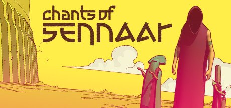
In this award-winning puzzle adventure game, play as the Traveler on a quest to reunite the Peoples of the Tower. Observe, listen, and decipher ancient languages in a fascinating universe inspired by the Myth of Babel.

$9.99Overwhelmingly Positive(583)
PuzzleAdventureSingleplayer
RundiscSep 5, 2023

Chants of Sennaar scores 75/100 — better than 70% of Puzzle capsules (n=4,501).

Overwhelmingly Positive (583 reviews) · $9.99 · Released Sep 5, 2023 · By Rundisc

Quick text summary

Chants of Sennaar scored 75/100 on Steam Analyzer — Good for a Puzzle capsule. Top priority fix: [genre_clarity] Introduce a subtle visual cue referencing language or symbols, such as a faint glyph or rune overlay near the figures, to hint at the puzzle-deciphering mechanic without breaking the aesthetic.

Capsule scores by dimension

  • Genre Clarity: 6/10 — Adventure mood, genre ambiguous. The two robed figures in a desert setting with ancient architecture in the background suggest a narrative adventure or exploration game, but at tiny size the genre could read as walking sim, puzzle, or even RPG. The stylized illustration style hints at indie adventure, but nothing explicitly communicates the language-deciphering puzzle mechanic that defines the game. At tiny size you can tell it is an atmospheric adventure but subgenre remains unclear.
  • Title Readability: 7/10 — Readable full size, strains tiny. The custom geometric font for 'Chants of Sennaar' is distinctive and reads clearly at full header size with good dark brown letterforms against the bright yellow background. At small capsule size the title still holds together reasonably well, but at tiny thumbnail size the angular letterforms in 'Sennaar' begin to blur and individual characters become hard to distinguish. The two-line stacking helps preserve readability across sizes.
  • Contrast & Color: 8/10 — Bold yellow pops against Steam dark. The saturated warm yellow background creates exceptional contrast against Steam's dark #1b2838 background, making this capsule immediately eye-catching during a quick scroll. The dark silhouettes of the two robed figures separate cleanly from the bright sky, and the magenta-pink accents on their robes add additional visual pop. In grayscale the value separation between figures and background remains strong, though the mid-ground details lose some clarity at tiny size.
  • Uniqueness & Polish: 8/10 — Distinctive illustration style and palette. The flat cel-shaded illustration style with bold outlines and a limited warm palette is immediately distinctive in the indie adventure space and feels cohesive and intentional. The custom angular logo font reinforces the ancient-language theme and gives the title a unique identity hook. Compared to genre peers like Jusant or The Invincible, this capsule has a stronger visual identity and more memorable color signature, though it does not explicitly tease the core puzzle mechanic.
  • Brand Consistency: 9/10 — Cohesive identity, strong internal harmony. The warm yellow and magenta palette, flat cel-shaded illustration style, and custom geometric typeface form a tight, recognizable visual system that would be immediately identifiable across store assets. The robed figure motif and ancient desert architecture reinforce the Babel-myth theme consistently. The art direction feels purposeful and unified, with no competing styles or mismatched elements, creating a strong brand identity that would carry across screenshots and promotional materials.
  • Composition: 7/10 — Clear focal hierarchy, minor edge tension. The large robed figure anchored to the right edge creates a strong primary focal point, while the smaller figure in the center-left provides depth and narrative intrigue, guiding the eye across the image. The title occupies the upper-left quadrant cleanly against open sky, avoiding competition with the figures. At small size the right-edge cropping of the large figure introduces slight tension, and the ancient ruins on the far left may be clipped, but the core composition remains legible and effective.

What works

  • Exceptional color contrast against Steam. The saturated yellow background immediately separates this capsule from Steam's dark UI, ensuring high visibility during quick browsing.
  • Distinctive custom typography. The angular geometric font for 'Sennaar' ties directly to the ancient-language theme and is memorable and unique among indie adventure titles.
  • Strong silhouette readability. The dark robed figures against the bright yellow sky read as clean, legible silhouettes even at tiny thumbnail size.
  • Cohesive art direction. The flat cel-shaded style, limited palette, and consistent line work create a polished and unified visual identity throughout the capsule.

What hurts the capsule

  • Genre ambiguity at tiny size. Nothing in the visual explicitly signals the language-puzzle mechanic, making genre identification rely entirely on atmosphere rather than gameplay cues.
  • Title letterforms blur at tiny size. The angular custom font becomes difficult to parse at 120x45 pixels, particularly the 'Sennaar' wordmark with its geometric characters.
  • Right figure cropped at edge. The large robed figure is anchored very close to the right edge, risking awkward cropping in certain capsule aspect ratios on Steam.
  • Puzzle mechanic not communicated. The image reads as a cinematic adventure rather than hinting at the deciphering and language puzzle gameplay that differentiates the title.

Priority fixes

  1. [genre_clarity] Introduce a subtle visual cue referencing language or symbols, such as a faint glyph or rune overlay near the figures, to hint at the puzzle-deciphering mechanic without breaking the aesthetic.
  2. [title_readability] Add a very subtle dark outline or shadow to the title letterforms to improve separation and legibility when the capsule is viewed at tiny thumbnail size.
  3. [composition] Shift the large right-hand figure slightly inward to reduce edge tension and ensure the full silhouette survives cropping across all Steam capsule formats.
  4. [genre_clarity] Consider adding a single recognizable symbol or motif from the in-game language system as a small accent element to anchor the unique premise visually.

Store copy priority fixes

  1. [hook_strength] Move the compelling Babel premise and reunification goal to the opening sentence of the detailed description, ahead of award accolades, to hook players emotionally before establishing critical pedigree.
  2. [feature_communication] Replace 'smart gameplay system' with a concrete example: 'solve language-based puzzles that teach you five distinct symbolic writing systems across the Tower's five floors' or similar.
  3. [audience_targeting] Add an explicit sentence early in the detailed description signalling single-player narrative focus: 'Experience this poetic journey entirely in solo mode, at your own pace, with a rich notebook-driven puzzle system designed for contemplative play.'
  4. [genre_clarity] State point-and-click interaction model explicitly in the first paragraph of detailed description, e.g., 'Explore the Tower using point-and-click discovery, recording symbols in your notebook as you learn each language.'

Related guides

Steam app ID: 1931770 · Tags: Puzzle, Adventure, Singleplayer, Indie, Colorful