Scoring genre clarity...

Stacklands capsule

Stacklands

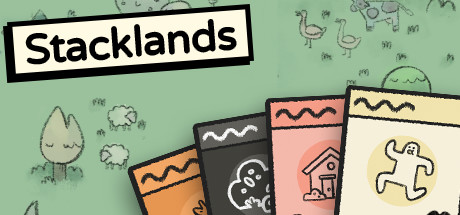
Stacklands is a village builder where you stack cards to collect food, build structures, and fight creatures. 🃏 For example, dragging a Villager card on top of a Berry Bush card will spawn Berry cards which the villagers can eat to survive. 🃏 Play your cards right and expand your village!

$3.99Overwhelmingly Positive(193)
Card GameManagementSurvival
Sokpop CollectiveApr 8, 2022

Stacklands scores 77/100 — better than 77% of Steam capsules we've analysed (n=22,658).

Overwhelmingly Positive (193 reviews) · $3.99 · Released Apr 8, 2022 · By Sokpop Collective

Quick text summary

Stacklands scored 77/100 on Steam Analyzer — Good for a Steam capsule. Top priority fix: [composition] Simplify or darken the background village scene to reduce mid-range noise and push the card cluster forward more clearly as the sole focal point.

Capsule scores by dimension

  • Genre Clarity: 8/10 — Card stacking village builder clear. The fanned card display in the foreground immediately signals a card-based mechanic, while the soft illustrated village scene in the background communicates the settlement-building theme. At tiny size the cards remain recognizable as the core mechanic element even if individual icons on them blur out. The combination of card game and cozy village cues lands the casual simulation genre with reasonable accuracy.
  • Title Readability: 9/10 — Bold boxed title reads at all sizes. The title 'Stacklands' sits in a high-contrast white box with a thick black border in the upper center, creating a clean cutout that pops against the green illustrated background. At small and tiny sizes this boxed treatment preserves legibility because the strong black outline separates it entirely from the busy background. The clean sans-serif letterform holds its shape even at 120x45 pixels.
  • Contrast & Color: 7/10 — Warm cards pop on soft green. The orange, pink, and dark card faces in the foreground create decent contrast against the muted sage-green background scene. Against Steam's dark #1b2838 background the overall image reads well because the card cluster is warm and light. At tiny size the fanned card group retains a clear warm silhouette, though the background illustration loses definition and becomes a flat green wash, which is acceptable.
  • Uniqueness & Polish: 7/10 — Charming handdrawn style stands out. The deliberately lo-fi, doodle-like illustration style is distinctive and consistent with the game's actual aesthetic, making it feel authentic rather than generic. The fanned card mechanic display is a smart visual hook that communicates the core loop directly in the capsule art. Compared to top-tier genre capsules like Balatro or Minami Lane it lacks a single strong focal character or high-impact compositional moment, keeping it from reaching excellent territory.
  • Brand Consistency: 8/10 — Cohesive doodle identity throughout. The hand-drawn wobbly outline style, muted earthy palette, and simple icon language on the cards all feel internally unified and match the game's in-game visual style. The card motif functions as a recognizable brand symbol that would carry across screenshots and other assets. The typography choice of a plain bold boxed font complements the no-frills charming aesthetic rather than fighting it.
  • Composition: 7/10 — Title top, cards bottom, clear split. The composition divides cleanly into a title zone at the top and a card display zone at the bottom, creating a readable two-layer hierarchy. The fanned card arrangement rising from the bottom edge draws the eye upward toward the title in a natural flow. At small size the card group and title block remain the two dominant elements without competing, though the background village scene adds mild visual noise in mid-range viewing.

What works

  • Boxed title treatment. The white-box-with-black-border approach ensures the title reads clearly at every viewing size without relying on background contrast.
  • Cards communicate core mechanic. Showing fanned game cards in the foreground instantly signals the card-stacking gameplay loop as the central identity of the product.
  • Authentic art style cohesion. The doodle illustration style on both the background scene and card icons feels genuinely unified and matches the game's in-engine look.
  • Warm palette separates from Steam dark UI. The orange and pink card faces create enough warmth and value contrast to stand out cleanly against Steam's #1b2838 dark background.

What hurts the capsule

  • Background scene clutters mid-range. The illustrated village background with trees, animals, and grass adds visual noise that competes with the cards at small capsule sizes.
  • No strong single focal character. Unlike top-performing genre capsules that anchor around one memorable character or object, this design distributes attention across four cards and a busy scene.
  • Card icons unreadable at tiny size. The strawberry, cloud, house, and ghost icons on the cards lose all detail at 120x45 pixels, reducing the mechanic storytelling value at the smallest viewing size.
  • Flat depth at small size. The foreground-background separation that reads well at full size collapses into a single busy plane at tiny thumbnail dimensions.

Priority fixes

  1. [composition] Simplify or darken the background village scene to reduce mid-range noise and push the card cluster forward more clearly as the sole focal point.
  2. [genre_clarity] Enlarge one or two hero card icons so at least one card's content remains legible at small capsule size, reinforcing the card-mechanic storytelling.
  3. [contrast_color] Add a subtle vignette or shadow beneath the card cluster to increase separation between the warm foreground cards and the mid-tone green background.
  4. [uniqueness_polish] Consider introducing one recognizable character or creature element from the game overlapping the cards to create a stronger single focal hook comparable to top-tier genre capsules.

Store copy priority fixes

  1. [uniqueness] Add 1-2 sentences explaining how the stacking mechanic creates emergent strategy or why it's more engaging than traditional card games (e.g., 'Every stack decision directly spawns resources, eliminating waiting or RNG randomness').
  2. [feature_communication] Clarify the roguelite loop: does the game reset after completion? Are there unlockables or difficulty modifiers that encourage replays? Add this to justify the 'Roguelite' tag.
  3. [hook_strength] Consider opening with an action verb to strengthen immediate appeal: 'Build your village by stacking cards—drag a Villager onto a Berry Bush to harvest food' emphasizes active agency more than the current neutral opener.

Related guides

Steam app ID: 1948280