Scoring genre clarity...

Whisper Mountain Outbreak capsule

Whisper Mountain Outbreak

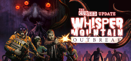
Escape room meets co-op survival horror. The year is 1998, and an ancient curse has been unleashed, trapping everyone on Mount Bisik. Alone or with up to 4 players, you must explore, find clues, figure out a way to escape...and survive the horror.

$6.39Very Positive(34)
Early AccessOnline Co-OpSurvival Horror
Toge ProductionsAug 11, 2025

Whisper Mountain Outbreak scores 70/100 — better than 30% of Steam capsules we've analysed (n=22,658).

Very Positive (34 reviews) · $6.39 · Released Aug 11, 2025 · By Toge Productions

Quick text summary

Whisper Mountain Outbreak scored 70/100 on Steam Analyzer — Good for a Steam capsule. Top priority fix: [title_readability] Increase the size and weight of the OUTBREAK subtitle and add a stronger dark drop shadow or background panel so it remains legible at 120x45 thumbnail size.

Capsule scores by dimension

  • Genre Clarity: 8/10 — Co-op horror survival clear. The looming demonic face with glowing red eyes in the upper left, the group of armed survivor characters in the foreground, and the tentacle elements clearly signal co-op survival horror. At tiny size the horror tone and group of characters still communicate multiplayer action-horror effectively. The 1998 setting and escape-room element are not communicated visually but the core genre is unmistakable.
  • Title Readability: 7/10 — Readable at full, strained at tiny. At full size the white bold blocky lettering of WHISPER MOUNTAIN with the red-outlined subtitle OUTBREAK reads clearly and has decent contrast against the dark background. At tiny size WHISPER MOUNTAIN shrinks significantly and the two-line stacked treatment competes with the character cluster below it, making the subtitle OUTBREAK nearly illegible. The heavy white stroke on the main title helps it survive small sizes better than the subtitle.
  • Contrast & Color: 7/10 — Dark palette with strong accent pops. The overall dark brown and black background provides good separation against the Steam dark UI, and the glowing red eyes and warm orange-yellow lighting on the survivor characters create strong accent focal points. In grayscale the characters maintain reasonable silhouette separation from the background due to the rim lighting effect. At tiny size the mid-dark values of the background and character clothing begin to merge slightly, reducing silhouette crispness.
  • Uniqueness & Polish: 6/10 — Competent but genre-generic execution. The composition of armed survivors backed by a looming monster face is a familiar horror game trope and does not strongly differentiate from other indie horror titles. The art style is competent with decent rendering quality on the characters and atmospheric demon face, but the tentacle elements feel like filler without a clear visual storytelling hook that communicates the escape-room co-op mechanic. Compared to top-tier benchmarks like Lethal Company or Content Warning which have distinctive visual identities, this reads as solid but unremarkable.
  • Brand Consistency: 7/10 — Cohesive dark horror palette identity. The capsule presents a consistent internal art direction with a unified dark atmospheric palette, consistent character rendering style, and a recurring motif of the monstrous glowing-eyed entity as a brand anchor. The red and orange color accents across the logo and character lighting create a recognizable signature. The title treatment with bold blocky white letters and red outline could serve as a consistent brand mark across marketing materials.
  • Composition: 7/10 — Clear hierarchy with minor clutter. The composition uses a strong diagonal split with the monster occupying the upper left and the survivor group anchoring the lower center-right, creating natural visual flow toward the title in the upper right. The title placement on a relatively clean dark area is a smart compositional decision. At small size the three-character group remains a readable focal cluster, though the tentacle details in the lower corners add visual noise that competes with the primary subjects at tiny size.

What works

  • Strong horror mood anchoring. The glowing red-eyed demon face dominates the upper area and immediately establishes a threatening horror atmosphere that is recognizable even at small sizes.
  • Effective survivor character grouping. The trio of armed characters with warm rim lighting creates a clear co-op multiplayer signal and reads as a unified focal cluster at small thumbnail size.
  • Title placement on clean background region. Positioning WHISPER MOUNTAIN OUTBREAK in the upper right against a controlled dark area avoids the noisy texture trap and gives the logo room to breathe.
  • Red eye accent creates memorable brand anchor. The glowing red eyes are a striking visual signature that could function as a recognizable identity element across all store assets.

What hurts the capsule

  • Subtitle OUTBREAK collapses at tiny size. The smaller red-outlined OUTBREAK text becomes nearly unreadable at 120x45 and the two-line title treatment splits reading attention under quick scroll conditions.
  • No visual hook for escape-room mechanic. The unique escape-room meets co-op survival premise is entirely absent from the visual storytelling, making this look like a generic zombie or monster survival game.
  • Tentacle filler adds clutter without narrative. The tentacle elements in the lower corners feel like decorative padding rather than purposeful storytelling and create edge noise that competes with the characters at small sizes.
  • Generic genre execution vs benchmark titles. Compared to top indie peers like Lethal Company or Content Warning the capsule lacks a distinctive visual identity hook that would make it memorable in a crowded horror category.

Priority fixes

  1. [title_readability] Increase the size and weight of the OUTBREAK subtitle and add a stronger dark drop shadow or background panel so it remains legible at 120x45 thumbnail size.
  2. [uniqueness_polish] Introduce a visual storytelling element that hints at the escape-room mechanic, such as a puzzle symbol, glowing clue object, or environmental detail that differentiates it from standard monster survival games.
  3. [contrast_color] Brighten the rim lighting on the foreground survivor characters and add a subtle dark vignette behind them to sharpen silhouette separation from the background at tiny size.
  4. [composition] Reduce or remove the tentacle corner decorations to reduce edge clutter and let the monster face and survivor group read more cleanly as the two primary compositional anchors.

Store copy priority fixes

  1. [uniqueness] Add a concrete puzzle example or mechanic (e.g., 'solve puzzles that require multi-player timing' or 'decipher cryptic clues to unlock escape routes') to justify the 'escape room meets survival horror' claim and differentiate from pure combat roguelikes.
  2. [audience_targeting] Insert a brief statement about solo viability early in detailed description (e.g., 'Whether you're braving Mt. Bisik alone or with friends, the difficulty scales to match your squad size') to signal accessibility for single-player audiences.
  3. [feature_communication] Expand the 'Learn new skills' section to include 1–2 specific examples of class perks or craftable items (e.g., 'craft molotov cocktails or healing salves') to make progression feel concrete rather than abstract.
  4. [hook_strength] Strengthen the opening story paragraph by adding a sensory detail (e.g., 'whispers that drive people mad' or 'creatures that emerge from the fog') to make the horror atmosphere more vivid and emotionally resonant.

Related guides

Steam app ID: 1953230