Scoring genre clarity...

Digimon Story Time Stranger capsule

Digimon Story Time Stranger

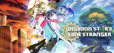
The latest in the Digimon Story series is finally here! In this RPG, unravel a mystery that spans across the human world and the Digital World, collecting and raising a wide variety of Digimon to save the world.

$39.89Very Positive(288)
RPGJRPGCreature Collector
Media.Vision Inc.Oct 2, 2025

Digimon Story Time Stranger scores 67/100 — better than 15% of Steam capsules we've analysed (n=22,658).

Very Positive (288 reviews) · $39.89 · Released Oct 2, 2025 · By Media.Vision Inc.

Quick text summary

Digimon Story Time Stranger scored 67/100 on Steam Analyzer — Solid for a Steam capsule. Top priority fix: [title_readability] Simplify the logo letterforms or increase outline weight to maintain crisp edges and readability at SMALL and TINY sizes without losing brand identity.

Capsule scores by dimension

  • Genre Clarity: 7/10 — Clear RPG with anime identity. The capsule effectively communicates a Japanese anime RPG through character pose, colorful Digimon creatures, and dynamic action composition. At TINY size, the cluster of characters and creatures still reads as a vibrant creature-collecting game, though specific genre mechanics are not immediately obvious without familiarity with the Digimon franchise.
  • Title Readability: 6/10 — Readable but ornate logo. The 'DIGIMON STORY TIME STRANGER' title is placed center-right with a metallic gold stylized font that maintains legibility at full size. At SMALL and TINY sizes, the ornate lettering becomes dense and slightly loses edge clarity, with the tagline becoming unreadable; the core logo remains identifiable but not as crisp as simpler treatments.
  • Contrast & Color: 7/10 — Strong warm-cool separation. The capsule uses a bold split composition with warm orange-red fire effects on the left against a cool blue-green sky and landscape on the right, creating good value separation against the dark Steam background. At TINY size, the color contrast holds and the silhouettes remain distinct, though some mid-tone detail in the character cluster softens slightly.
  • Uniqueness & Polish: 6/10 — Competent anime style, familiar formula. The visual execution is clean with well-rendered characters and creatures in a dynamic group composition, but the overall presentation follows standard anime RPG capsule conventions seen in similar franchises. The dual-world split (destruction left, nature right) is thematic to the game's premise but not visually distinctive enough to stand out against premium RPG benchmarks like Persona 3 Reload or Metaphor.
  • Brand Consistency: 7/10 — Strong Digimon visual identity. The capsule leverages recognizable Digimon character designs, the franchise's signature colorful aesthetic, and the established split-world visual motif consistent with marketing. The metallic gold logo treatment reinforces brand recognition for fans, and the color palette aligns with Digimon's typically vibrant, optimistic tone.
  • Composition: 7/10 — Clear focal point, balanced layout. The centered character cluster serves as the primary focal point with supportive Digimon creatures distributed around them, while the environmental split (fire destruction vs. lush nature) frames the action nicely. The title placement is slightly off-center right, and at SMALL size all elements maintain hierarchy; however, the dense character grouping creates minor visual clutter that could read as busy at TINY sizes.

What works

  • Strong color separation. The warm orange-cool blue split provides excellent contrast against the dark Steam background and maintains silhouette clarity even at tiny thumbnail size.
  • Recognizable franchise cues. Digimon character designs and the dual-world visual motif immediately signal the IP and game's core premise to the target audience.
  • Dynamic composition. The layered character arrangement with foreground, midground, and background elements creates visual depth that guides the eye effectively.

What hurts the capsule

  • Ornate logo loses clarity at scale. The metallic gold stylized font becomes dense and difficult to parse at SMALL and TINY sizes, reducing legibility compared to simpler treatments.
  • Generic anime RPG presentation. While well-executed, the overall visual approach follows familiar anime RPG conventions and does not stand out distinctly against premium genre benchmarks.
  • Dense character clustering. The tight grouping of characters and creatures in the center creates minor visual clutter that may read as busy at thumbnail sizes.

Priority fixes

  1. [title_readability] Simplify the logo letterforms or increase outline weight to maintain crisp edges and readability at SMALL and TINY sizes without losing brand identity.
  2. [uniqueness_polish] Add a distinctive visual hook or signature effect that differentiates this entry from standard anime RPG capsules—consider emphasizing the 'Time Stranger' mechanic or a unique art flourish.
  3. [composition] Reduce character cluster density slightly or rebalance focal point hierarchy to prevent the image reading as visually busy when scaled down to thumbnail size.

Store copy priority fixes

  1. [feature_communication] Move the 'About the Game' section and 'An Epic Story of Connection' paragraphs above the edition descriptions so gameplay and story hook are encountered before SKU options.
  2. [uniqueness] Add a sentence explicitly contrasting this entry to prior Digimon Story games (e.g., 'A new time-travel mystery mechanic redefines the Digimon Story formula by allowing players to alter fate across parallel timelines') to clarify what veteran fans and newcomers should expect differently.
  3. [hook_strength] Rewrite the opening to lead with the time-travel stakes: 'An agent awakens eight years in the past after witnessing a city-leveling explosion—now you must uncover the mystery of the world's collapse by collecting Digimon across two worlds and the timeline itself.'
  4. [tone_match] Inject anime-personality language into edition descriptions (e.g., replace formal bullet points with brief, character-driven flavor text) to align with the cute, anime-forward tag set and appeal to the franchise's fanbase.

Related guides

Steam app ID: 1984270