Scoring genre clarity...

The 9th Charnel capsule

The 9th Charnel

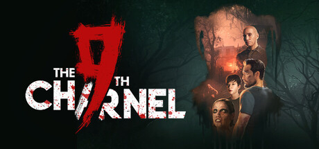
A first-person psychological survival horror game, The 9th Charnel is filled with a rich and frightening atmosphere. While exploring the many mysteries of this world, you must survive- whether you do it through stealth or by using weapons.

$19.99Mostly Negative(19)
Survival HorrorHorrorStory Rich
Saikat DebJan 29, 2026

The 9th Charnel scores 72/100 — better than 55% of Survival Horror capsules (n=1,176).

Mostly Negative (19 reviews) · $19.99 · Released Jan 29, 2026 · By Saikat Deb

Quick text summary

The 9th Charnel scored 72/100 on Steam Analyzer — Good for a Survival Horror capsule. Top priority fix: [brand_consistency] Introduce a distinctive visual motif or character silhouette unique to The 9th Charnel that becomes instantly recognizable and can be carried across marketing materials.

Capsule scores by dimension

  • Genre Clarity: 8/10 — Horror survival clearly communicated. The red slashed '9' logo, dark atmospheric background with silhouetted figures, and eerie green-tinted lighting immediately signal psychological horror and survival themes. At tiny size, the red logo symbol and menacing group composition still read as horror, though specific survival mechanics are not visually explicit. The genre intent is unmistakable even in quick scroll contexts.
  • Title Readability: 7/10 — Title readable with minor weight issues. THE 9TH CHARNEL uses strong white sans-serif lettering on a dark background with the red '9' acting as a visual anchor and breaking up the text block. At small size the title remains legible, though the split treatment with the number in red could risk slight confusion at tiny size if the logo and text are not immediately grasped as unified. The clean typeface and high contrast against #1b2838 supports readability across scales.
  • Contrast & Color: 8/10 — Strong value separation and silhouettes. Bright white typography and the vibrant red logo pop distinctly against the dark teal-green background, creating excellent value separation. The warm orange-amber glow on the character figures in the right side provides depth layering and visual interest without muddying readability. At tiny size, the white text and red accent remain clearly distinguishable and the overall silhouette composition holds cohesion.
  • Uniqueness & Polish: 7/10 — Solid horror presentation, slightly familiar. The capsule demonstrates professional craft with intentional color grading, atmospheric lighting, and a distinctive red slash motif that feels like a branded element. The grouping of shadowed figures evokes psychological horror effectively, though this composition approach is somewhat common in the genre (similar to Lies of P and Hellblade II benchmarks). The work is polished and genre-appropriate but lacks a truly standout hook that would distinguish it from peer titles.
  • Brand Consistency: 6/10 — Consistent atmosphere, limited identity cues. The dark atmospheric aesthetic, green color grading, and red accent motif create internal coherence across the visible capsule. However, without reference to the 8 store screenshots, there are limited iconic character, symbol, or palette markers that would immediately signal The 9th Charnel in a crowded Steam view. The presentation is thematically consistent but does not yet establish a highly recognizable visual identity distinct from other horror titles.
  • Composition: 7/10 — Clear hierarchy with centered focal point. The red '9' logo anchors the left side while the character group occupies the right, creating a natural left-to-right reading flow with the title dominating the visual center. The title placement avoids the very edge and maintains safe margins, though at tiny size the image-heavy right side could feel slightly crowded. Depth layering between the foreground figures, ambient glow, and textured background supports visual clarity and prevents flatness.

What works

  • Strong contrast against Steam background. White title text and red logo symbol create excellent value separation against the dark #1b2838 context, ensuring visibility in quick scroll and at small thumbnail sizes.
  • Professional atmospheric color grading. The teal-green background with warm amber lighting on characters creates a cohesive, premium mood that signals psychological horror effectively without clutter.
  • Red logo acts as visual anchor. The branded '9' in red breaks up the white title block, adds visual interest, and provides a memorable motif that could support brand recognition with repeated exposure.

What hurts the capsule

  • Generic horror composition approach. The silhouetted group of figures in moody lighting is a well-worn trope in horror game marketing that does not immediately distinguish this title from competitors like Resident Evil 4 or Lies of P.
  • Limited iconic character or symbol identity. Beyond the red slash logo, there are no distinctive character designs, mascots, or visual signatures that would make The 9th Charnel instantly recognizable on repeat viewings.
  • Right side figure composition slightly busy at scale. At small and tiny sizes, the grouping of multiple shadowed figures on the right creates mild visual noise and competes slightly with the title for attention.

Priority fixes

  1. [brand_consistency] Introduce a distinctive visual motif or character silhouette unique to The 9th Charnel that becomes instantly recognizable and can be carried across marketing materials.
  2. [uniqueness_polish] Refine the figure composition or add a unique environmental detail (e.g., distinctive architecture, object, or lighting effect) that sets the horror atmosphere apart from genre peers.
  3. [composition] Consider tightening the right-side figure grouping or adjusting spacing to ensure clarity and reduce visual crowding at small and tiny thumbnail sizes.

Store copy priority fixes

  1. [hook_strength] Rewrite the short description to lead with the core conflict or inciting incident—'Stranded in a cursed valley, uncover what happened to your friends while evading unimaginable threats' rather than generic atmosphere promises.
  2. [feature_communication] Add a structured breakdown of the gameplay loop: clearly state whether stealth is primary or co-equal with combat, explain how inventory and puzzle-solving pace progression, and specify mission or chapter structure.
  3. [uniqueness] Replace 'truly unique gaming experience' and similar marketing filler with a concrete differentiator—e.g., 'branching character perspectives' or 'dynamic threat escalation' or whatever mechanically sets this apart from Outlast, Amnesia, or similar titles.
  4. [audience_targeting] Clarify player type: is this for stealth-focused players (like Thief/Hitman fans), story-first narrative players, or action-survival fans? Signal expected playtime, difficulty, and whether replaying with different characters is essential to full story completion.

Related guides

Steam app ID: 2005690 · Tags: Survival Horror, Horror, Story Rich, Atmospheric, Puzzle