Scoring genre clarity...

WARCANA capsule

WARCANA

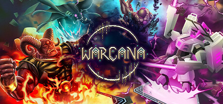
WARCANA is a fantasy inspired base defence, RTS game with a deck-building mechanic. Face hundreds of thousands of unrelenting monsters in a battle royale between 30 other mighty magicians. Build your deck. Prepare your defences. Summon your armies. Survive the onslaught. Be the last one standing.

$4.24Mixed(440)
StrategyCard GameCard Battler
1000 OrksAug 29, 2024

WARCANA scores 65/100 — better than 11% of Steam capsules we've analysed (n=22,658).

Mixed (440 reviews) · $4.24 · Released Aug 29, 2024 · By 1000 Orks

Quick text summary

WARCANA scored 65/100 on Steam Analyzer — Solid for a Steam capsule. Top priority fix: [genre_clarity] Introduce a visible strategic element such as card icons, tower defences, or a battlefield grid as a secondary visual layer to communicate the deck-building base-defence genre at a glance.

Capsule scores by dimension

  • Genre Clarity: 6/10 — Fantasy battle unclear genre signals. The image shows multiple distinct fantasy characters including a demonic warrior with flames on the left, a large floating mage figure in the center-top, and a mechanical golem on the right, suggesting a multi-faction fantasy game. At full size this reads as fantasy combat with possible strategy or card elements implied by the circular logo motif, but at tiny size the multi-character spread collapses into a busy clash of shapes with no clear genre signal. Base defence, deck-building, or RTS are not communicated visually at any size.
  • Title Readability: 7/10 — Title reads at full, fades tiny. WARCANA is rendered in a gold serif-adjacent font with a circular decorative border at center composition, placed on a relatively controlled mid-tone area between the character clusters. At full size it is clearly legible with good contrast against the neutral center region. At tiny size around 120x45 the letterforms compress significantly and the decorative circle border merges with the text, making it harder to parse quickly, though the word shape is still roughly discernible.
  • Contrast & Color: 7/10 — Strong warm-cool split aids pop. The image uses a strong warm-cool color split with red-orange fire on the left and purple-pink energy on the right, which creates good visual energy and pops reasonably well against Steam's dark #1b2838 background. The flame character on the left has strong silhouette separation, and the mechanical golem on the right reads clearly due to the pink glow. In grayscale the center logo area becomes mid-grey and risks blending, and the mage figure at top center is darker and less separated from the background.
  • Uniqueness & Polish: 6/10 — Competent but genre-generic feel. The art style is consistent and polished with a stylized comic or 2D illustrated look across the three featured characters, which is appealing. However the three-characters-clashing composition is a very common template for fantasy strategy games and does not communicate a distinctive selling point like the deck-building or base defence mechanics that make WARCANA unique. Compared to benchmark titles like Balatro or Hades II which have strong signature visual hooks, this reads as competent genre art without a memorable standout idea.
  • Brand Consistency: 7/10 — Cohesive palette and art direction. The three characters share the same stylized illustrated rendering style with bold outlines, saturated glows, and a consistent level of detail, suggesting a unified art direction. The warm-cool color duality and the circular logo motif with its arcane ring design provide a recognizable identity anchor. The combination of the WARCANA wordmark inside the decorative circle could become a recognizable brand symbol across store assets, though the golem's more geometric blocky style is slightly visually distinct from the organic character designs on the left.
  • Composition: 6/10 — Wide spread dilutes focal clarity. The composition spreads three large characters across the horizontal width with the title logo centered in the middle, creating a balanced but spatially fragmented layout where attention is pulled in three directions simultaneously. At small and tiny sizes the horizontal spread causes the image to become a wall of competing shapes with no single dominant focal point guiding the eye. The logo placement at center is smart but the surrounding characters compete equally for attention rather than supporting a clear hierarchy, and the top-center mage figure is somewhat disconnected from the main horizontal band.

What works

  • Strong warm-cool color contrast. The red-orange to purple split creates immediate visual energy and pops well against Steam's dark background in a quick scroll.
  • Consistent illustrated art style. All three characters share bold outlines and saturated glow effects that signal a polished, unified art direction.
  • Logo placement on controlled region. WARCANA is placed at the natural center gap between characters giving it a relatively clean background to read against at full size.
  • Character variety implies depth. The three distinct unit types hint at faction or army variety which aligns with the multi-faction strategy gameplay.

What hurts the capsule

  • No deck-building or defence mechanic visible. The core unique mechanics of deck-building and base defence are completely absent from the visual language, missing a key differentiation opportunity.
  • Three-way split dilutes tiny-size readability. At 120x45 the three characters collapse into an undifferentiated mass of color with no single hero or element anchoring the eye.
  • Logo detail collapses at tiny size. The decorative circular border around the WARCANA text merges with the letterforms at tiny size, reducing legibility.
  • Generic fantasy clash composition. The multi-character confrontation layout is overused in the fantasy strategy genre and does not communicate a distinctive selling point compared to benchmark titles.

Priority fixes

  1. [genre_clarity] Introduce a visible strategic element such as card icons, tower defences, or a battlefield grid as a secondary visual layer to communicate the deck-building base-defence genre at a glance.
  2. [composition] Establish one dominant hero or focal character in the center-foreground and reduce the other characters to supporting roles so the image has a single anchor point at tiny size.
  3. [title_readability] Simplify or enlarge the WARCANA wordmark and reduce the decorative circular border detail so the logo remains legible when compressed to 120x45.
  4. [uniqueness_polish] Add a signature visual hook unique to WARCANA such as arcane card elements or a defensive formation that separates it from generic fantasy battle capsules in the genre.

Store copy priority fixes

  1. [hook_strength] Delete 'WARCANA is a fantasy inspired base defence, RTS game' and restructure the short description to open with 'Face hundreds of thousands of monsters in a 30-player battle royale where you build decks, summon armies, and defend your base in real-time.' This frontloads the unique hybrid concept.
  2. [uniqueness] Rewrite the final paragraph to lead with the devotion system's strategic impact: 'Each devotion—Fay Caller, Occultism, and others—grants unique perks and deck synergies that fundamentally alter your economy and army composition. Multi-colour decks let you blend devotion powers for explosive combinations other players won't expect.'
  3. [feature_communication] Add a single-sentence summary after the opening hook: 'Command a tech tree of cards, manage economy buildings, and summon hundreds of units while defending your base against rival mages in real-time.' This consolidates the core loop before mode descriptions.
  4. [audience_targeting] Insert a sentence targeting the core audience: 'If you love deckbuilding roguelikes, tower defence strategy, and competitive multiplayer, WARCANA merges all three.' This clarifies who should care.

Related guides

Steam app ID: 2022930