Scoring genre clarity...

Die in the Dungeon capsule

Die in the Dungeon

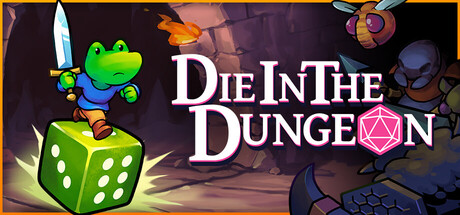
Fight your way through a mysterious dungeon in this deck-building, turn-based roguelike game where you don't use cards, but dice! Deal with enemies by combining powerful dice on your board, boost their effects with magical relics, and risk it all hoping for a good roll on unexpected encounters.

$9.74Very Positive(83)
RoguelikeStrategyDeckbuilding
ATICOMay 1, 2026

Die in the Dungeon scores 78/100 — better than 86% of Roguelike capsules (n=2,506).

Very Positive (83 reviews) · $9.74 · Released May 1, 2026 · By ATICO

Quick text summary

Die in the Dungeon scored 78/100 on Steam Analyzer — Good for a Roguelike capsule. Top priority fix: [contrast_color] Add a stronger dark outline or neon rim light to the frog's blue jacket to improve silhouette separation from the midground background in grayscale at small sizes

Capsule scores by dimension

  • Genre Clarity: 8/10 — Dice roguelike dungeon crawler clear. The d20 die integrated into the title logo, the dungeon cave background, and the frog character wielding a sword collectively signal a fantasy roguelike or dungeon crawler. The dice mechanic cue is especially clever and communicates the core hook visually. At tiny size the frog with sword and dungeon setting still implies a fantasy RPG roguelike even if the d20 detail is lost.
  • Title Readability: 8/10 — Bold serif title reads well small. The white serif title 'Die In The Dungeon' has strong contrast against the darker left-side background and uses a clean drop shadow with pink accent that separates it well. At small capsule size the text remains largely legible with the bold weight carrying it. At tiny size the text begins to compress but the bold letterforms and high contrast keep it marginally readable, though fine details of the d20 replacement for the letter O are lost.
  • Contrast & Color: 7/10 — Warm pink glow pops on dark Steam. The warm magenta-pink radial glow behind the frog character creates strong separation from the dark dungeon background and pushes the character forward effectively. The bright green frog with neon yellow outline pops clearly against both the glowing background and the Steam dark UI. In grayscale the frog silhouette is distinct but the blue jacket reduces contrast slightly against the warm background at tiny size.
  • Uniqueness & Polish: 8/10 — Charming frog mascot with smart dice branding. The cartoon frog protagonist is immediately memorable and stands out strongly from the genre's typical dark fantasy or gritty aesthetic seen in competitors like Hades II or Diablo IV. The d20 cleverly embedded in the title logo is a smart design choice that communicates the dice mechanic without explanation. The overall craft feels polished and intentional with a cohesive cartoon style, clean lighting, and a distinctive personality that avoids the generic template look.
  • Brand Consistency: 8/10 — Frog mascot creates strong identity. The bright green cartoon frog with its simple expressive design functions as a strong recurring mascot that would be immediately recognizable across store assets. The pastel cartoon rendering style, warm pink dungeon lighting, and clean bold typography form a coherent visual identity. The palette of green, magenta-pink, blue, and gold is distinctive enough to be recalled and tied back to this specific game within the roguelike deck-builder subgenre.
  • Composition: 8/10 — Clear hierarchy with strong focal frog. The composition places the frog character at right-center as the clear primary focal point with the title in the upper left creating a strong diagonal hierarchy that guides the eye naturally. The radial pink glow acts as a spotlight isolating the frog from the background effectively. At small and tiny sizes the frog silhouette remains the dominant element and the title sits in a clean region, though at tiny size both compete slightly and the supporting dungeon background detail becomes noise rather than context.

What works

  • Memorable frog mascot. The bright green cartoon frog is immediately distinctive against genre norms and creates instant personality differentiation from competitor capsules.
  • Clever d20 title integration. Embedding the d20 die into the title logo communicates the core dice mechanic as a visual branding element without requiring text explanation.
  • Strong subject-background separation. The magenta-pink radial glow spotlight creates clear value separation that isolates the frog and ensures it reads even at tiny thumbnail sizes.
  • Legible title placement on clean background. The title occupies the left side over a relatively controlled dark cave region, avoiding noisy texture overlap that would hurt readability.

What hurts the capsule

  • Blue jacket reduces silhouette clarity. The frog's blue jacket has similar value to the midground dungeon background in certain tonal ranges, slightly weakening the lower-body silhouette in grayscale.
  • Dice on floor poorly visible at small size. The small dice prop visible on the dungeon floor is too small to read at small or tiny sizes and loses its contextual value as a genre cue.
  • Background cave detail adds noise at tiny size. The crystalline rocks and cave architecture that read as atmospheric at full size become visual noise competing with the primary subject at tiny thumbnail dimensions.
  • No explicit roguelike or deck-builder genre cue beyond dice. Without the d20 logo detail reading cleanly at tiny size, the image could be misread as a general action RPG rather than a dice-based roguelike.

Priority fixes

  1. [contrast_color] Add a stronger dark outline or neon rim light to the frog's blue jacket to improve silhouette separation from the midground background in grayscale at small sizes
  2. [genre_clarity] Make the d20 element in the title logo slightly larger or bolder so it retains its shape and genre signaling at tiny capsule size
  3. [composition] Slightly reduce or soften background cave rock detail to prevent it from competing with the primary frog focal point at tiny thumbnail sizes
  4. [title_readability] Test the title at 120x45 crop and consider increasing the stroke weight or adding a subtle glow behind the text block to ensure letters remain distinct

Store copy priority fixes

  1. [hook_strength] Rewrite the short description to open with the dice mechanic first: "A deck-building roguelike where your dice replace your cards—combine unique dice on your board, customize each face, and roll for victory." This leads with the differentiator rather than burying it.
  2. [feature_communication] Add a concrete example of dice customization and synergy early in the detailed description: e.g., "Customize each die's faces with unique abilities—stack a poison die next to a reroll die to trigger devastating combos."
  3. [tone_match] Remove or replace the closing line "Trust the roll of the dice, master the board, and discover the fate that awaits you" with language that echoes the playful frog aesthetic established earlier, maintaining tonal consistency throughout.

Related guides

Steam app ID: 2026820 · Tags: Roguelike, Strategy, Deckbuilding, Card Game, Roguelike Deckbuilder