Scoring genre clarity...

Disney Illusion Island Starring Mickey and Friends capsule

Disney Illusion Island Starring Mickey and Friends

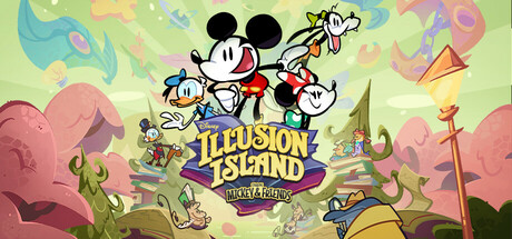
Mickey and Friends embark on an adventure to find three magical books and save the mysterious island of Monoth. Explore weird and wonderful biomes, meet unusual allies and face peculiar foes all in this hand-drawn 2D adventure.

$20.99Positive(28)
AdventurePlatformer2D Platformer
Dlala StudiosMay 30, 2025

Disney Illusion Island Starring Mickey and Friends scores 77/100 — better than 77% of Steam capsules we've analysed (n=22,658).

Positive (28 reviews) · $20.99 · Released May 30, 2025 · By Dlala Studios

Quick text summary

Disney Illusion Island Starring Mickey and Friends scored 77/100 on Steam Analyzer — Good for a Steam capsule. Top priority fix: [title_readability] Increase the size and weight of 'ILLUSION ISLAND' and simplify or remove the 'Starring Mickey & Friends' subtitle so the primary title remains legible at tiny 120x45 size.

Capsule scores by dimension

  • Genre Clarity: 8/10 — Colorful 2D platformer adventure clear. The hand-drawn style, whimsical fantasy landscape with stylized trees and warm organic colors, and the dynamic poses of Mickey, Minnie, Donald, and Goofy immediately suggest a 2D side-scrolling adventure or platformer. At tiny size the iconic Mickey silhouette and bright pastel world still read as family-friendly adventure. The genre lands clearly in casual platformer or adventure territory without ambiguity.
  • Title Readability: 7/10 — Title readable at full, weak tiny. At full size the 'ILLUSION ISLAND' text in bold stylized letters with strong contrast against the background reads well, and the Disney wordmark and 'Mickey & Friends' subtitle are visible. At small and tiny sizes the subtitle 'Starring Mickey & Friends' becomes illegible and the Disney logo shrinks to an unreadable mark, though 'ILLUSION ISLAND' still partially holds due to its large bold letterforms. The drop-shadow treatment on the title text helps separation but the serif-adjacent decorative font loses crispness at tiny scale.
  • Contrast & Color: 7/10 — Warm pastels pop against Steam dark. The warm greens, pinks, oranges, and creamy whites of the background create reasonable separation against Steam's dark #1b2838 background, and the characters' black outlines give strong silhouette definition. In grayscale the characters read clearly due to their black ink outlines, though the background and midground share similar mid-tone values that can muddy together at tiny size. The overall palette is bright enough to stand out in a dark-background scroll.
  • Uniqueness & Polish: 8/10 — Distinctive hand-drawn Disney craft. The hand-drawn animation aesthetic is immediately recognizable and premium-feeling, clearly communicating a high production value 2D adventure. The composition with all four iconic characters in dynamic poses over a lush fantasy island background feels cohesive and intentional rather than generic asset placement. Compared to genre peers this has a clear distinctive visual identity driven by the Disney IP and authentic animation style, though it does not push into truly inventive territory beyond leveraging established brand strength.
  • Brand Consistency: 9/10 — Strong Disney IP cohesion throughout. The rubber-hose animation style, character design, color palette, and whimsical world design are internally extremely cohesive and immediately signal the Disney brand without needing text confirmation. The warm organic color palette of greens, pinks, and oranges is consistent with the hand-drawn 2D adventure aesthetic seen in gameplay. The four iconic Disney characters serve as an instantly recognizable identity anchor that would be recalled easily in future browsing.
  • Composition: 7/10 — Characters central, title well anchored. The four characters are grouped centrally and slightly left-of-center with clear hierarchy, Mickey being the tallest and most central focal point, while the title card sits in the lower-center creating a natural reading path from characters to title. At small size the character group and title block remain the dominant readable elements, though the busy background foliage and floating elements compete slightly for attention. The composition is resilient to cropping with no critical elements hugging edges, though the lower-right corner has some wasted decorative space.

What works

  • Iconic character silhouettes. Mickey's ears and the group pose are instantly recognizable even at tiny thumbnail size due to strong black outlines and familiar shapes.
  • Hand-drawn aesthetic premium feel. The authentic animation style elevates perceived production quality well above typical casual genre capsules.
  • Warm palette pops on Steam dark background. The bright greens, pinks, and oranges contrast effectively against #1b2838 making it eye-catching during quick scrolling.
  • Clear genre and tone communication. Whimsical fantasy landscape and character poses immediately communicate family-friendly 2D adventure without ambiguity.

What hurts the capsule

  • Subtitle illegible at tiny size. 'Starring Mickey & Friends' and the Disney wordmark become unreadable at 120x45 due to small size and decorative rendering.
  • Busy background competes at small sizes. The detailed foliage, floating islands, and background characters create visual noise that erodes clarity when the image shrinks.
  • Mid-tone background mudding in grayscale. The green and pink background tones share similar values that merge in grayscale, reducing depth separation from the characters.
  • Lower-right area is compositionally weak. The bottom-right corner contains a decorative torch and sparse elements that add clutter without contributing to the focal hierarchy.

Priority fixes

  1. [title_readability] Increase the size and weight of 'ILLUSION ISLAND' and simplify or remove the 'Starring Mickey & Friends' subtitle so the primary title remains legible at tiny 120x45 size.
  2. [contrast_color] Darken or desaturate the mid-background foliage to create stronger value separation between the character group and the background, improving silhouette clarity at small sizes.
  3. [composition] Reduce or simplify background detail elements like floating islands and secondary characters to reduce noise and let the four main characters read as the unambiguous focal point at small size.
  4. [title_readability] Add a subtle vignette or darkened region behind the title text to reinforce contrast and prevent the logo from competing with the colorful background at reduced sizes.

Store copy priority fixes

  1. [hook_strength] Rewrite the short description to lead with co-op or a gameplay hook: 'Grab up to three friends and explore the magic of Monoth together—or go solo. Solve puzzles, unlock wild abilities, and uncover the mystery of three stolen Tomes in this hand-drawn adventure made for the whole family.'
  2. [uniqueness] Add a sentence to the opening that articulates what sets this apart: 'Disney Illusion Island combines classic side-scrolling adventure with unique co-op mechanics designed so friends control the world together—not just separately on screen.'
  3. [audience_targeting] Explicitly call out accessibility in the short description or lead feature to immediately signal family/casual inclusivity: 'Fully accessible for players of all skill levels, with adjustable difficulty and designed for families and friends.'
  4. [feature_communication] Move or restate the unique multiplayer abilities (Rope Drop, Leap Frog, heart gifting hug) into the short or opening detailed description so they land before the world-building section.

Related guides

Steam app ID: 2054660