Scoring genre clarity...

Summa Expeditionis capsule

Summa Expeditionis

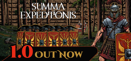
Summa Expeditionis is a colony sim and base building game set in ancient Roman Empire. Follow the career of a Roman soldier from Legionnaire to Centurion. Build and manage your camp, recruit more soldiers and face the barbarians for the glory of Rome.

$9.79Mixed(10)
Colony SimBase BuildingManagement
Lobico GamesMay 6, 2026

Summa Expeditionis scores 63/100 — better than 6% of Steam capsules we've analysed (n=22,658).

Mixed (10 reviews) · $9.79 · Released May 6, 2026 · By Lobico Games

Quick text summary

Summa Expeditionis scored 63/100 on Steam Analyzer — Solid for a Steam capsule. Top priority fix: [title_readability] Add a semi-transparent dark backing panel or a stronger drop shadow behind the title text so 'SUMMA EXPEDITIONIS' remains legible at tiny size.

Capsule scores by dimension

  • Genre Clarity: 8/10 — Roman military strategy clearly conveyed. The row of Roman legionaries with scutum shields and the prominent soldier in full Roman armor immediately communicate an ancient Roman military theme. At tiny size the shield formation and Roman helmet silhouette still read clearly enough to suggest a historical strategy or tactics game. The woodland backdrop and formation layout hint at tactical/strategy gameplay rather than pure action.
  • Title Readability: 6/10 — Readable at full, struggles tiny. The title 'SUMMA EXPEDITIONIS' uses a clean serif uppercase font centered at the top with decent contrast against the lighter sky-and-forest background. At full size it reads clearly, but at tiny size (120x45) the two-line Latin title becomes very small and the letterforms compress making it difficult to parse, especially the word 'EXPEDITIONIS' which is long and thin. No strong outline or drop shadow reinforces the text at reduced sizes.
  • Contrast & Color: 6/10 — Moderate contrast, muted palette. The red and gold of the shields provide the strongest color accent against the muted green-brown forest background, creating useful focal points. However, the overall palette is earthy and desaturated, and the primary soldier figure on the right has similar mid-tone values to the background, limiting silhouette separation in grayscale. Against Steam's dark #1b2838 background the capsule's lighter edges help it stand out marginally, but the muddy midtones reduce pop at small sizes.
  • Uniqueness & Polish: 5/10 — Competent but generic Roman theme. The hand-drawn or illustrated art style gives it some character compared to photobashed capsules, and the shield wall formation is a clever compositional choice that signals unit management. However the overall execution feels like a competent indie capsule without a distinctive visual hook or polished finishing touches — the background forest is plain, the lighting is flat, and it lacks the premium craft seen in top strategy titles like Manor Lords or Total War. The visual doesn't communicate the base-building or career-progression aspect of the game.
  • Brand Consistency: 6/10 — Coherent Roman identity, limited signature. The illustrated art style, Roman military iconography, and earthy color palette form a consistent internal identity. The red-and-gold shields are a recognizable motif that could serve as a brand signature. However, there is no strong logo mark, distinctive typographic treatment, or memorable compositional device that would make this capsule instantly recognizable in a library or search results.
  • Composition: 7/10 — Shield wall anchors strong hierarchy. The composition uses a clear foreground-midground-background structure: the shield formation dominates the center-left, the hero soldier stands tall on the right, and the forest fills the background. The title sits cleanly in the top-center over a relatively clear sky region. At small size the shield wall and soldier create two competing focal points of roughly equal weight, which slightly dilutes focus. The title placement is safe and margins are respected, with no critical elements near crop edges.

What works

  • Shield formation as genre signal. The row of Roman scutum shields immediately communicates unit-based tactical gameplay and anchors the historical setting at a glance.
  • Illustrated art style adds character. The hand-drawn aesthetic differentiates it from photobashed indie capsules and gives the image a consistent, crafted feel.
  • Title placement on controlled background. The title sits over the lighter sky and forest canopy region, providing a relatively clean reading surface without competing noise.
  • Red and gold color accent. The shield iconography introduces the strongest saturation in the image, drawing the eye immediately and reinforcing the Roman theme.

What hurts the capsule

  • Title collapses at tiny size. The long two-line Latin title with no outline or shadow becomes effectively unreadable at 120x45 pixels, harming discoverability.
  • Flat, muted background reduces pop. The plain woodland backdrop shares similar mid-tone values with the soldier figure, weakening silhouette separation especially in grayscale.
  • No unique gameplay hook visible. The base-building and career-progression mechanics — the game's key differentiators — are not communicated anywhere in the capsule.
  • Competing dual focal points at small size. The shield wall and the right-side soldier command equal visual weight, splitting attention at small capsule sizes instead of directing the eye cleanly.

Priority fixes

  1. [title_readability] Add a semi-transparent dark backing panel or a stronger drop shadow behind the title text so 'SUMMA EXPEDITIONIS' remains legible at tiny size.
  2. [contrast_color] Increase the value contrast of the right-side soldier against the background using a rim light or vignette so the silhouette separates cleanly in grayscale.
  3. [uniqueness_polish] Introduce a secondary visual cue — such as a small camp or fortification in the background — to hint at the base-building mechanic and distinguish the game from pure combat titles.
  4. [composition] Establish a single dominant focal point by making the hero soldier larger and moving the shield formation to a supporting midground role, reducing attention split at small sizes.

Store copy priority fixes

  1. [uniqueness] Add a specific mechanical or systemic differentiator: e.g., 'Unlike other colony sims, [specific unique feature]' or explain what makes the Roman setting more than cosmetic—does it affect gameplay rules, tech trees, or unit types?
  2. [feature_communication] Expand one feature section with concrete examples: replace 'craft equipment' with 'forge weapons and tools from gathered materials to improve soldier effectiveness and defense capabilities.'
  3. [audience_targeting] Insert a sentence identifying the core audience: 'Perfect for fans of Crusader Kings and Oxygen Not Included who want [specific appeal]' or 'Best for players who enjoy [gameplay style] over action.'
  4. [hook_strength] Strengthen the short description by adding a mechanical or thematic hook beyond setting: Replace or supplement 'face the barbarians for the glory of Rome' with a unique mechanical promise like 'manage supply lines across hostile territory' or 'balance military expansion with settler welfare.'

Related guides

Steam app ID: 2056200