Scoring genre clarity...

Disfigure capsule

Disfigure

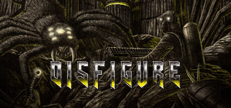
Disfigure is a grim-dark action rogue-like where you battle relentless hordes of monsters lurking in the shadows. Unlock powerful weapons, craft god-like builds with hundreds of upgrades, slay colossal bosses, and push your limits in intense 20–30 minute survival runs!

Free to PlayOverwhelmingly Positive(119)
Action RoguelikeBullet Hell2D
Cold Brew EntertainmentJul 26, 2023

Disfigure scores 75/100 — better than 68% of Steam capsules we've analysed (n=22,658).

Overwhelmingly Positive (119 reviews) · Free to Play · Released Jul 26, 2023 · By Cold Brew Entertainment

Quick text summary

Disfigure scored 75/100 on Steam Analyzer — Good for a Steam capsule. Top priority fix: [uniqueness_polish] Introduce a signature visual motif—a unique weapon design, creature mutation feature, or iconic UI element—that differentiates Disfigure's identity from competing grimdark action titles.

Capsule scores by dimension

  • Genre Clarity: 8/10 — Dark action rogue-like immediately clear. The grotesque multi-eyed creature with sharp teeth and mechanical elements screams grimdark action-horror at full size and reads as 'monster slayer' at small size. The gothic architecture and creature design evoke dungeon-crawler or rogue-like survival gameplay. At tiny size the silhouette of the creature remains recognizable enough to signal action-horror, though fine detail collapses.
  • Title Readability: 7/10 — Strong readability with minor size concerns. DISFIGURE uses bold white lettering with yellow accent underlines positioned centrally over a dark background, ensuring good legibility at full and small sizes. At tiny size the letters remain distinguishable but the yellow accent details become subtle; the title holds up well due to stroke weight and contrast. Spacing is clean and the logo does not collapse, though letterforms lose some sharpness at extreme reduction.
  • Contrast & Color: 8/10 — Strong value separation and silhouette. The cream and yellow creature against dark scratched metal background creates excellent contrast that pops against Steam's #1b2838 background. The white title text with yellow accent lines stands out sharply, and the grayscale test confirms distinct edge separation between subject and background. At small size the creature's bright eyes and pale flesh tones still read clearly against the dark frame and weathered texture.
  • Uniqueness & Polish: 7/10 — Polished grimdark aesthetic, minor generic feel. The hand-drawn engraving style and detailed creature design show craft and intentionality, avoiding cheap asset templates. The yellow accent color on the title adds a distinctive touch that hints at supernatural or corrupted elements matching the grimdark rogue-like theme. However, the composition leans on familiar grimdark tropes—oversized monster, gothic setting, pale flesh—that are common in the genre, keeping it solid but not standout.
  • Brand Consistency: 7/10 — Coherent grimdark palette, weak icon. The muted gold, pale flesh, and dark metal palette is internally consistent and matches the grimdark action aesthetic expected from the game. The engraving art style shows coherent rendering throughout. However, there is no immediately iconic character, symbol, or signature motif that would help recognition on repeat viewing—the creature is grotesque but not uniquely branded to Disfigure specifically.
  • Composition: 8/10 — Excellent focal hierarchy and balance. The creature anchors the center-left as a strong primary subject with the title positioned prominently center-right, creating clear hierarchy and guiding the eye naturally. The background architecture frames without overwhelming, using depth layering effectively. The composition survives all size reductions gracefully—at tiny size the creature silhouette and title remain the dominant focal points with no edge-cropping issues.

What works

  • Title contrast and legibility. White lettering with yellow accents maintains readability across full, small, and tiny sizes due to strong stroke weight and dark background separation.
  • Clear genre signaling. The grotesque creature and gothic setting immediately communicate grimdark action-horror and monster-slaying gameplay without ambiguity.
  • Strong silhouette preservation. The creature's distinctive profile holds visual weight even at tiny thumbnail size, ensuring discoverability in quick scrolls.
  • Internal art cohesion. Consistent engraving style, palette, and rendering across creature, background, and framing creates a unified premium feel.

What hurts the capsule

  • Generic grimdark archetype. The oversized multi-eyed creature and pale flesh tones follow familiar rogue-like and action-horror templates without a distinctive signature element unique to Disfigure.
  • Weak brand identity icon. The creature is visually competent but not memorable enough to serve as a recognizable brand symbol across marketing and store presence.
  • Limited color palette range. The muted gold, pale cream, and charcoal tones work well for grimdark but lack the vibrant accent or color hook that makes premium action capsules stand out.

Priority fixes

  1. [uniqueness_polish] Introduce a signature visual motif—a unique weapon design, creature mutation feature, or iconic UI element—that differentiates Disfigure's identity from competing grimdark action titles.
  2. [brand_consistency] Develop and enforce a distinctive brand color or symbol element visible across all marketing materials to improve long-term recognition and recall.
  3. [contrast_color] Consider adding a bright secondary accent color (electric blue, toxic green, or blood red) in small strategic areas to increase visual punch and differentiation at small sizes.

Store copy priority fixes

  1. [hook_strength] Rewrite the short description opening to lead with the vision mechanic: 'Disfigure is a grim-dark roguelike where you battle darkness itself—swap between limited circle and long-cone vision to balance sight and power in intense 20–30 minute survival runs.' This moves the unique angle front and center.
  2. [feature_communication] Move the DLC donation sentence to the footer or remove it from the opening; replace it with a hook sentence about the vision mechanic or build diversity to keep momentum.
  3. [uniqueness] Add a sentence to the Build Variety section emphasizing vision control as the mechanical core: 'Your vision mode fundamentally shapes every build—light sources become weapons, darkness becomes strategy.' This clarifies what makes Disfigure distinct.
  4. [audience_targeting] Explicitly mention the leaderboards and difficulty modes earlier in the short or opening paragraph to signal competitive/hardcore appeal alongside the accessible run length.

Related guides

Steam app ID: 2083160