Scoring genre clarity...

Edge Islands capsule

Edge Islands

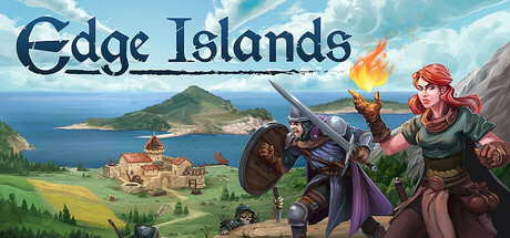
Discover a unique blend of Colony Sim and Tactical RPG. Recruit and train your heroes, build your outpost, explore dungeons and engage in turn-based strategic battles to protect and expand your domain. Shape your stories by managing moods, relationships, ambitions and more!

$12.59Mostly Positive(91)
Early AccessStrategySingleplayer
LS GamesMar 24, 2025

Edge Islands scores 60/100 — better than 0% of Steam capsules we've analysed (n=22,659).

Mostly Positive (91 reviews) · $12.59 · Released Mar 24, 2025 · By LS Games

Quick text summary

Edge Islands scored 60/100 on Steam Analyzer — Solid for a Steam capsule. Top priority fix: [composition] Establish a single dominant character as the clear focal point rather than two equal-weight heroes side by side, to create stronger hierarchy at small and tiny sizes.

Capsule scores by dimension

  • Genre Clarity: 6/10 — Fantasy colony RPG implied. The two armored/mage characters in the foreground combined with a settlement and island landscape in the background suggest a fantasy strategy or RPG setting. The 'Automation Update' subtitle adds a simulation/management hint, though colony sim is not immediately obvious at tiny size. At tiny size, the characters read as generic fantasy heroes without clearly communicating the tactical or colony-management depth.
  • Title Readability: 7/10 — Title clear at full, weak tiny. The 'Edge Islands' title uses a blue stylized serif font with moderate contrast against the light sky background at full size, making it readable. The subtitle 'Automation Update' in a white banner below is legible at full size but collapses to near-unreadable at tiny size. At small and tiny sizes, the main title still partially reads due to the distinct letterforms, but the subtitle becomes invisible noise.
  • Contrast & Color: 6/10 — Moderate contrast, soft midtones. The overall palette leans toward naturalistic greens, blues, and warm skin tones that don't strongly pop against Steam's dark #1b2838 background. The characters have reasonable edge definition but blend somewhat into the landscape midground due to similar value ranges. In a grayscale mental test, the silhouettes of the two characters are distinguishable but the background island scene creates clutter that reduces clean separation.
  • Uniqueness & Polish: 5/10 — Competent but genre-generic feel. The illustration quality is decent with hand-painted character art, but the overall composition and style feels similar to many mid-tier indie fantasy titles. The 'Automation Update' banner across the bottom, while informative, gives the impression of a promotional patch rather than a polished core identity. Compared to benchmarks like Manor Lords or Hades II, there is no strong visual hook or distinctive art direction that would make this stand out in a crowded scroll.
  • Brand Consistency: 6/10 — Coherent but not distinctive. The illustrated character style, fantasy island setting, and blue title font form an internally consistent presentation. However, the two characters shown do not establish a strong memorable mascot or iconic motif that would create lasting brand recognition. The soft natural color palette and illustrated style are cohesive but too common in the indie fantasy genre to build a unique identity signal.
  • Composition: 6/10 — Dual character foreground crowds frame. The two characters are placed side by side in the lower two-thirds of the image with the island settlement visible in the mid-background and the title occupying the upper portion. This creates a reasonable three-layer hierarchy, but having two equally weighted characters competing for attention weakens the single focal point needed for tiny sizes. The 'Automation Update' banner at the bottom edge risks crop on some Steam display contexts and pulls visual weight away from the main composition.

What works

  • Readable title at full size. The 'Edge Islands' logo in blue serif font is clearly legible at full and small sizes against the lighter sky region.
  • Fantasy setting clearly communicated. The combination of armored warrior, mage with fire, and medieval settlement background quickly conveys a fantasy genre.
  • Layered background depth. The foreground characters, midground settlement, and distant island create a sense of world depth that supports the colony-exploration theme.

What hurts the capsule

  • Subtitle collapses at tiny size. The 'Automation Update' white banner text becomes completely unreadable at tiny thumbnail size, adding noise without value.
  • Two competing focal points. Placing two equally prominent characters side by side creates split attention with no clear primary hero to anchor the eye at small and tiny sizes.
  • Low contrast against Steam dark background. The soft natural greens and blues in the background do not create strong edge separation from Steam's dark #1b2838 interface color.
  • Generic indie fantasy feel. The art style and composition closely resemble dozens of mid-tier fantasy indie titles, offering no distinctive visual hook to stand out in scroll.

Priority fixes

  1. [composition] Establish a single dominant character as the clear focal point rather than two equal-weight heroes side by side, to create stronger hierarchy at small and tiny sizes.
  2. [contrast_color] Darken the background landscape and add a stronger rim light or glow effect around the foreground characters to improve silhouette separation against Steam's dark UI.
  3. [title_readability] Remove or deprioritize the 'Automation Update' subtitle banner so it does not compete with the main logo and reduces clutter at tiny sizes.
  4. [uniqueness_polish] Introduce a distinctive visual element or signature motif, such as a unique character design, symbol, or color accent, that differentiates Edge Islands from other fantasy indie capsules.

Store copy priority fixes

  1. [hook_strength] Move the demo note below the About the Game section and replace it with a sentence that reinforces the core appeal (e.g., 'Manage a team of heroes whose moods, relationships, and ambitions directly impact their combat performance and your colony's fate.').
  2. [uniqueness] Add 2-3 specific examples of how the colony sim and tactical RPG systems interact (e.g., 'A hero's mood affects their combat accuracy,' 'Winning battles unlocks new farm types,' 'Each hero class changes your base's optimal layout').
  3. [feature_communication] Clarify the progression pacing in a new line (e.g., 'Take your time building and optimizing, or speedrun dungeons—every playstyle is viable').
  4. [tone_match] Remove or contextualize technical terms like 'light or temperature propagation systems' for accessibility; replace with player-friendly language (e.g., 'Optimize your base's layout using advanced environmental systems').

Related guides

Steam app ID: 2111020