Scoring genre clarity...

Keep Those Bugs Away From the Bomb capsule

Keep Those Bugs Away From the Bomb

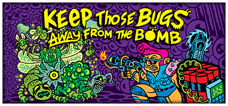
Survive the swarm and clear the arena of alien infestation in this fast-paced bullet hell roguelite shooter. Unlock new heroes, guns, and skills in a never ending quest with one thing in mind. Keep Those Bugs Away From The Bomb!

Bullet HellRogueliteArena Shooter
small brosComing soon

Keep Those Bugs Away From the Bomb scores 77/100 — better than 77% of Steam capsules we've analysed (n=22,658).

Released Coming soon · By small bros

Quick text summary

Keep Those Bugs Away From the Bomb scored 77/100 on Steam Analyzer — Good for a Steam capsule. Top priority fix: [title_readability] Consider abbreviating or restructuring the title lock-up for small sizes, such as emphasizing KEEP THOSE BUGS at larger scale with a secondary smaller line for the rest.

Capsule scores by dimension

  • Genre Clarity: 8/10 — Bullet hell shooter genre clear. The center character wielding a gun facing off against a swarm of grotesque bug creatures communicates action shooter immediately. The bomb prop and swarming enemies reinforce the bullet hell survival concept from the title itself. At tiny size the gun-toting hero versus monster horde read is still discernible, though individual details collapse into a colorful blob.
  • Title Readability: 7/10 — Bold title reads at small size. The large yellow hand-lettered title with black outlines occupies the upper portion and is legible at full and small sizes due to high contrast against the purple background. At tiny size around 120x45 the full title becomes compressed and partially unreadable, though the dominant words KEEP and BUGS and BOMB remain parseable due to the bold letterforms. The decorative wobbly font style slightly reduces precision legibility but the thick black outlines compensate well.
  • Contrast & Color: 8/10 — Vivid palette pops on dark Steam. The saturated yellow title, bright green monsters, and neon-accented hero create strong contrast against the deep purple background which itself sits well against Steam's dark navy. In grayscale the yellow title and green creatures maintain adequate separation from the purple field. At small size the high saturation and value contrast ensure the image does not dissolve into the Steam dark background.
  • Uniqueness & Polish: 8/10 — Distinctive retro gross-out art style. The 1980s underground comics aesthetic with intentionally grotesque character design and hand-lettered typography gives this capsule a strong personality that stands out clearly among polished AAA and generic indie shooters. The art direction is cohesive and the illustrative style communicates a deliberate creative choice rather than asset-flip or template. Compared to genre benchmarks this has a more distinct visual identity than most indie bullet hell capsules, though the busy composition slightly undermines the premium feel.
  • Brand Consistency: 8/10 — Cohesive retro comic identity. The purple and green palette with hand-drawn linework and acid-trip creature design creates a recognizable internal identity. The typography style matches the illustration style tightly, both feeling from the same aesthetic world. The bomb motif, the specific hero character design, and the signature purple background give strong recall cues that would translate consistently across store screenshots.
  • Composition: 7/10 — Clear hero versus horde hierarchy. The composition splits cleanly with title text dominating the upper half and the character confrontation filling the lower half, creating a readable two-zone layout. The hero is positioned right of center with enemies to the left, creating natural left-to-right tension and a clear focal dynamic. At small size the title and character read as distinct zones, though the extremely busy background texture and dense bug pile slightly compete with the hero silhouette and reduce clarity during a quick scroll.

What works

  • Vivid color contrast. Saturated yellow, green, and hot pink elements pop strongly against the purple background and Steam's dark navy, ensuring high visibility even at tiny thumbnail size.
  • Distinctive art style. The underground comics gross-out illustration style is immediately recognizable and differentiates this capsule from generic indie shooter templates.
  • Title placement and legibility. The large bold yellow title with thick black outlines occupies prime upper real estate and remains readable at small capsule sizes.
  • Genre signaling is strong. Gun-wielding hero facing a monster swarm with a bomb prop communicates the bullet hell survival loop without requiring text at a glance.

What hurts the capsule

  • Busy background competes with hero. The densely patterned purple background texture and large blob of bug creatures make it harder to isolate the hero silhouette at tiny size.
  • Title too long for tiny sizes. The full six-word title collapses into near-illegibility at the 120x45 thumbnail size, which could hurt discoverability in certain Steam browse contexts.
  • Hero silhouette lacks crispness. At small sizes the hero character merges somewhat with the surrounding monster mass due to similar mid-tone values along the left edge of the character.
  • Limited depth layering. The background, midground creatures, and hero exist on a fairly flat plane which reduces the sense of drama and spatial hierarchy when the image scales down.

Priority fixes

  1. [title_readability] Consider abbreviating or restructuring the title lock-up for small sizes, such as emphasizing KEEP THOSE BUGS at larger scale with a secondary smaller line for the rest.
  2. [composition] Increase contrast between the hero character and the surrounding bug cluster by adding a stronger light halo or drop shadow behind the hero to separate the silhouette at small sizes.
  3. [contrast_color] Slightly darken or simplify the background pattern texture so it recedes further and stops competing with the foreground action cluster during quick scroll.
  4. [uniqueness_polish] Add a subtle depth gradient or lighting cone from the hero outward to create foreground versus background separation and increase the sense of premium craft.

Store copy priority fixes

  1. [uniqueness] Add a sentence explaining what makes this game's progression, weapon system, or enemy variety distinctly different from other roguelite bullet hells—e.g., 'four weapon types interact with environmental hazards' or 'enemy swarms scale dynamically based on survivor rescues.'
  2. [feature_communication] Replace 'Automated weapons that fire as you move around the levels' with a clearer description of aiming and firing mechanics—does the player aim manually, or do weapons auto-target? This is critical to understanding core gameplay.
  3. [audience_targeting] Add one sentence acknowledging the difficulty level and suggesting who should play—e.g., 'Demanding fast reflexes and tactical skill, this roguelite is built for bullet-hell veterans seeking endless replayability' or note an easier mode if available.
  4. [hook_strength] Consider opening the short description with a more distinctive hook that leads with the bomb-defense premise or a specific visual/mechanical hook before 'Survive the swarm.'

Related guides

Steam app ID: 2133500