Scoring genre clarity...

A Tower Full of Cats capsule

A Tower Full of Cats

A Tower Full of Cats is a hidden object game where you need to gather cats through the whole history of catkind... and beyond!

$4.19Overwhelmingly Positive(14)
CatsHidden ObjectPuzzle
DevcatsMay 20, 2024

A Tower Full of Cats scores 68/100 — better than 19% of Steam capsules we've analysed (n=22,658).

Overwhelmingly Positive (14 reviews) · $4.19 · Released May 20, 2024 · By Devcats

Quick text summary

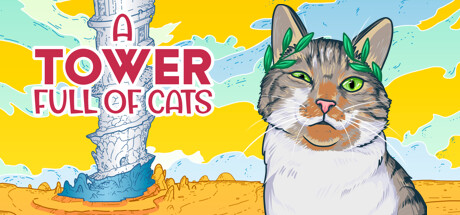
A Tower Full of Cats scored 68/100 on Steam Analyzer — Solid for a Steam capsule. Top priority fix: [genre_clarity] Add a subtle hidden object visual cue such as a magnifying glass, scattered cat silhouettes, or a seek-and-find frame element to communicate the core mechanic at a glance.

Capsule scores by dimension

  • Genre Clarity: 5/10 — Casual vibe unclear genre. The bright comic-art style and crowned cat communicate a lighthearted, casual tone clearly, but the hidden object genre is not implied at all by the visuals. At tiny size the image reads as a general casual or puzzle-adjacent game, possibly a narrative adventure, but nothing in the composition hints at searching or finding. The tower element adds a vague progression or exploration cue but does not resolve the genre ambiguity.
  • Title Readability: 8/10 — Bold title reads well small. The large red bold lettering of TOWER and CATS dominates the left half with strong contrast against the yellow background, making the key words legible even at small capsule size. The word A and FULL OF are smaller and lighter in a script style, which collapses at tiny size and becomes unreadable, but the dominant words still communicate the core name. The white outline on the red text adds useful separation against the busy yellow and blue background.
  • Contrast & Color: 7/10 — Warm yellow pops on Steam dark. The saturated yellow-orange background creates strong contrast against Steam's dark #1b2838 environment, immediately drawing the eye. The cat's light fur on the right is well separated from the background through a subtle outline and the color shift from orange ground to blue-white sky. In grayscale the cat silhouette holds reasonably well, though the tower on the left blends somewhat into the light sky behind it at tiny size.
  • Uniqueness & Polish: 7/10 — Charming comic style stands out. The hand-drawn comic art style with bold outlines and a flat saturated palette is distinctive and immediately communicates a charming personality that differentiates it from generic casual capsules. The laurel-crowned cat is a memorable and slightly absurd visual hook that gives the game a clear identity. Compared to top-tier benchmarks like Little Kitty Big City or Snufkin the craft is solid but the composition feels slightly unbalanced and the tower element is underutilized as a unique selling point.
  • Brand Consistency: 8/10 — Cohesive comic art identity. The flat comic-book illustration style, bold outlines, warm saturated palette, and the regal cat motif form a coherent and recognizable internal visual identity. The typography choice in red with a playful script complement the illustration tone without clashing. The crowned cat is a strong potential recurring brand icon that could be recognized across Steam store pages, and the style appears consistent with what a hidden object casual game in this art direction would sustain across screenshots.
  • Composition: 6/10 — Split focus with dead center gap. The capsule is divided into a left text-heavy zone and a right character zone with a tall tower occupying the upper center, creating a somewhat fragmented three-part layout. At small size the large cat face on the right is the clearest focal point and reads well, but it competes with the bold title on the left rather than the two elements guiding each other. The central area between the title and cat has a noticeable empty gap that reduces compositional tension and wastes prime real estate.

What works

  • Vibrant yellow background pops on Steam. The saturated warm yellow-orange palette creates immediate shelf contrast against Steam's dark interface and draws the eye in under one second.
  • Bold title keywords remain legible at small size. TOWER and CATS in large red bold lettering with white outlines survive small capsule compression and communicate the core name clearly.
  • Crowned cat is a memorable brand icon. The laurel-wreathed cat face is an immediately appealing and slightly absurd visual hook that differentiates the capsule within the casual genre.
  • Coherent comic art style with clean outlines. The flat saturated illustration style is consistently applied across character, background, and tower, giving the capsule a polished handcrafted feel.

What hurts the capsule

  • Hidden object genre not communicated. Nothing in the composition implies searching or finding mechanics, leaving the genre ambiguous and potentially costing clicks from the target audience.
  • Small script text collapses at tiny size. The words A and FULL OF in the lighter script style are completely unreadable at 120x45 thumbnails, fragmenting the full title read.
  • Tower element is weak and blends at small size. The tall pillar in the upper center loses detail rapidly at small sizes and blends into the light sky, making it a wasted compositional anchor.
  • Dead zone between title and character. The empty gap in the center of the capsule between the text block and the cat reduces compositional energy and wastes prime visual real estate.

Priority fixes

  1. [genre_clarity] Add a subtle hidden object visual cue such as a magnifying glass, scattered cat silhouettes, or a seek-and-find frame element to communicate the core mechanic at a glance.
  2. [title_readability] Increase the size and weight of the words A and FULL OF so all five title words survive tiny thumbnail compression, or consolidate into a single unified logo treatment.
  3. [composition] Shift the crowned cat slightly left to close the central dead zone and create a tighter relationship between the character and the title text, improving hierarchy at small size.
  4. [contrast_color] Add a stronger outline or shadow to the tower pillar to separate it from the light sky background so it reads as a distinct element at small and tiny sizes.

Store copy priority fixes

  1. [feature_communication] Expand the detailed description to 200+ words explaining: what the tower structure is, how each level or era works, what 'extra stuff' includes (collectibles, lore, minigames?), and what progression feels like.
  2. [hook_strength] Rewrite the opening to lead with the emotional or curiosity hook—e.g., 'Travel through time collecting impossibly adorable cats—from ancient Egypt to the distant future—in this cozy hidden object adventure.' instead of restating the mechanic.
  3. [audience_targeting] Add a sentence explicitly signaling who this is for: 'Perfect for players who love relaxing puzzles, cat lovers, and collectors looking for a charming solo adventure with no time pressure.'
  4. [uniqueness] Clarify what makes this hidden object game different—e.g., explain the historical timeline mechanic or the adaptive soundtrack's role in immersion, or highlight story/character elements that set it apart.

Related guides

Steam app ID: 2179170