Scoring genre clarity...

Fatherhood capsule

Fatherhood

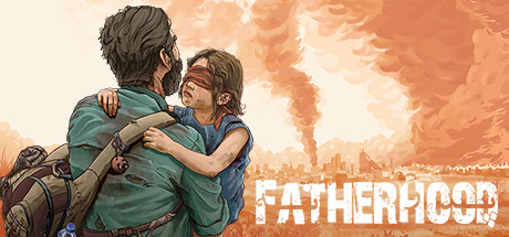
Play a 2.5D side-scrolling war adventure as a single father protecting his blind daughter. Navigate through dangers, sacrificing everything to keep her safe. Every choice matters—use the hugging mechanic to appease Asma, discover multiple endings, and solve puzzles in this emotional war story.

NarrativeAdventureWar
Persis PlayComing soon

Fatherhood scores 75/100 — better than 66% of Narrative capsules (n=259).

Released Coming soon · By Persis Play

Quick text summary

Fatherhood scored 75/100 on Steam Analyzer — Good for a Narrative capsule. Top priority fix: [brand_consistency] Introduce a subtle iconic visual motif (e.g., signature color accent, symbolic object, or character silhouette mark) that will anchor brand recognition across all marketing materials and make the capsule uniquely 'Fatherhood' rather than generic war narrative.

Capsule scores by dimension

  • Genre Clarity: 7/10 — War narrative action adventure clear. The capsule clearly communicates an emotional action-adventure through the central embrace of father and daughter against a war-torn cityscape backdrop with fire and destruction. The character positioning, backpack gear, and post-apocalyptic orange environment establish the genre and core mechanic (protection) effectively. At tiny size, the silhouettes and warm disaster setting still read as action-adventure, though the specific 'fatherhood' emotional narrative and 2.5D platformer mechanics become less apparent.
  • Title Readability: 8/10 — Bold sans-serif white type legible. The title 'FATHERHOOD' uses a strong, condensed sans-serif font in bright white with a subtle dark outline, positioned in the lower right over a clearer orange zone. The letterforms remain crisp and readable at both small and tiny sizes due to weight and contrast against the background. The placement avoids the character focal point, making the design breathe well across all viewing scales.
  • Contrast & Color: 8/10 — Warm orange palette strong separation. The dominant warm orange and coral gradient sky creates excellent value separation from the darker character silhouettes and teal-blue clothing in the foreground. The white title text pops cleanly against both the sky and character layers. Even in grayscale, the value range between the light sky and dark figures maintains clear silhouette definition, reading strong at tiny size.
  • Uniqueness & Polish: 7/10 — Illustrated art style emotional focus. The hand-painted illustration style conveys a premium, indie-art-house quality distinct from generic AAA war imagery, with expressive brushwork in the sky and detailed character rendering showing visible care in craft. The emotional core—a father protecting his blind daughter—is communicated through gesture and composition rather than action spectacle, making it narratively distinctive. The execution is polished but not groundbreaking; it feels intentional and thematic rather than generic, sitting solidly in the 7 range for indie adventure peers.
  • Brand Consistency: 7/10 — Warm illustrated aesthetic recognizable. The watercolor-influenced illustration style, warm orange-to-cream color palette, and intimate character framing establish a cohesive visual identity that would be recognizable across marketing materials. The teal-and-rust color blocking in clothing and the gestural brushwork create memorable internal consistency. Without reference to the 17 store screenshots, internal signals alone suggest a consistent indie narrative-adventure brand identity, though no iconic motif or symbol is strongly unique to this game.
  • Composition: 8/10 — Clear focal point balanced hierarchy. The father-daughter embrace is the dominant focal point, centered-left with strong emotional weight, while the apocalyptic cityscape and title occupy supporting zones without competing for attention. The depth layering (sky, distant city, midground characters) creates natural hierarchy and visual flow. Safe margins protect the title and key figures across all size reductions, and the composition remains legible and emotionally resonant at tiny scale without cropping issues.

What works

  • Emotional narrative clarity through gesture. The father-daughter embrace immediately communicates the core theme without text; the hug mechanic is visually implied in the composition itself.
  • Strong value contrast and silhouette. Dark characters against bright warm sky create immediate visual separation that holds at tiny size and in grayscale, with clean edge definition throughout.
  • Premium illustration quality and style. Hand-painted aesthetic with visible brushwork and expressive character rendering elevates the capsule above template-based indie work.
  • Title legibility across all sizes. White condensed sans-serif with dark outline remains crisp and readable from full header to tiny thumbnail without collapse.

What hurts the capsule

  • Genre specificity loss at tiny scale. While the action-adventure reads well, the 2.5D platformer and puzzle elements are not visually communicated; the capsule leans heavily on emotional narrative over gameplay type.
  • Limited unique visual hook. The composition is strong but uses familiar post-apocalypse war imagery; no signature motif, symbol, or visual element uniquely identifies 'Fatherhood' versus other indie war narratives.
  • Secondary character details blur at small sizes. The daughter's blindfold and some character expression details that reinforce narrative depth become indistinct at small and tiny viewports.

Priority fixes

  1. [brand_consistency] Introduce a subtle iconic visual motif (e.g., signature color accent, symbolic object, or character silhouette mark) that will anchor brand recognition across all marketing materials and make the capsule uniquely 'Fatherhood' rather than generic war narrative.
  2. [genre_clarity] Add a small gameplay affordance hint (e.g., minimal puzzle element, platform silhouette, or hug-mechanic icon) in the background or composition to communicate the 2.5D platformer and mechanic-driven gameplay beyond emotional narrative alone.
  3. [composition] Verify safe margins in actual Steam display to ensure no title or character elements are cut during carousel crop or responsive scaling on smaller store displays.

Store copy priority fixes

  1. [feature_communication] Explain puzzle types and frequency in a dedicated sentence; clarify how puzzles integrate with stealth and parenting mechanics (e.g., 'solve environmental puzzles while keeping Asma safe and unheard').
  2. [hook_strength] Remove 'join our discord' from the opening line and replace with an immediate statement about the game's emotional core or the central dilemma.
  3. [feature_communication] Condense repeated mechanics sections into a single, well-structured feature list; eliminate the three separate explanations of stealth, hugging, and moral choice.
  4. [genre_clarity] Add one sentence clarifying combat possibility: whether stealth failure leads to combat, avoidance, or instant failure state to sharpen player expectations.

Related guides

Steam app ID: 2180850 · Tags: Narrative, Adventure, War, Choices Matter, Stealth