Scoring genre clarity...

Begone Beast capsule

Begone Beast

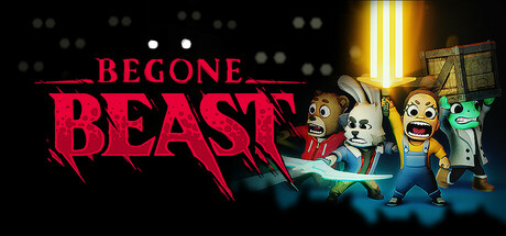
BEGONE BEAST is a spooky top-down action game for 1-4 players. HACK & SLASH & SCREAM through hordes of demons, endlessly changing levels, and ancient terrifying BEASTS. Harness the power of SNACKS, FLASHLIGHTS, and FRIENDSHIP in this scary (but also cute) race for survival!

Early AccessHack and SlashDungeon Crawler
TandemiComing soon

Begone Beast scores 67/100 — better than 15% of Steam capsules we've analysed (n=22,658).

Released Coming soon · By Tandemi

Quick text summary

Begone Beast scored 67/100 on Steam Analyzer — Solid for a Steam capsule. Top priority fix: [composition] Break the flat character row by staggering characters in depth or scale, elevating one character as a dominant hero figure in the foreground to create a clear focal point at small size.

Capsule scores by dimension

  • Genre Clarity: 6/10 — Cute horror action ambiguous genre. The four stylized cartoon characters in defensive/scared poses alongside the large horror-styled 'BEAST' title suggest a spooky action or survival game, but the chibi art style could imply a party game or casual title rather than action hack-and-slash. At tiny size, the characters are too small to read poses clearly, and the genre signal collapses to 'cute game with scary title.' The tonal mismatch between cute characters and horror branding creates mixed messaging about gameplay type.
  • Title Readability: 8/10 — Bold title reads well at most sizes. The large red 'BEAST' wordmark with dripping horror-style lettering is dominant and highly legible at full and small sizes, and the smaller 'BEGONE' above it in caps is readable at full size. At tiny size, 'BEGONE' becomes difficult to parse but 'BEAST' remains recognizable as the dominant brand element. The high contrast of red text against the dark background ensures the primary title survives size reduction well.
  • Contrast & Color: 7/10 — Strong title contrast, characters mid-range. The bright red title pops strongly against the near-black background, creating excellent value separation at the top. The four characters in the lower portion sit against a dark background but their lighter tones (white rabbit, tan bear, bright human skin) provide reasonable silhouette separation. At tiny size the character group merges into a mid-tone blob, losing individual definition, though the central glowing light source adds a useful focal highlight.
  • Uniqueness & Polish: 6/10 — Charming concept lacks premium finish. The cute-meets-horror concept is genuinely distinctive and the character designs have personality, but the overall execution feels closer to a mid-tier indie than a premium release. The composition of four characters lined up in a row is a common group-shot template, and the background offers minimal depth or environmental storytelling beyond a faint wooden structure. Compared to benchmark titles like Helldivers 2 or Resident Evil 4, the craft and visual hierarchy feel noticeably less refined.
  • Brand Consistency: 7/10 — Coherent cute-horror identity signals. The bold red horror typography paired with chibi-style cartoon characters creates a distinctive and internally consistent 'cute but scary' identity that feels intentional and memorable. The color palette of deep blacks, reds, and warm spotlight tones is cohesive. The four recognizable character designs (frog, rabbit, human, bear) function as a potential ensemble brand identity that could be recognized across assets.
  • Composition: 6/10 — Top-heavy title, flat character arrangement. The title dominates the upper half while the four characters are arranged in a flat horizontal line across the lower half, creating a two-zone split with limited depth layering or dynamic hierarchy. The central glowing light behind the characters adds a minor focal anchor, but at small size the character row reads as undifferentiated clutter below the title. The composition lacks a single dominant focal point that would carry at tiny size, and the flat arrangement misses opportunities for depth and visual energy.

What works

  • Dominant red title. The large 'BEAST' wordmark in bold red with horror-drip styling is highly legible at small size and immediately conveys tone.
  • Distinctive cast of characters. The four unique animal and human character designs create a memorable ensemble identity that communicates co-op gameplay.
  • Strong tonal contrast at top. The red-on-dark background combination for the title creates excellent pop against Steam's dark UI without any extra treatment.
  • Cute-horror tonal hook. The combination of adorable chibi characters with aggressive horror typography is a memorable and genre-subverting visual hook.

What hurts the capsule

  • Flat horizontal character row. All four characters are arranged at the same depth and height, creating a lineup that loses individuality at small and tiny sizes.
  • Genre ambiguity at tiny size. At 120x45 pixels the cute characters dominate and the hack-and-slash action context is lost, making it read as a casual or party game.
  • Thin background environment. The dark background provides minimal environmental storytelling and no strong setting cues to reinforce the spooky action genre.
  • BEGONE loses readability at small sizes. The smaller 'BEGONE' text above the main logo is at risk of becoming illegible at tiny thumbnail size, weakening the full title communication.

Priority fixes

  1. [composition] Break the flat character row by staggering characters in depth or scale, elevating one character as a dominant hero figure in the foreground to create a clear focal point at small size.
  2. [genre_clarity] Add a subtle environmental background element such as a dark dungeon floor, demon silhouettes, or weapon effects to reinforce the hack-and-slash action context at tiny size.
  3. [title_readability] Increase the size or weight of 'BEGONE' so both lines of the title remain legible as a unit at small sizes, or integrate it more tightly into the 'BEAST' logo.
  4. [uniqueness_polish] Add atmospheric depth to the background with fog, dynamic lighting, or enemy shadows to elevate the perceived production value beyond a plain dark gradient.

Store copy priority fixes

  1. [feature_communication] Remove or replace the corrupted 'AAAAA' text block at the end of the detailed description immediately—this is a major credibility issue in Early Access copy.
  2. [uniqueness] Add a sentence that explicitly differentiates the DAD/MOM systems: e.g., 'Our Dynamic AI Director and Map Outline Maker adapt to your playstyle—no two runs feel the same and the game learns from you.'
  3. [feature_communication] Clarify the BEAST progression loop: explain how many BEAST encounters exist per run, whether defeating all unlocks new content, and how scaling difficulty prevents repetition fatigue.

Related guides

Steam app ID: 2192380