Scoring genre clarity...

Echo of the Last Light capsule

Echo of the Last Light

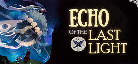
The worlds of light and dark are in danger. Will the creatures of the light be the key to saving your homeland in the dark? Journey with your new companion to discover how you can save the world while fending off those who would harm you and your companion.

Free to PlayPositive(33)
Action-Adventure3D PlatformerPvE
Fat Bear SocietyApr 25, 2023

Echo of the Last Light scores 70/100 — better than 30% of Steam capsules we've analysed (n=22,658).

Positive (33 reviews) · Free to Play · Released Apr 25, 2023 · By Fat Bear Society

Quick text summary

Echo of the Last Light scored 70/100 on Steam Analyzer — Good for a Steam capsule. Top priority fix: [title_readability] Increase the weight and contrast of the 'of the' connector text, or stylistically integrate it into the main logo so it reads as a unified block at tiny size.

Capsule scores by dimension

  • Genre Clarity: 7/10 — Atmospheric indie adventure implied. The luminous ethereal creature on the right and the small silhouetted figure below suggest a companion-based adventure with a light-versus-dark theme, aligning well with the described narrative. The whimsical, painterly art style hints at an indie narrative adventure or puzzle platformer. At tiny size the glowing creature and small hero silhouette still suggest a journey/companion genre, though RPG or action-adventure ambiguity remains.
  • Title Readability: 7/10 — Bold title reads at small size. ECHO OF THE LAST LIGHT uses large, high-contrast cream/yellow letterforms against a dark background on the left half, making the main words ECHO, LAST, and LIGHT legible at small size. The smaller phrase 'of the' is noticeably thinner and lower contrast, becoming difficult to read at tiny size. The moon-butterfly medallion logo adds charm but competes slightly with the subtitle text at reduced sizes.
  • Contrast & Color: 7/10 — Strong left contrast, right blends somewhat. The left side benefits from near-black background making the cream title text pop cleanly against #1b2838. The glowing blue-white creature on the right has good luminosity but its pale tones partially merge with the lighter mid-blue background at tiny size. In grayscale the creature silhouette still reads due to its halo glow, though the small figure below risks disappearing at thumbnail scale.
  • Uniqueness & Polish: 7/10 — Distinctive art style, polished craft. The painterly illustration of the large ethereal creature with its peacock-eye motif and floating orbs is genuinely distinctive and memorable compared to generic indie capsules. The split composition of bold typography left and evocative art right is a clean, confident layout choice. However, the overall concept of glowing spirit companion against dark backdrop is somewhat familiar in the indie space, keeping it from truly elite uniqueness.
  • Brand Consistency: 7/10 — Cohesive palette and motif language. The moon-butterfly medallion, cool blue-white glow palette, and painterly art style form a recognizable identity that feels internally consistent. The typography style, with its warm golden glow on the title lettering, complements the light-versus-dark theme. The moon and butterfly motifs function as memorable brand symbols that could aid recognition across store assets.
  • Composition: 7/10 — Clean split layout with clear hierarchy. The horizontal split between typography on the left and illustration on the right creates a clear reading order: title first, then visual world-building. The large creature anchors the right side as the focal point, with the small hero silhouette providing scale storytelling below it. At small size the composition holds well, though the bottom-center region between the title block and creature feels slightly empty, and the small figure risks being cropped or lost at tiny thumbnail scale.

What works

  • Distinctive creature design. The large luminous ethereal creature with peacock-eye motif and floating orbs is visually unique and memorable even at small viewing sizes.
  • High-contrast title placement. Placing the bold cream-gold title against the near-black left half ensures ECHO, LAST, and LIGHT remain legible even at small capsule sizes.
  • Thematic color storytelling. The cool blue-white glow against a dark background effectively communicates the light-versus-dark theme without any text explanation.
  • Recognizable brand medallion. The moon-butterfly circular logo provides a compact, iconic brand mark that supports identity recognition across store assets.

What hurts the capsule

  • 'Of the' subtitle text too small. The smaller 'of the' text between ECHO and LAST LIGHT drops to near-illegible contrast and weight at tiny thumbnail size.
  • Small hero figure may disappear at tiny size. The silhouetted companion figure at the bottom of the illustration is very small and risks being completely lost or cropped at 120x45 thumbnail scale.
  • Right background blends with creature. The mid-blue atmospheric background on the right side reduces edge contrast around the creature in grayscale, softening its silhouette separation.
  • Genre ambiguity between subgenres. While the adventurous tone is clear, the visuals do not distinguish between a platformer, narrative adventure, or RPG at tiny size, which may reduce click intent for genre-specific browsers.

Priority fixes

  1. [title_readability] Increase the weight and contrast of the 'of the' connector text, or stylistically integrate it into the main logo so it reads as a unified block at tiny size.
  2. [composition] Enlarge or reposition the small hero silhouette slightly upward and increase its brightness so it remains visible as a scale reference at thumbnail sizes.
  3. [contrast_color] Add a subtle dark vignette or deeper tonal separation behind the creature's right edge to improve silhouette clarity in grayscale and at small sizes.
  4. [genre_clarity] Introduce a subtle environmental cue such as a path, ruins, or light beam between the character and creature to more explicitly signal a journey or exploration genre.

Store copy priority fixes

  1. [hook_strength] Rewrite the short description to lead with a concrete gameplay verb and hook: 'Guide a mysterious creature of light through a darkening world, using its Echo ability to reveal hidden paths and enemy weaknesses while solving puzzles and battling The Royal Eclipse.'
  2. [tone_match] Move the student-collaboration paragraph to the bottom of the detailed description (or a separate 'About' section) and replace the opening with an atmospheric world-building paragraph that immediately immerses the player in the game's premise.
  3. [feature_communication] Consolidate scattered feature descriptions into a clear bulleted list: Core Mechanics, Combat & Abilities, Exploration & Puzzles, so players can quickly scan what they will do.
  4. [uniqueness] Add a sentence explaining why the companion and Echo ability are meaningfully different from other puzzle-platformers, such as 'The Echo can only be used in specific contexts, forcing you to think creatively about when to reveal the world's secrets.'

Related guides

Steam app ID: 2200030