Scoring genre clarity...

MakeRoom capsule

MakeRoom

Build rooms, gardens, and camper vans with 1,100+ objects and the ability to make your own furniture from scratch. Learn with gentle design requests, then relax and create at your own pace.

$6.99Very Positive(26)
DecoratingImmersive SimDesign & Illustration
KenneyAug 7, 2025

MakeRoom scores 78/100 — better than 56% of Decorating capsules (n=39).

Very Positive (26 reviews) · $6.99 · Released Aug 7, 2025 · By Kenney

Quick text summary

MakeRoom scored 78/100 on Steam Analyzer — Good for a Decorating capsule. Top priority fix: [contrast_color] Add a brighter accent color or increase saturation on the character outline to improve pop against #1b2838 during scroll.

Capsule scores by dimension

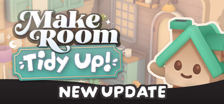
  • Genre Clarity: 8/10 — Clear casual creation game. The cheerful character, warm interior setting with furniture and plants, and cozy aesthetic immediately signal a relaxation-focused design game. At tiny size, the room interior and cute character mascot remain recognizable enough to suggest creative simulation, though the specific 'room building' focus becomes less explicit at smallest scales.
  • Title Readability: 9/10 — Bold, legible title treatment. The 'Make Room' logotype uses thick, well-spaced serif lettering with strong black outline and white fill that maintains excellent contrast against the light background at all sizes. Even at tiny 120x45, the text remains clearly readable and doesn't collapse, and the two-word layout is simple enough to parse at a glance during quick scroll.
  • Contrast & Color: 8/10 — Warm pastels with good separation. The soft peachy-cream interior palette contrasts adequately with the Steam dark background, while the mint-green roof on the character creates a bright accent that pops. At small and tiny sizes, the character silhouette remains distinct from the blurred background room, though the overall mid-tone warmth means it doesn't have maximum punch compared to high-contrast alternatives.
  • Uniqueness & Polish: 7/10 — Charming aesthetic, slight generic feel. The cute character mascot and soft, rounded interior design feel intentional and cohesive, with clear visual storytelling around cozy creation. However, the warm cottage interior is a common aesthetic in the indie casual space, and the capsule relies more on charm than a distinctive visual hook that sets it apart from Stardew-adjacent design games.
  • Brand Consistency: 7/10 — Consistent cute style, readable character. The smiling character mascot with simple features and the warm, pastel interior palette form a coherent visual identity that aligns with the game's gentle, accessible tone. The style appears consistent with what would be expected from screenshots, though without reference images visible here, the specific brand markers like signature UI elements or recurring motifs cannot be verified for strong iconic recognition.
  • Composition: 8/10 — Well-balanced focal points. The cute character on the right anchors attention while the left-aligned title creates good visual balance, and the blurred room background provides depth without clutter. At small and tiny sizes, the character remains the clear primary subject, and safe margins around the title prevent edge-cutting issues, though the composition could benefit from slightly stronger foreground-background separation.

What works

  • Highly legible title logotype. Thick serif letterforms with white fill and black outline remain clear and readable even at tiny thumbnail size.
  • Clear genre signaling. The cozy interior setting, character mascot, and soft aesthetic immediately communicate a casual creation or design game.
  • Strong character focal point. The cute, smiling mascot with rounded features provides an instant hook and guides the viewer's attention naturally.
  • Warm, inviting color palette. Pastel tones and soft lighting create visual appeal that matches the relaxation-focused gameplay promise.

What hurts the capsule

  • Generic aesthetic within genre. The warm cottage interior and soft character design, while charming, are common templates in indie casual games and lack a distinctive visual signature.
  • Moderate contrast against dark Steam background. The warm mid-tone palette doesn't create dramatic value separation, potentially reducing visual pop during quick browsing.
  • Background detail becomes noise at small sizes. The room interior blurs into a soft mush at tiny scales, losing the room-building context that would reinforce the game's core mechanic.

Priority fixes

  1. [contrast_color] Add a brighter accent color or increase saturation on the character outline to improve pop against #1b2838 during scroll.
  2. [uniqueness_polish] Introduce a distinctive visual motif or signature UI element (e.g., a build grid, custom furniture silhouette, or color accent) that reinforces the 'make your own' selling point.
  3. [composition] Sharpen the background room interior or add a subtle frame/border to maintain readable depth and room-building context at small and tiny sizes.

Store copy priority fixes

  1. [hook_strength] Rewrite the short description to lead with "Create custom furniture from scratch" or position custom creation as a primary hook alongside the 1,100+ objects, as it is the strongest differentiator.
  2. [uniqueness] Add a specific comparative claim such as 'the only building game where you design every object from the ground up' or explain what the custom furniture creation system offers that prefab building cannot.
  3. [audience_targeting] Add one explicit signal about progression or long-term appeal, such as 'unlock new tools and secret codes as you build' or 'no pressure—play at your own pace with optional challenges,' to clarify the experience arc.

Related guides

Steam app ID: 2212670 · Tags: Decorating, Immersive Sim, Design & Illustration, Sandbox, Building