Scoring genre clarity...

Zombie Rollerz: The Last Ship capsule

Zombie Rollerz: The Last Ship

Build turrets, lead your crew, and upgrade the ship while gathering loot in this exciting "Tower Defense-on-wheels zombie survival roguelite" game.

HK$ 47.52Mostly Positive(134)
Action RoguelikeExplorationBullet Hell
Zing Games Inc., 紫英互娱24 Jun, 2025

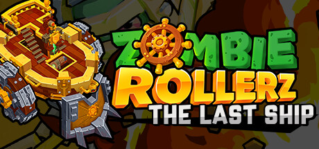
Zombie Rollerz: The Last Ship scores 68/100 — better than 14% of Action Roguelike capsules (n=1,708).

Mostly Positive (134 reviews) · HK$ 47.52 · Released 24 Jun, 2025 · By Zing Games Inc.

Quick text summary

Zombie Rollerz: The Last Ship scored 68/100 on Steam Analyzer — Solid for a Action Roguelike capsule. Top priority fix: [title_readability] Increase the size and weight of THE LAST SHIP subtitle or integrate it more prominently into the logo lockup so it remains readable at small capsule sizes.

Capsule scores by dimension

  • Genre Clarity: 7/10 — Tower defense zombie action clear. The golden energy beam firing from a mech-like right-side character into rolling zombie units clearly communicates action combat with a tower defense flavor. Cartoon zombie enemies and a mechanical shooter suggest the hybrid roguelite-defense genre reasonably well. At tiny size the beam of fire and zombie silhouettes still hint at the genre, though the rolling mechanic specific to the game is not immediately obvious.
  • Title Readability: 7/10 — Bold title readable at small size. ZOMBIE ROLLERZ uses a chunky green outlined font with good contrast against the warm yellow-orange background, and it reads clearly at full and small sizes. THE LAST SHIP subtitle is significantly smaller and becomes unreadable at tiny size. At tiny thumbnail size only ZOMBIE ROLLERZ remains parseable, which is acceptable since it is the primary identifier.
  • Contrast & Color: 7/10 — Warm palette pops on dark Steam bg. The dominant yellow-orange background and glowing energy beam create strong contrast against Steam's dark #1b2838 background, making the capsule pop immediately on the store page. The mech character on the right has sufficient value contrast to separate from the background. In grayscale the central beam remains the brightest element and anchors the read, though some zombie characters in the midground blend slightly into each other at tiny size.
  • Uniqueness & Polish: 6/10 — Competent but genre-generic cartoon style. The cartoon art style is clean and consistent, and the energy beam adds dynamism, but the overall presentation feels like a competent mid-tier mobile-adjacent game capsule rather than a standout Steam title. Compared to top-performing genre capsules like Hades II or Shadow Gambit, there is no singular striking visual hook or memorable compositional idea that makes this capsule feel premium. The polished cartoon execution keeps it from dropping lower, but it does not distinguish itself from other indie tower defense releases.
  • Brand Consistency: 7/10 — Cohesive cartoon zombie identity. The chunky outlined typography, rounded cartoon zombie character designs, warm yellow-orange palette, and steam-punk mech aesthetic form a consistent internal identity. The ship wheel motif embedded in the O of ZOMBIE ties to the subtitle THE LAST SHIP and hints at a recognizable brand symbol. The rendering style is uniform across all visible elements suggesting good art direction cohesion throughout the game's visual identity.
  • Composition: 7/10 — Diagonal beam drives clear focal flow. The diagonal golden energy beam from lower-left to upper-right creates strong directional movement and guides the eye effectively across the image. The mech character anchors the right side as the clear hero element while the title occupies the upper left, creating a balanced Z-pattern read. At small size the beam and right-side mech remain the dominant read, though the left-side zombie cluster becomes slightly cluttered and competes for attention when the image is reduced.

What works

  • High contrast warm palette. The dominant yellow-orange background and glowing beam immediately separate the capsule from Steam's dark interface, ensuring strong shelf presence during quick scrolling.
  • Readable primary title at small size. ZOMBIE ROLLERZ in chunky outlined lettering holds legibility down to small capsule sizes due to the bold stroke weight and clean color contrast.
  • Dynamic diagonal energy beam. The glowing beam creates motion and energy that communicates active gameplay and draws the eye across the full composition.
  • Consistent cartoon art direction. Character designs, typography, and background all share the same rounded cartoon rendering style, creating internal visual coherence.

What hurts the capsule

  • Subtitle unreadable at tiny size. THE LAST SHIP in small lettering below the main logo becomes completely illegible at 120x45 thumbnail size, wasting potential narrative hook.
  • Left zombie cluster becomes cluttered. The group of three zombie characters on the left side overlaps at small sizes and loses individual readability, creating visual noise rather than supporting the composition.
  • Generic compared to top-tier benchmarks. Against category leaders like Hades II or Shadow Gambit, the capsule lacks a singular memorable visual idea or premium craft quality that would make it stand out in a crowded genre page.
  • Mech character lacks strong silhouette. The right-side mechanical shooter has a complex shape that partially merges with background elements at tiny size, reducing its impact as the intended hero element.

Priority fixes

  1. [title_readability] Increase the size and weight of THE LAST SHIP subtitle or integrate it more prominently into the logo lockup so it remains readable at small capsule sizes.
  2. [uniqueness_polish] Introduce a single stronger focal hero moment, such as a more iconic character pose or a unique visual element that communicates the ship-on-wheels roguelite mechanic to differentiate from generic zombie tower defense capsules.
  3. [composition] Reduce the left zombie cluster to one or two clearly silhouetted characters with more spacing to eliminate clutter at small and tiny viewing sizes.
  4. [contrast_color] Strengthen the mech character's silhouette with a stronger light rim or outline so it separates cleanly from the background in both color and grayscale at tiny size.

Store copy priority fixes

  1. [hook_strength] Rewrite the short description opening to lead with an emotional hook: "Survive endless zombie waves from behind your heavily-armed ship" instead of the static list of actions, then mention the turret/crew/upgrade trifecta.
  2. [uniqueness] Add one sentence in the detailed description that explicitly states what makes this crew-management + tower-defense + roguelite combo distinct from solo tower defense or roguelikes (e.g., 'Crew synergies unlock unique turret combos unavailable in solo runs').
  3. [feature_communication] Insert a brief explanation of roguelite persistence: which upgrades carry over between runs, which are one-time, and how progression feels rewarding across multiple playthroughs.
  4. [audience_targeting] Add a single sentence clarifying recommended play style or session length to help solo players and tactical strategists self-select (e.g., 'Perfect for 20-minute survival runs or long strategic campaigns').

Related guides

Steam app ID: 2224120 · Tags: Action Roguelike, Exploration, Bullet Hell, Shoot 'Em Up, Roguelite