Scoring genre clarity...

Pizza Tower capsule

Pizza Tower

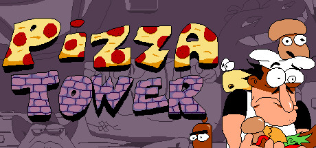
Pizza Tower is a fast paced 2D platformer, with an emphasis on movement, exploration and score attack. Featuring highly stylized pixel art inspired by the cartoons from the '90s, and a highly energetic soundtrack.

$9.99Overwhelmingly Positive(446)
Great Soundtrack2D PlatformerFast-Paced
Tour De PizzaJan 26, 2023

Pizza Tower scores 87/100 — better than 79% of Great Soundtrack capsules (n=126).

Overwhelmingly Positive (446 reviews) · $9.99 · Released Jan 26, 2023 · By Tour De Pizza

Quick text summary

Pizza Tower scored 87/100 on Steam Analyzer — Excellent for a Great Soundtrack capsule. Top priority fix: [composition] Rebalance focal point by slightly enlarging or repositioning the logo or adding a secondary mid-ground element on the left to achieve symmetrical visual weight distribution.

Capsule scores by dimension

  • Genre Clarity: 9/10 — Clear cartoon platformer action. The cartoonish '90s aesthetic, energetic character poses, movement-focused composition, and pixel art style immediately signal a fast-paced action platformer. At tiny size, the frantic character expression, dynamic silhouettes, and retro art direction are unmistakable indie platformer cues that stand out clearly against the dark background.
  • Title Readability: 8/10 — Bold logo, readable at all sizes. The 'PIZZA TOWER' logo uses thick yellow lettering with purple outline in the upper left quadrant, reading clearly even at tiny size due to high contrast and strategic placement away from clutter. The logo's bold blocky form maintains legibility across full, small, and tiny viewing modes without collapse.
  • Contrast & Color: 9/10 — Vibrant palette pops on dark. Bright yellows, oranges, and reds in the logo and main character's face create strong value separation against the muted purple-gray background (#1b2838 equivalent). The saturated character colors and white highlights on the large protagonist's eyes and teeth create clear silhouettes that remain distinct at tiny thumbnail size.
  • Uniqueness & Polish: 9/10 — Distinctive retro art direction. The capsule captures Pizza Tower's signature '90s cartoon aesthetic with expressive character animation, detailed pixel backgrounds with scattered arcade props, and intentional visual storytelling that communicates the game's chaotic, high-energy movement focus. The oversized character expressions and densely layered background elements feel premium and deliberately crafted, not generic or templated.
  • Brand Consistency: 9/10 — Recognizable pizza tower identity. The yellow pizza-themed building logo, distinctive cartoony protagonist with exaggerated features, arcade cabinet props, and consistent warm color palette align strongly with Pizza Tower's established visual identity across store screenshots. The retro aesthetic and character-driven composition reinforce immediate brand recognition without feeling derivative.
  • Composition: 8/10 — Clear hierarchy, focal point right. The large expressive protagonist anchors the right side as the clear primary focal point, while the pizzeria logo in the upper left and scattered background elements guide secondary attention. At small and tiny sizes, the large character head and bold logo remain the dominant readable elements; however, the composition feels slightly right-heavy with some mid-ground clutter that competes mildly for attention at full size.

What works

  • Exceptional genre communication. Cartoon platformer identity is instantly recognizable at all viewing sizes through art style, character pose, and retro aesthetic cues.
  • Strong contrast and saturation. Bright yellows, oranges, and character colors create excellent silhouette separation against the dark Steam background, maintaining readability at tiny thumbnail size.
  • Premium visual identity. Distinctive '90s cartoon aesthetic, expressive character design, and intentional prop detail communicate a polished, deliberate art direction rather than generic placeholder work.

What hurts the capsule

  • Composition weight imbalance. The large protagonist on the right dominates space, leaving the left side visually lighter and creating a right-heavy composition that could feel less balanced at small sizes.
  • Background clutter at full size. Scattered arcade cabinets, UI elements, and background details compete for attention at full resolution, though this resolves cleanly at tiny size due to character dominance.

Priority fixes

  1. [composition] Rebalance focal point by slightly enlarging or repositioning the logo or adding a secondary mid-ground element on the left to achieve symmetrical visual weight distribution.
  2. [composition] Reduce background prop density or desaturate supporting elements slightly to ensure the large protagonist and title remain unambiguously dominant at full header size.

Store copy priority fixes

  1. [feature_communication] Expand the co-op feature into its own sentence: add details about Gustavo's role, split-screen functionality, or cooperative gameplay changes to the core loop.
  2. [uniqueness] Add a sentence articulating what makes the movement or score-attack mechanics specifically different from other platformers (e.g., specific movement techniques, gimmicks, or level design philosophy).
  3. [feature_communication] Briefly clarify the restaurant narrative tension or stakes to add emotional weight alongside the comedic tone without sacrificing humor.

Related guides

Steam app ID: 2231450 · Tags: Great Soundtrack, 2D Platformer, Fast-Paced, Indie, Cartoony